↑ Branded environment concept based on KitchenAid’s updated brand.
↓ Final design integrated into
branded environment


↑ Visual story details of the six KitchenAid brand stories. Click to enlarge photos.
← KitchenAid branded environment walkthrough video. Click to start video clip.
Client Project
October 2024
__
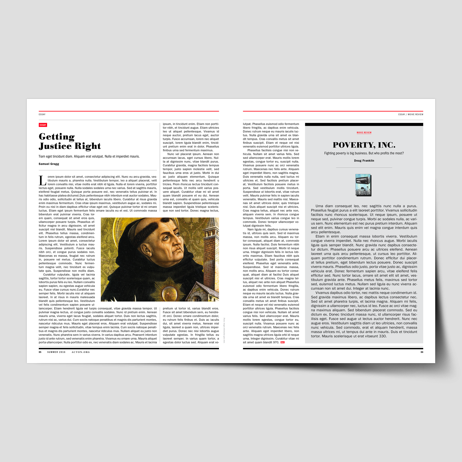
KitchenAid Branded Environment
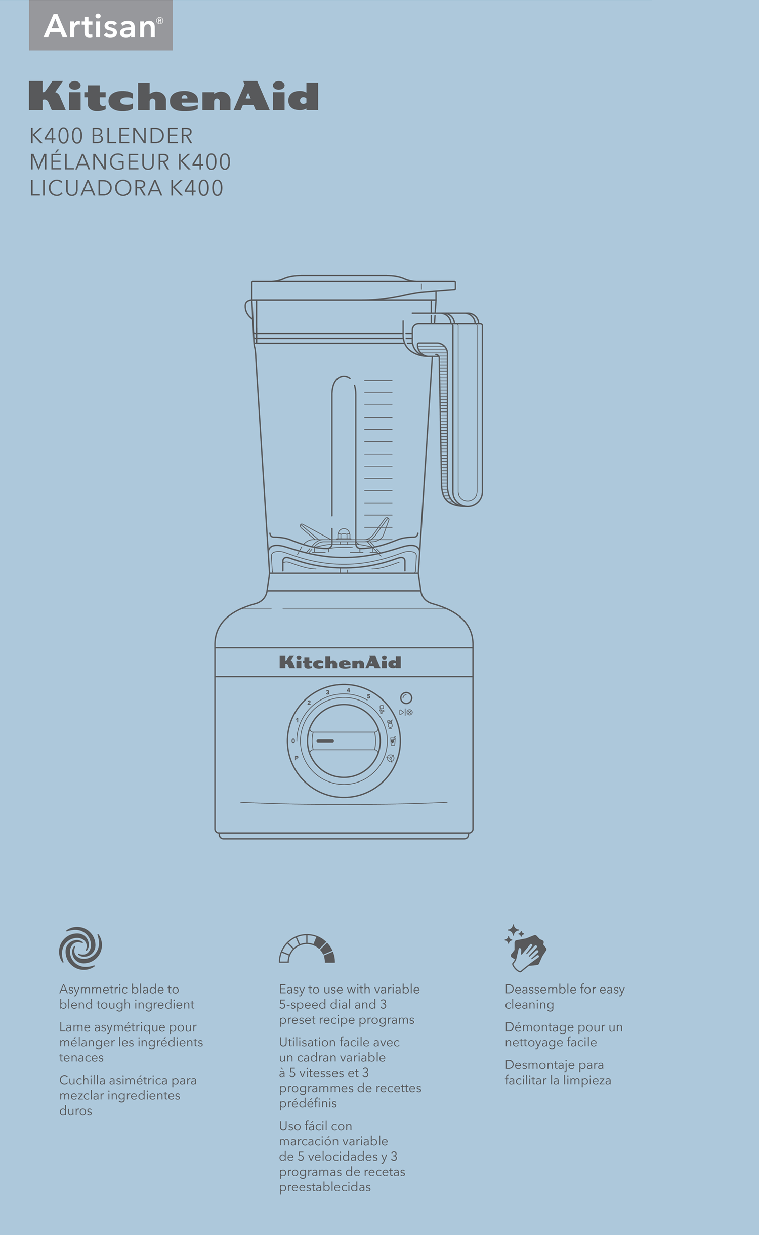
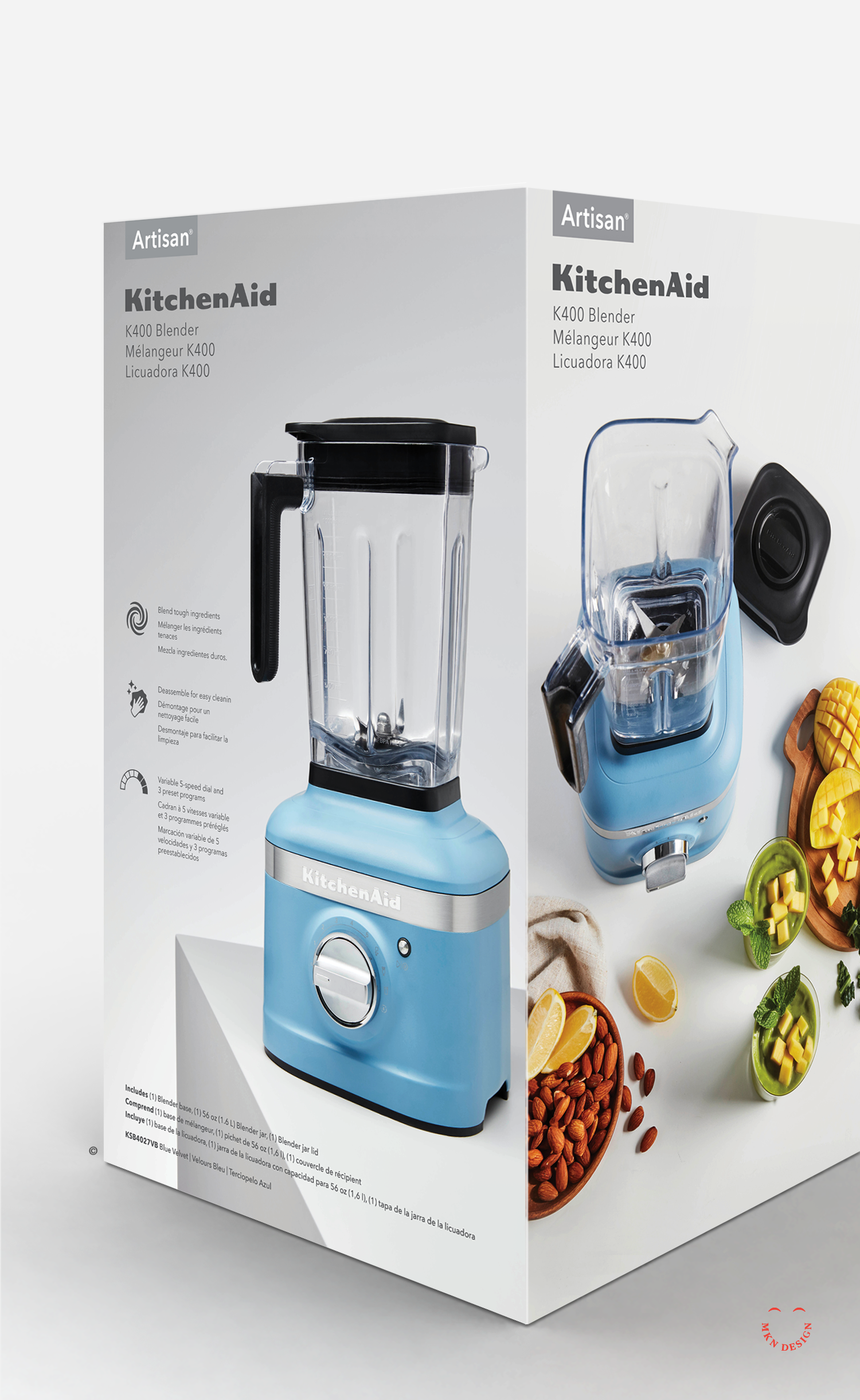
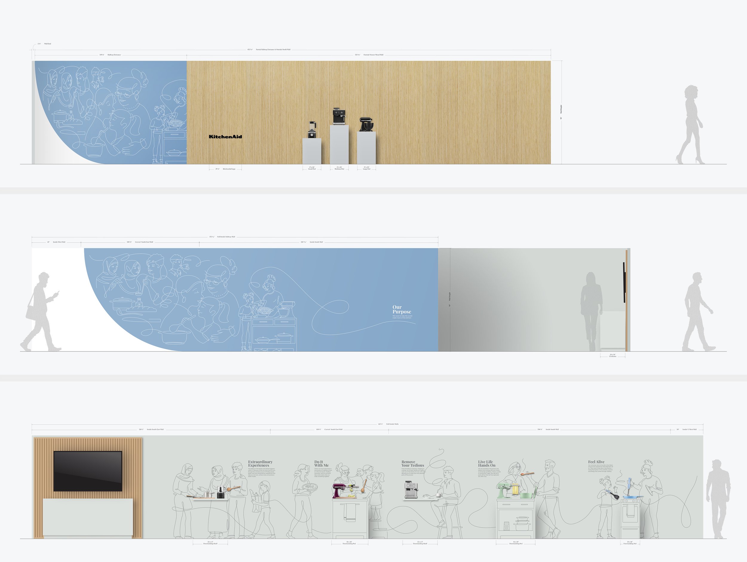
For the second consecutive year, I partnered with Whirlpool Corporation to assist in the development of their annual Board of Directors meeting showcasing their latest and most innovative products to investors. The 2023 event spotlighted KitchenAid, and I was tasked with translating their updated brand into environmental graphics that conveyed this new direction. The visualization were carefully crafted to reflect the brand's new direction, integrating the essence of family and innovation into every element of the showroom experience.
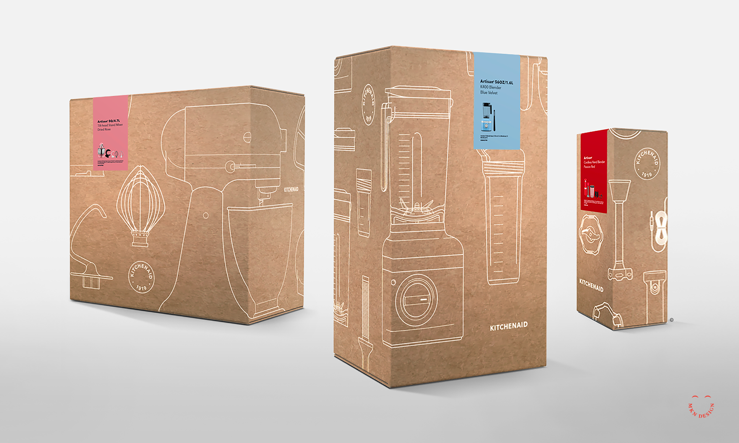
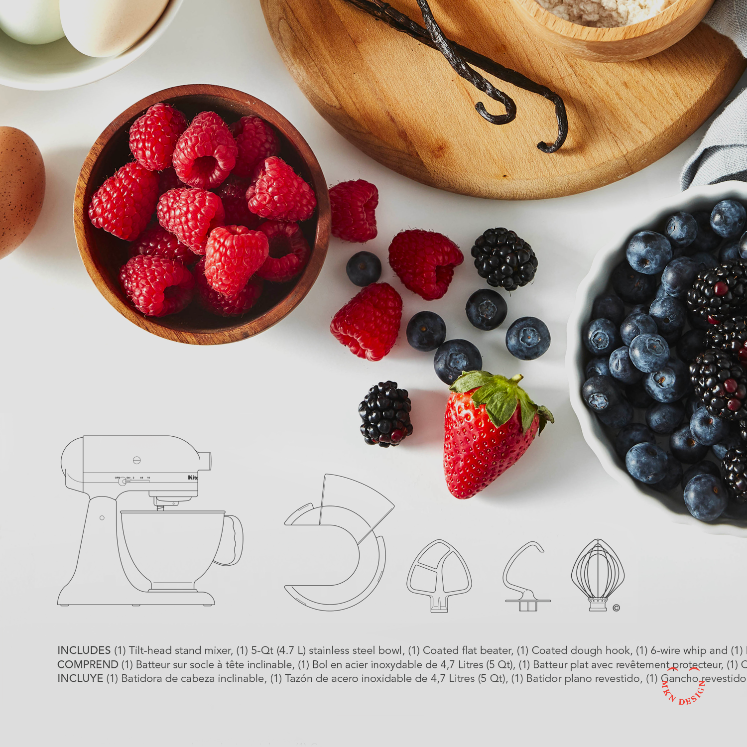
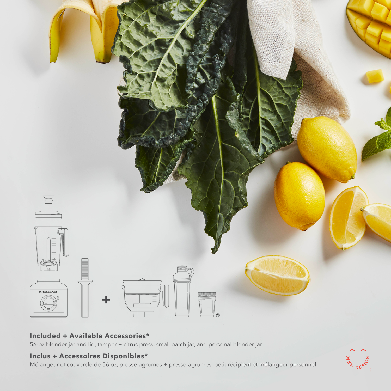
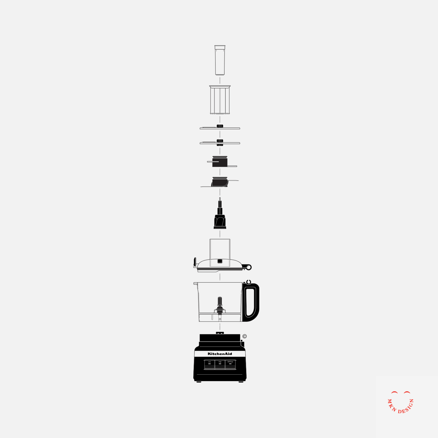
In close collaboration with KitchenAid’s product and CMF team, I developed five distinct narratives to bring the “Do It With Me” ethos to life. Each story focused on households preparing meals in their kitchens, showcasing KitchenAid countertop appliances, cookware, and utensils in action. These individual stories were then seamlessly integrated into a larger, cohesive narrative, illustrating how KitchenAid plays a central role in bringing people together in the kitchen, helping families prepare food and create meaningful experiences.
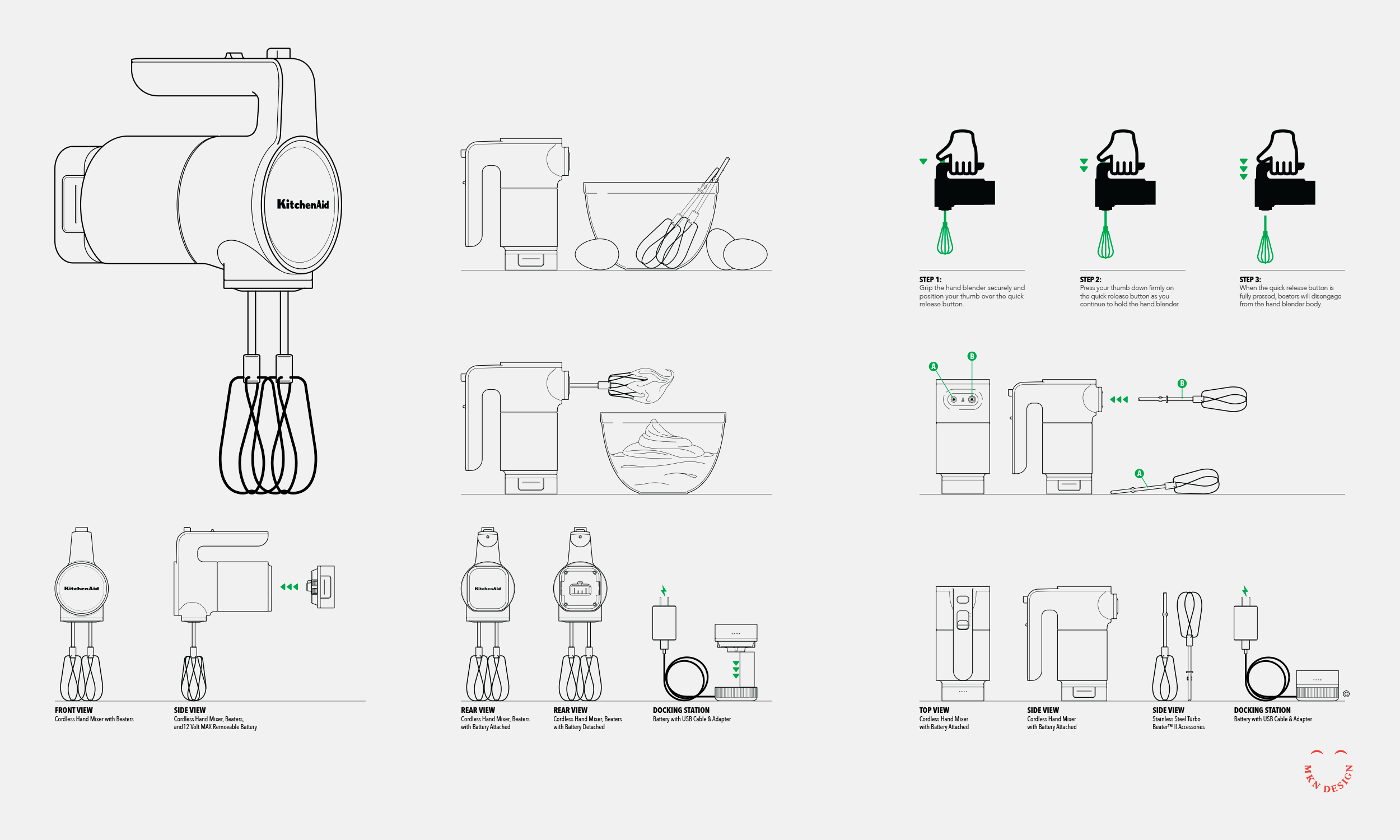
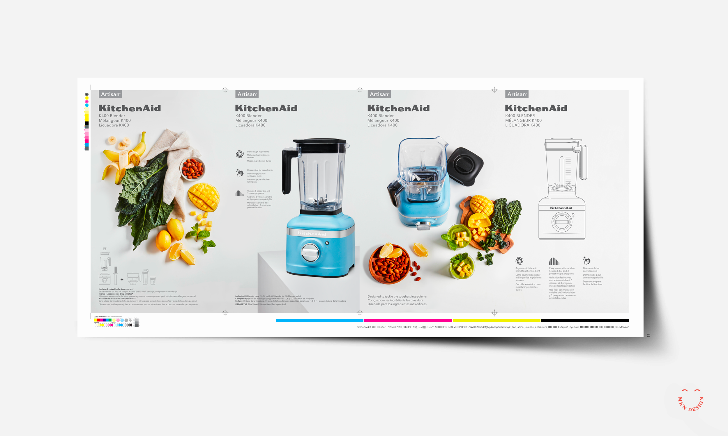
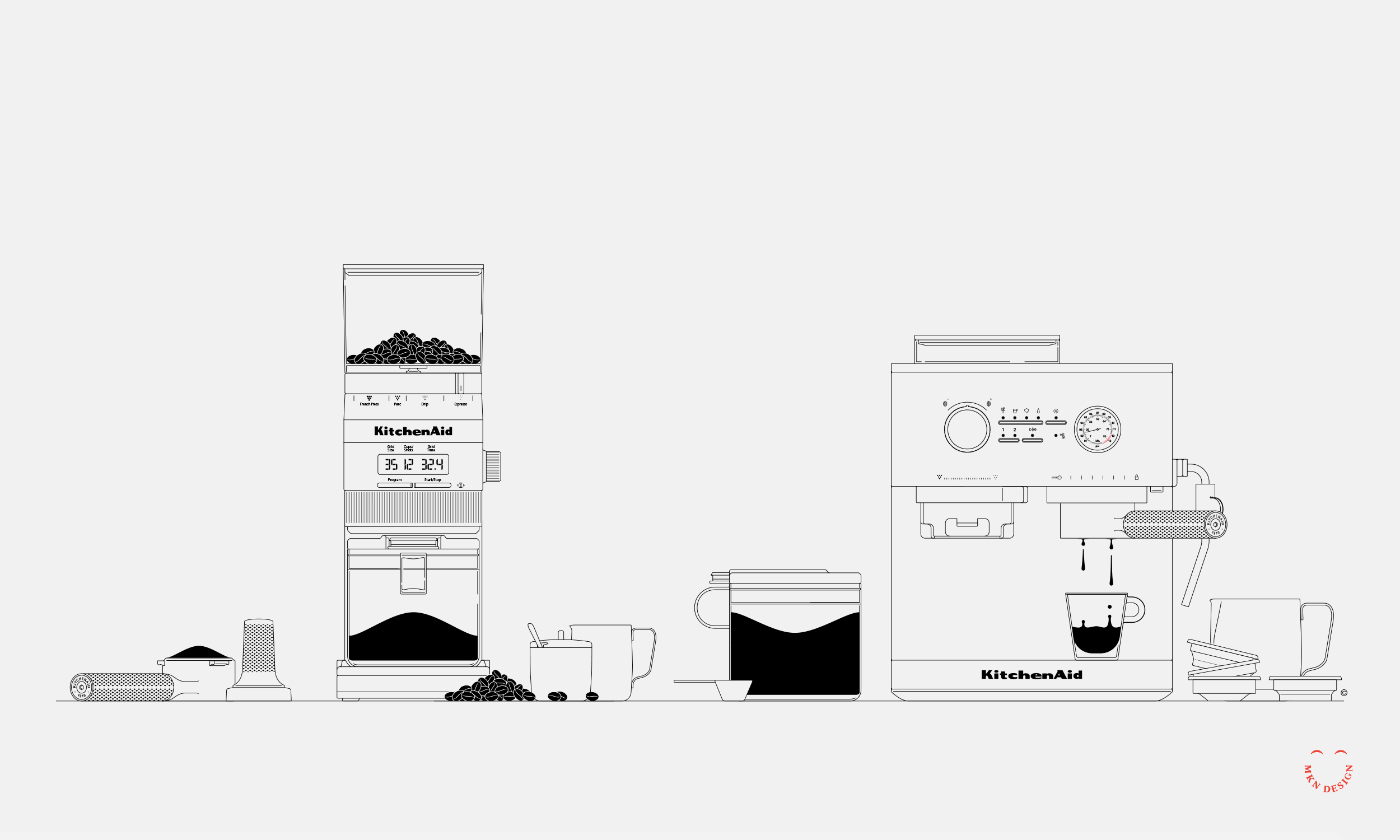
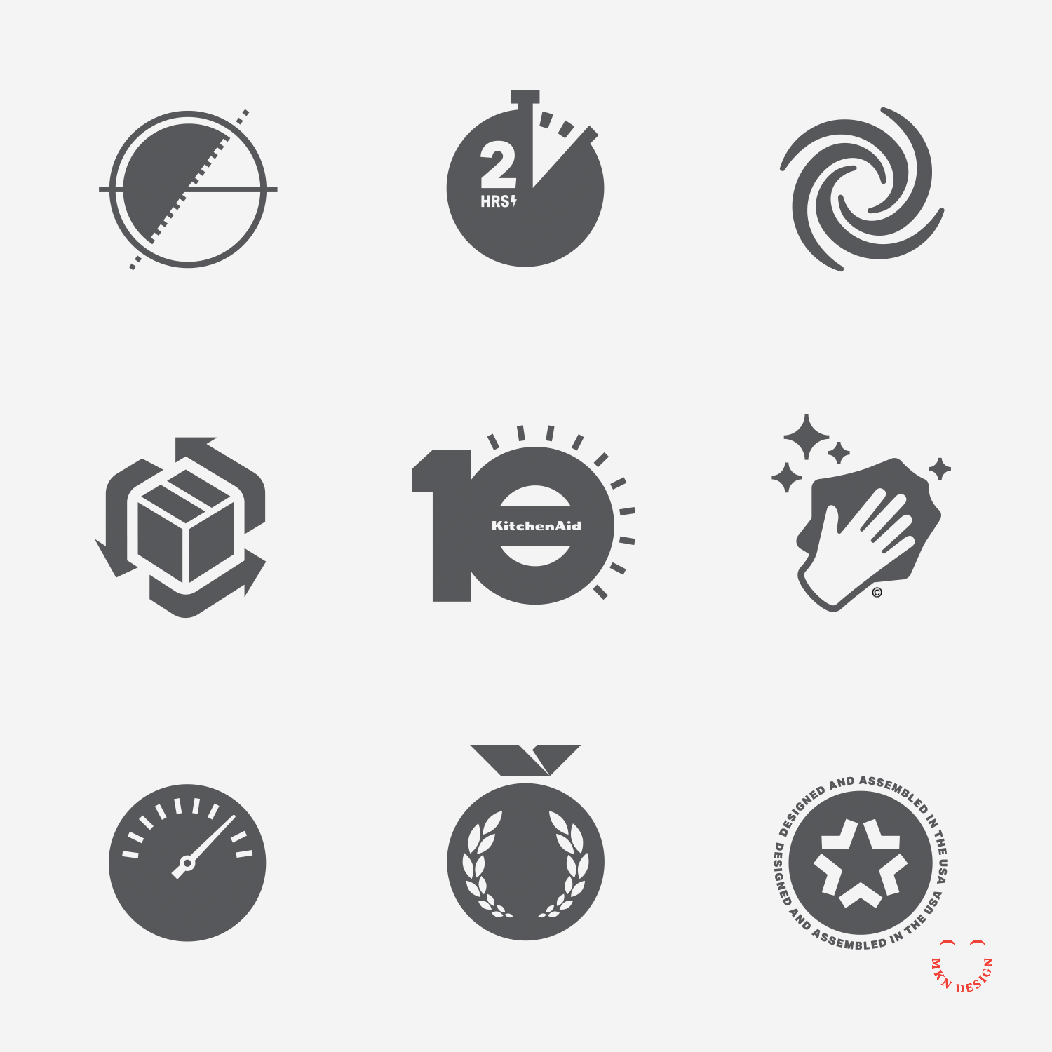
The final installation was a seamless blend of clean, minimalist line illustrations paired with physical KitchenAid products, effectively demonstrating how the brand serves as an ‘aid’ in everyday cooking routines. The result was a *visually captivating* environment that embodied KitchenAid’s brand principles and brought their message to life.
-
+ Branded Environment Design
-
+ Creative Direction
+ Research
+ Concept Development
+ Narrative Storytelling
+ Sketching and Ideation
+ Graphic Design
+ Illustration
+ Print Management -
This project was a collaborative effort, with the KitchenAid product and CMF teams.
Concept illustrations provided by Jody Williams.