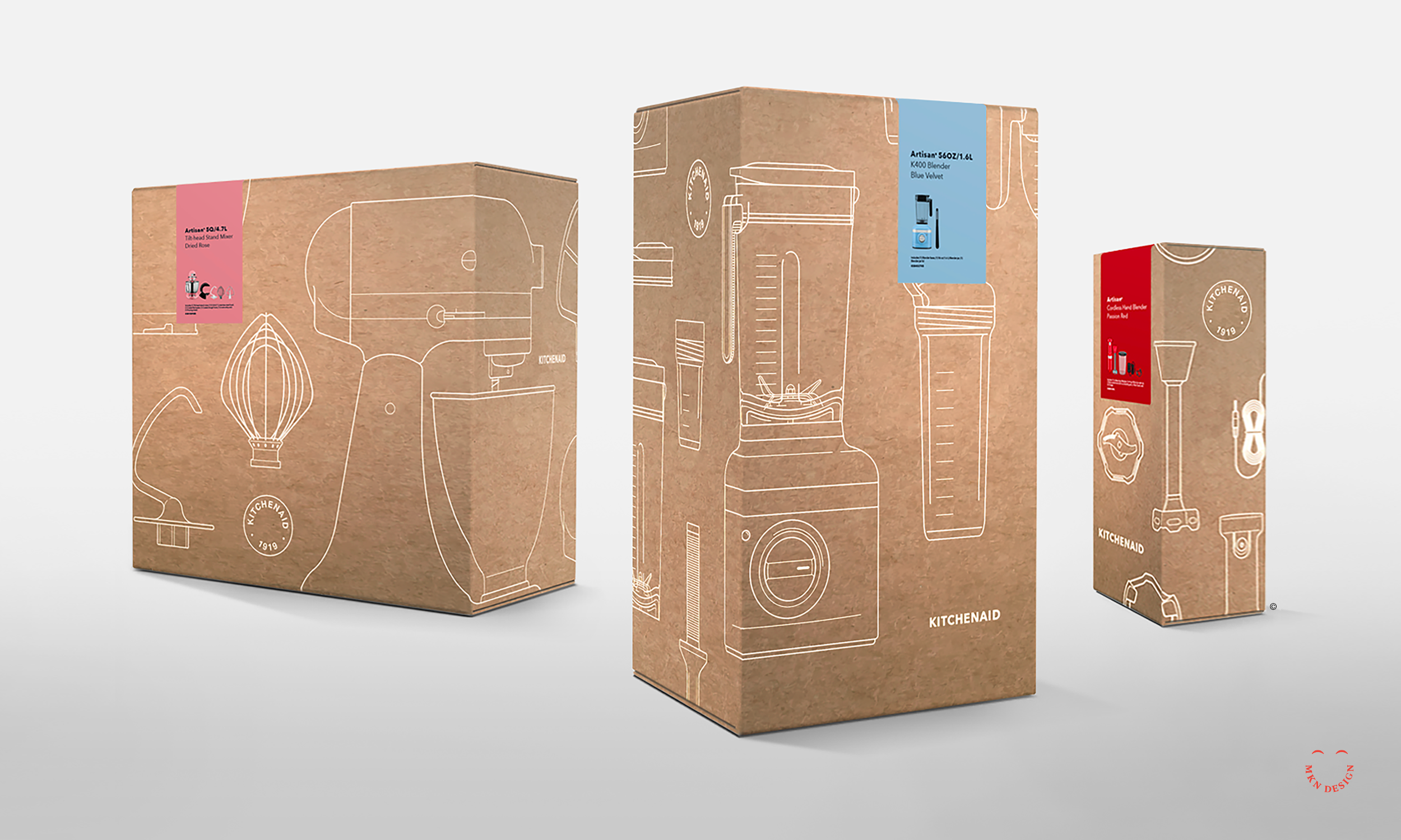
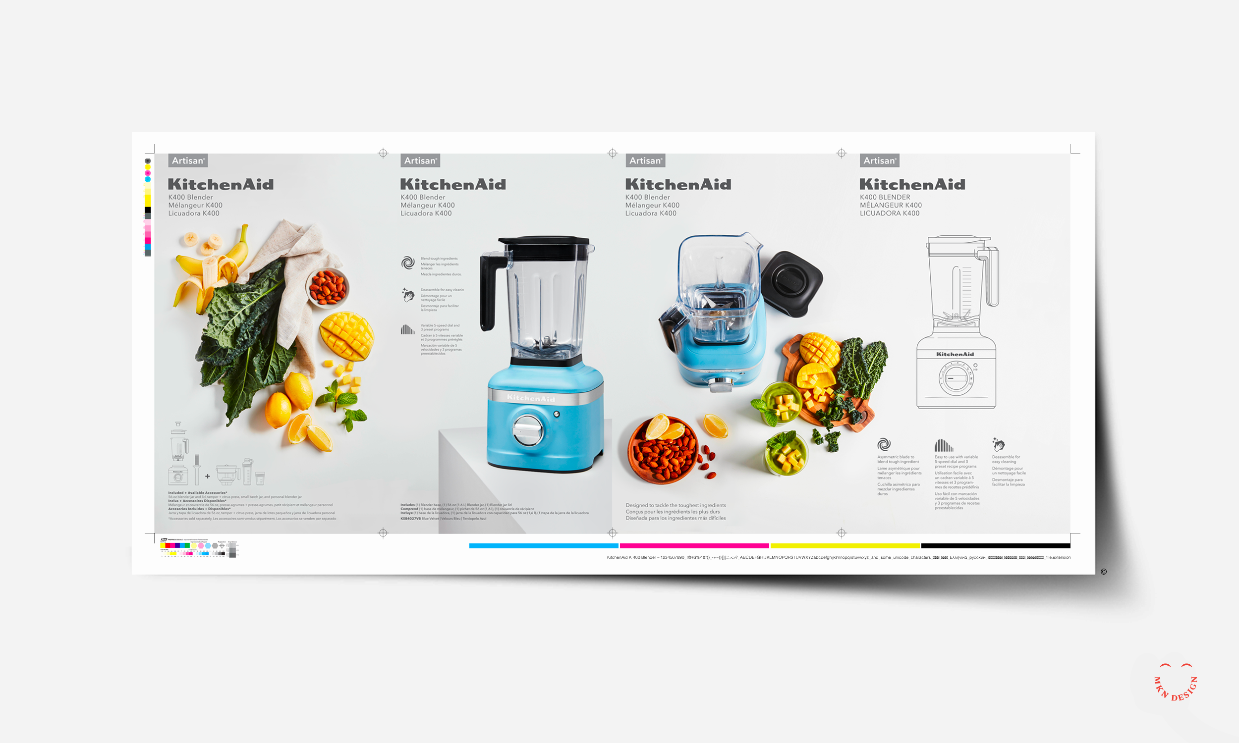
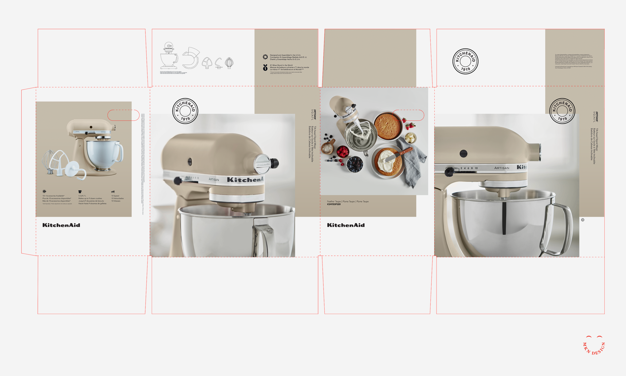
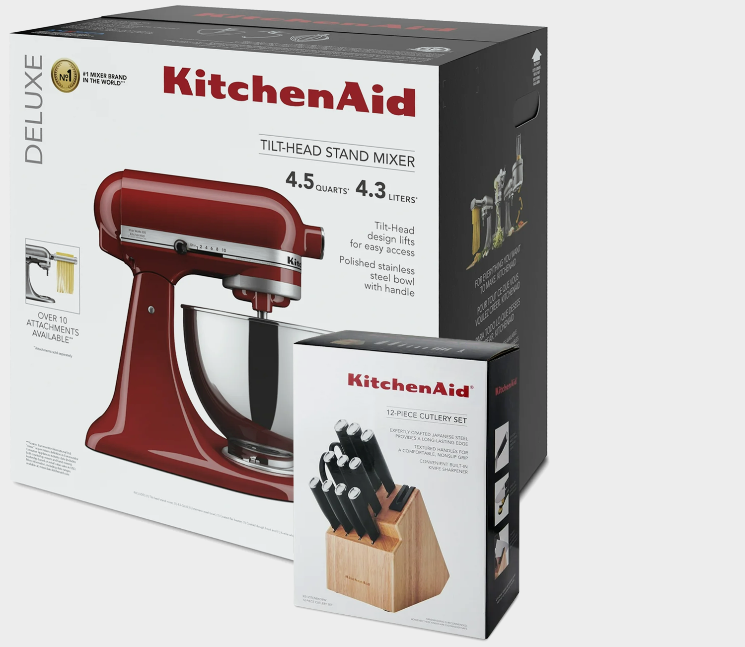
After examining the design of their existing packaging, it became clear that the aesthetics no longer aligned with the expectations of today’s consumers. In a market shaped by bold simplicity, clean visual storytelling, and modern minimalism, the packaging felt dark, cluttered, and outdated.
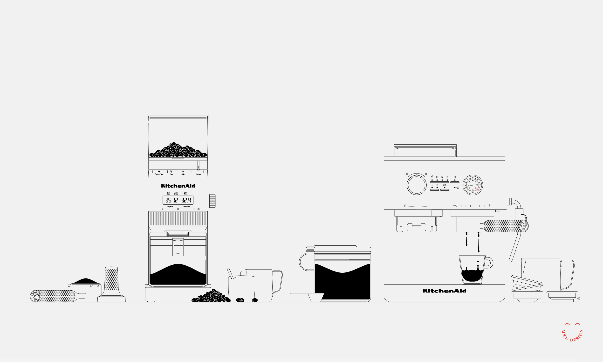
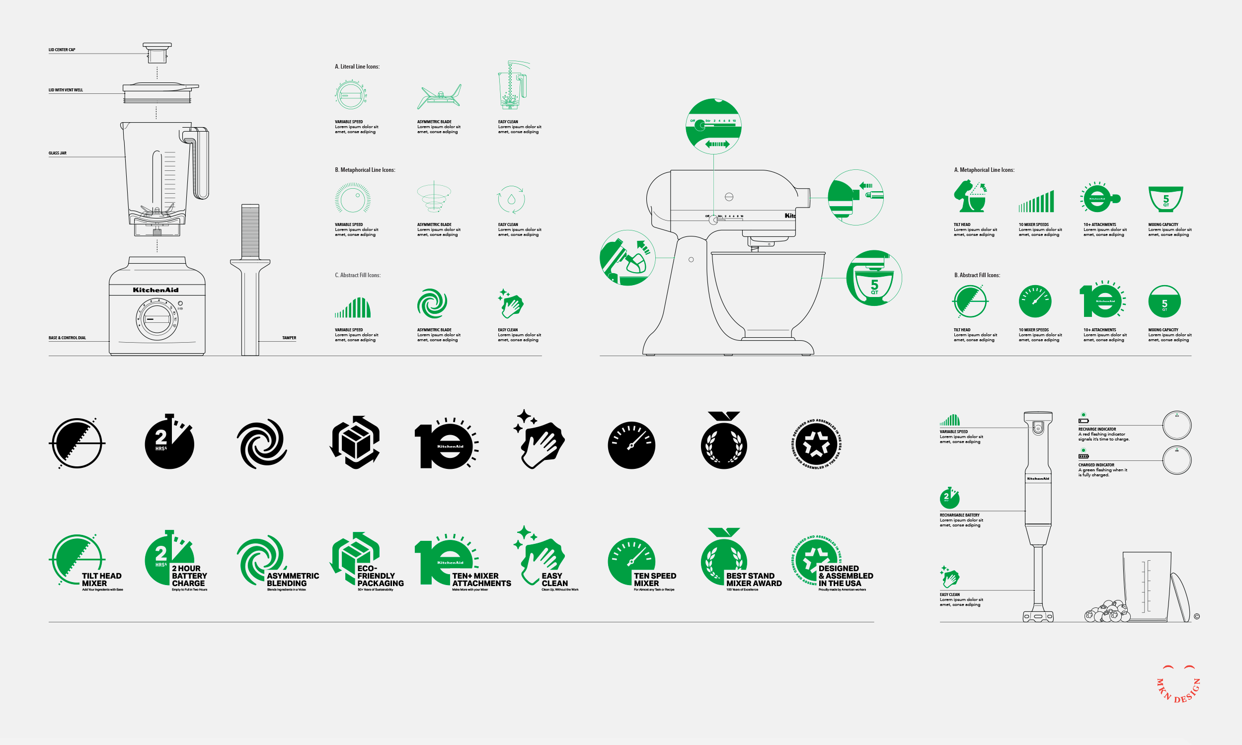
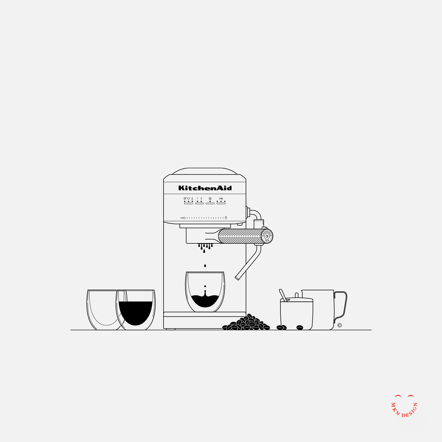
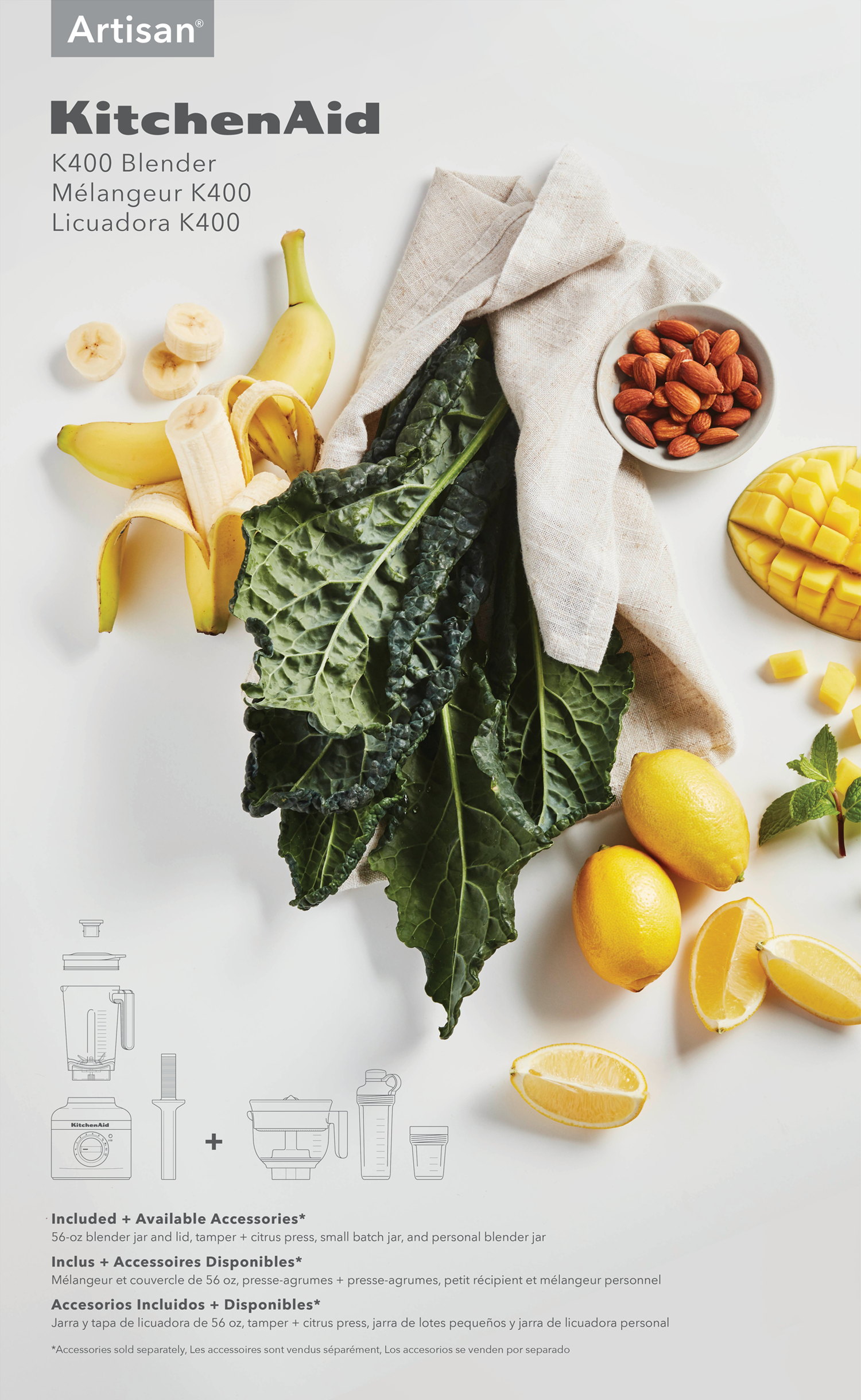
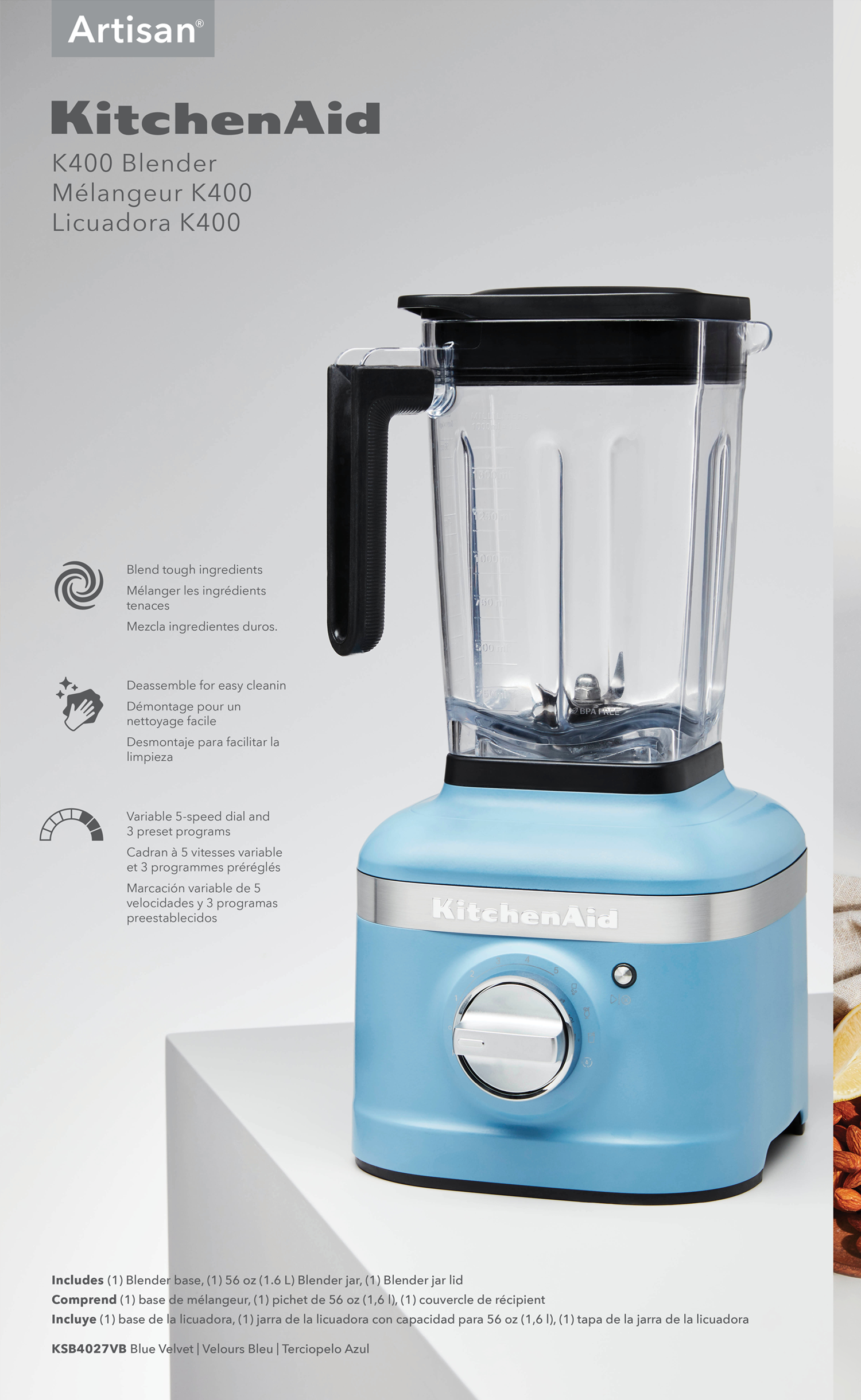
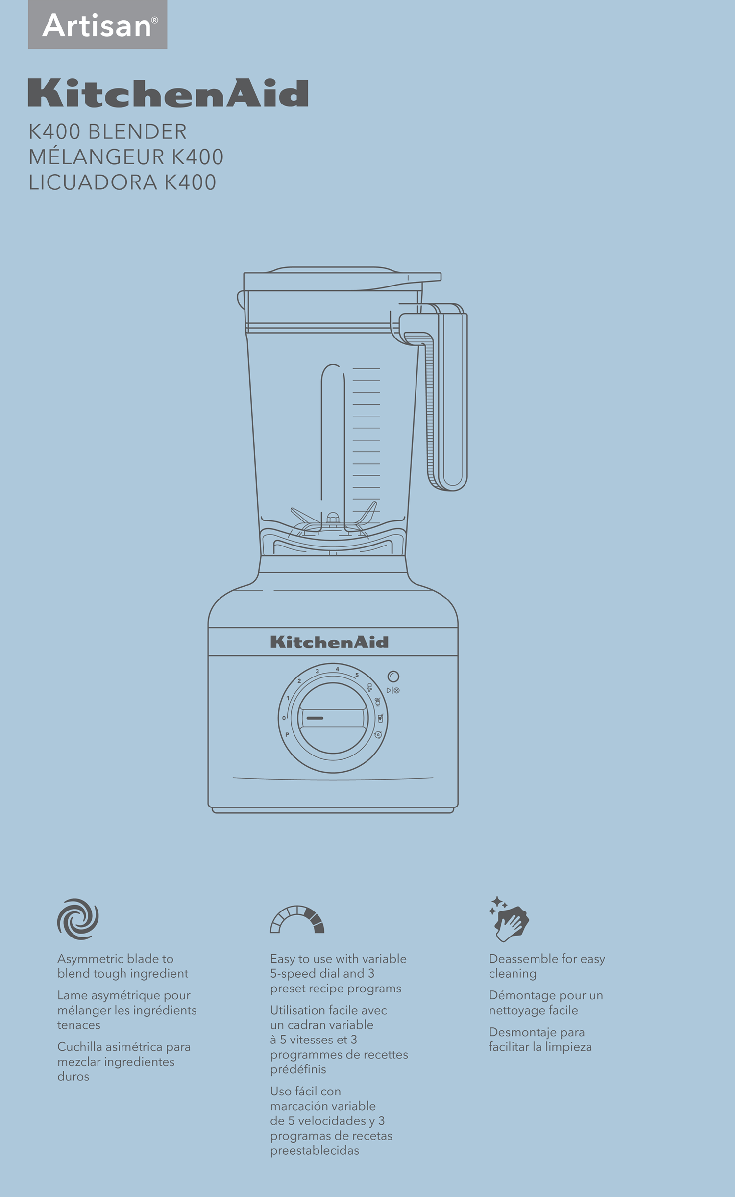
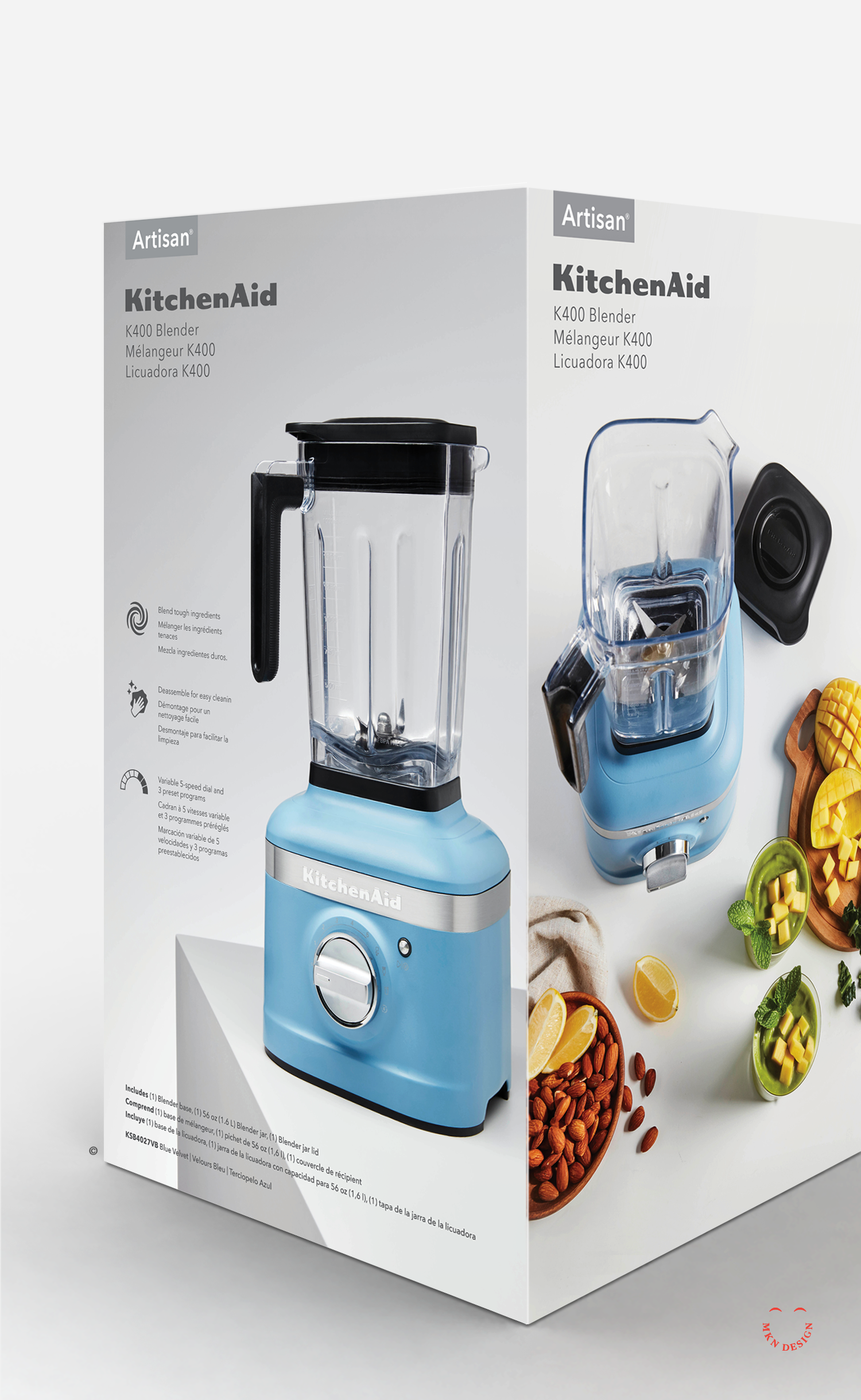
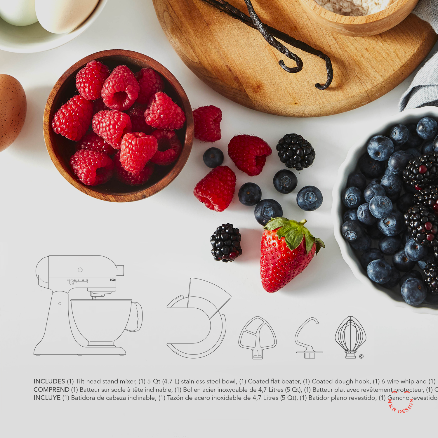
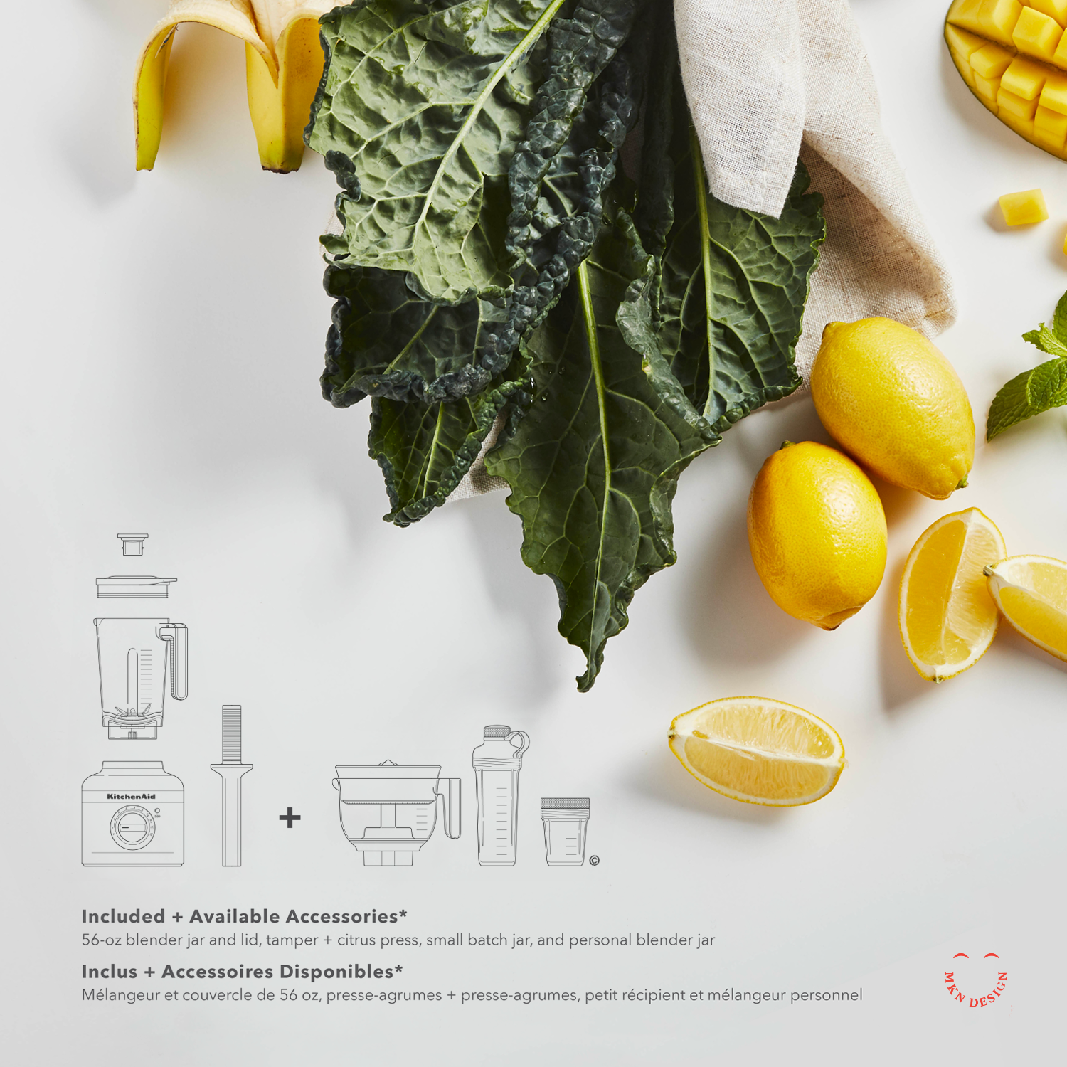
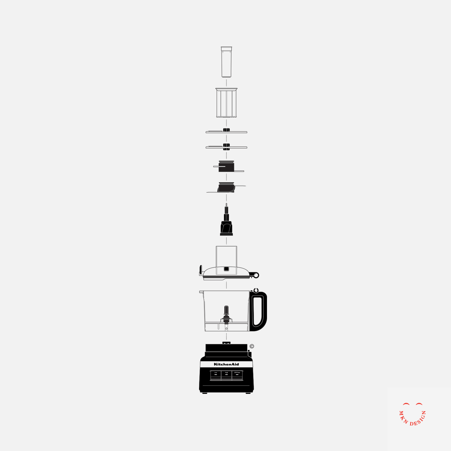
The design challenge was clear—reimagine the packaging in a way that honored KitchenAid’s heritage, spoke directly to today’s consumers, and embraced a more modern visual language. Working closely with the internal KitchenAid team, we began by diving into consumer insights, packaging trends, and design systems across related industries, while also bringing our own creative sensibilities and perspective to the table. From that research, we developed a series of concepts that introduced a refined visual language—using custom iconography, simplified illustrations, and thoughtful layout systems. We explored how this new approach could be applied across product lines and packaging sizes, reinforcing the brand while prioritizing clarity and consumer engagement.
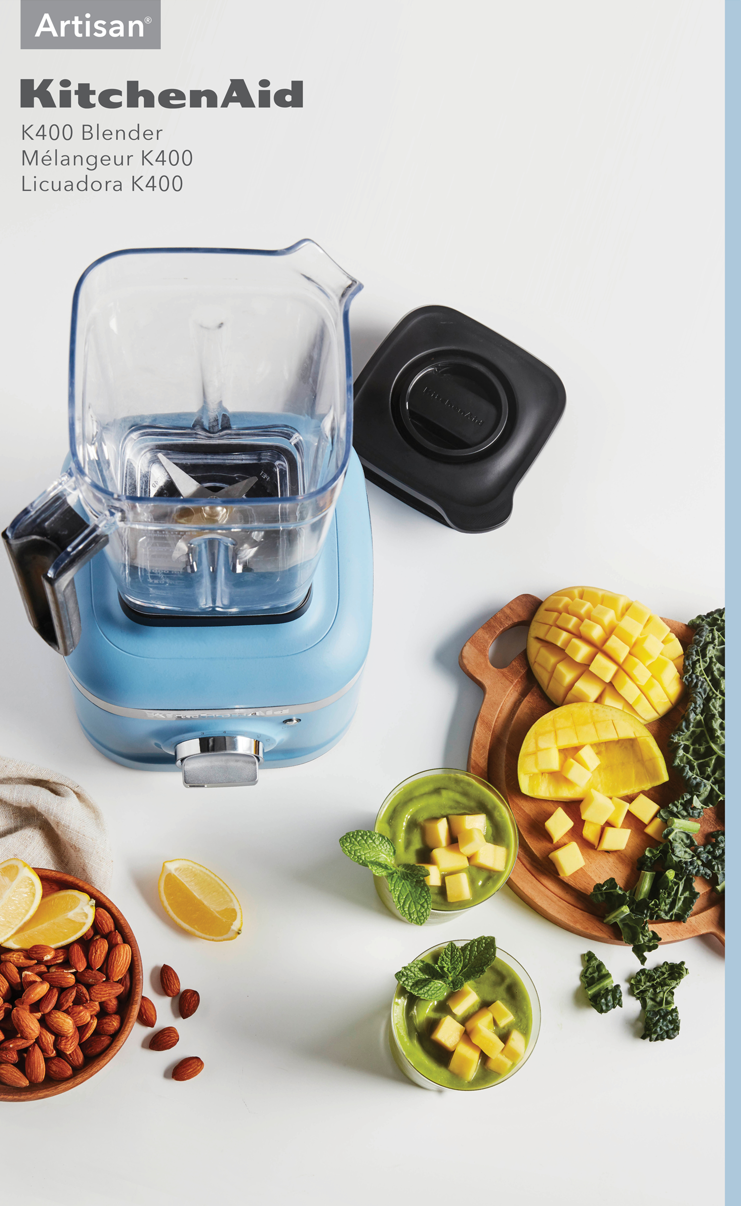
The final result was a flexible, strategic packaging system that scaled across all product tiers—unmistakably KitchenAid, while reinforcing the brand and putting clarity and consumer engagement at the forefront.