


Client Project
August 2022
__
KitchenAid, Packaging an Icon
When KitchenAid approached me, they weren’t just looking to refresh their packaging—they were looking to reimagine how their iconic products could better connect to consumers, stand out on store shelves alongside competing brands, and reflect the modern, design-forward brand they had become. At the same time, they wanted to ensure that any evolution stayed rooted in the heritage that made KitchenAid a household name—especially with their globally recognized stand mixer.
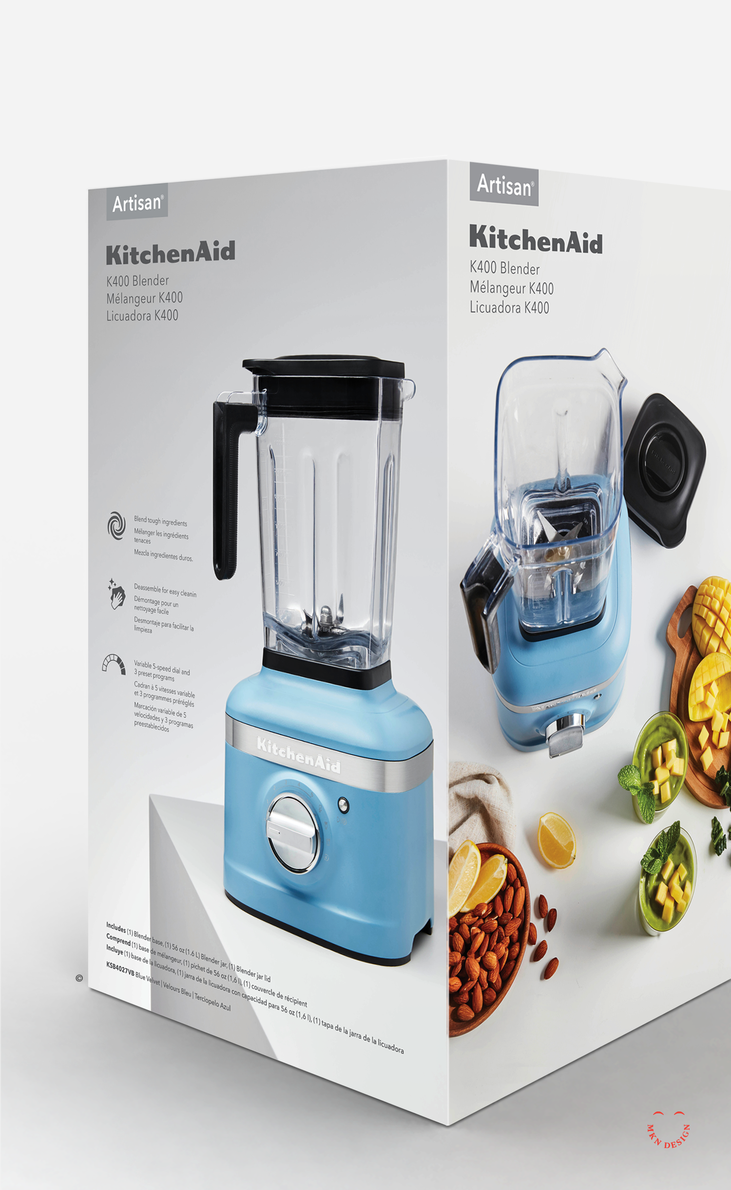
After examining the design of their existing packaging, it became clear that the aesthetics no longer aligned with the expectations of today’s consumers. In a market shaped by bold simplicity, clean visual storytelling, and modern minimalism, the packaging felt dark, cluttered, and outdated.
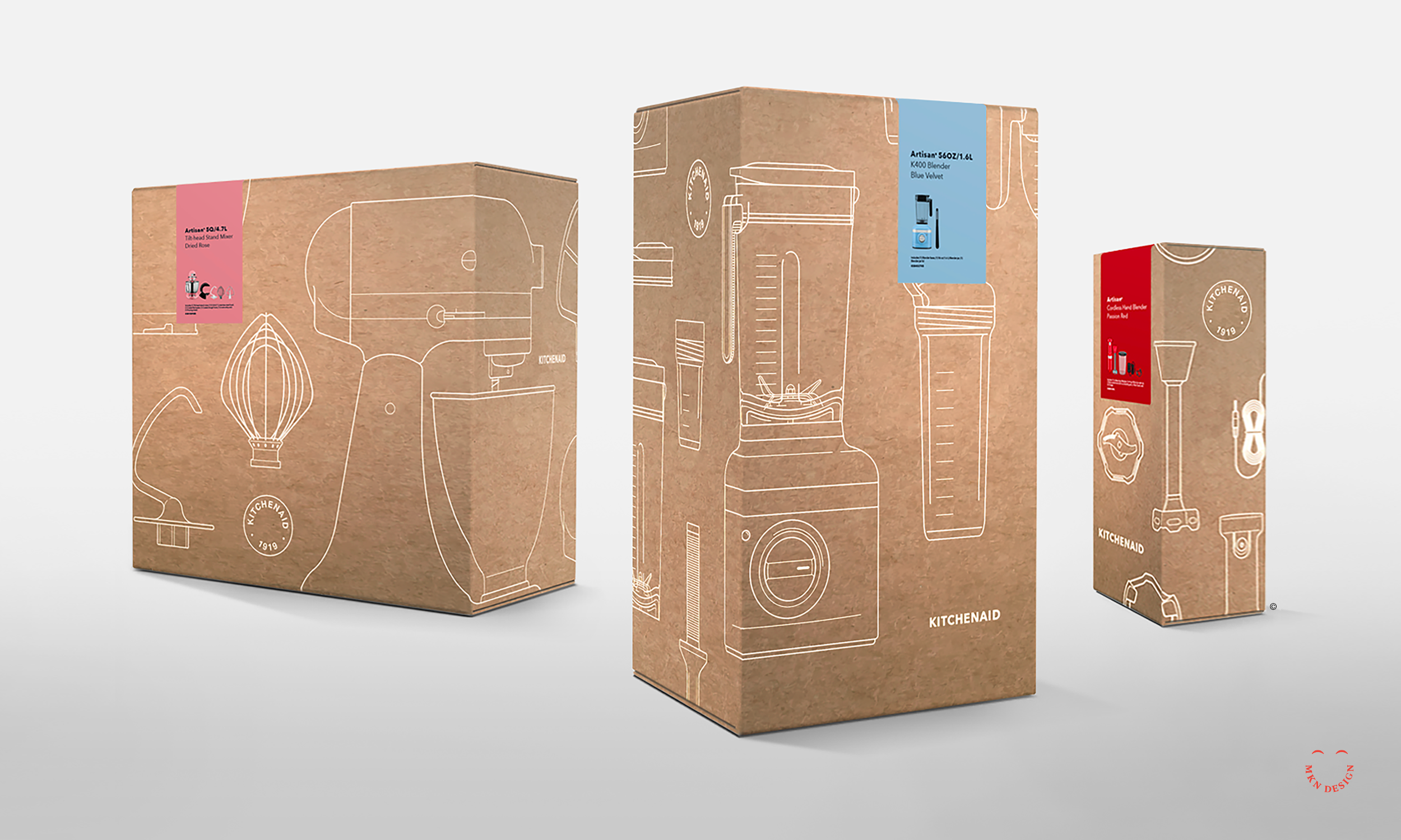
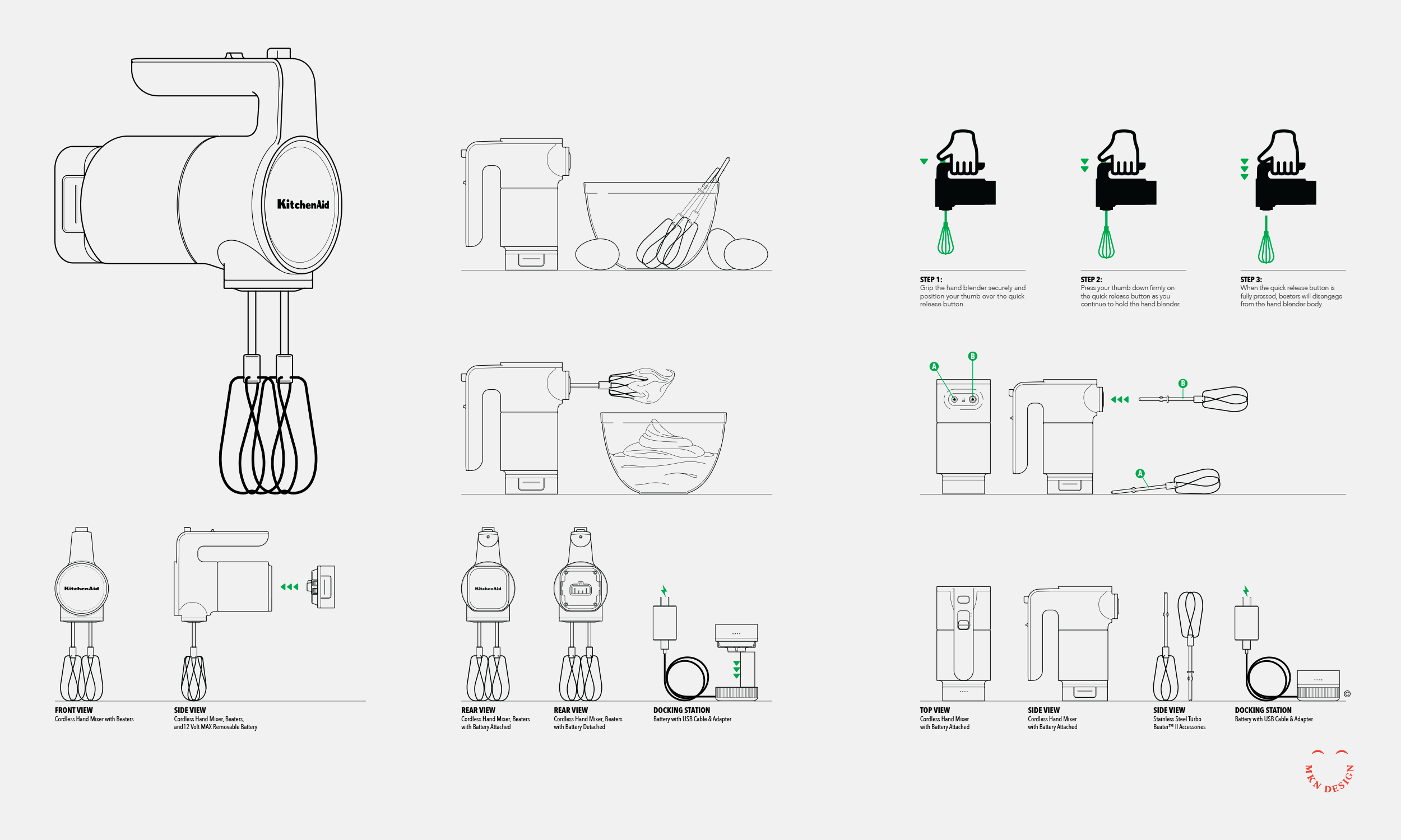
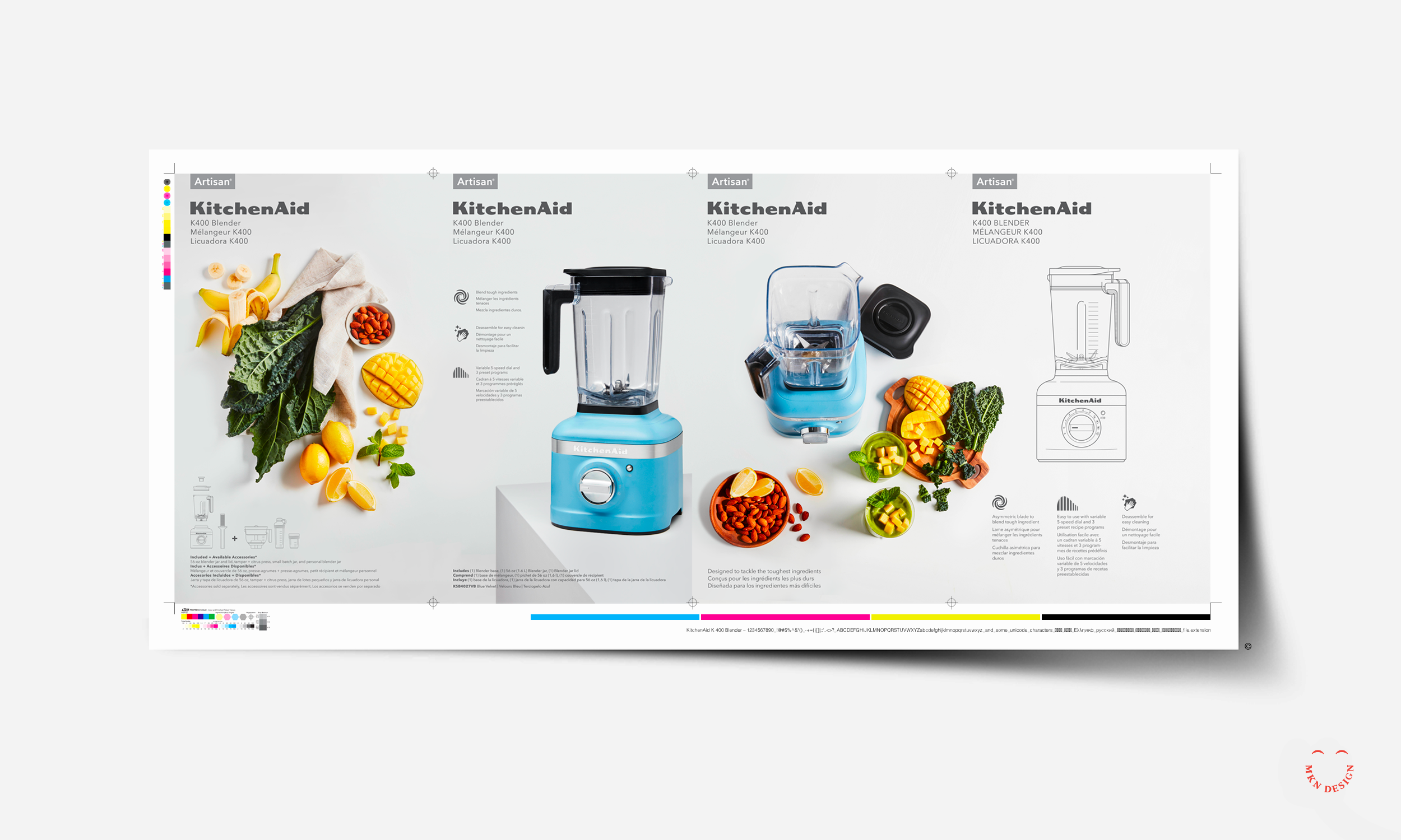
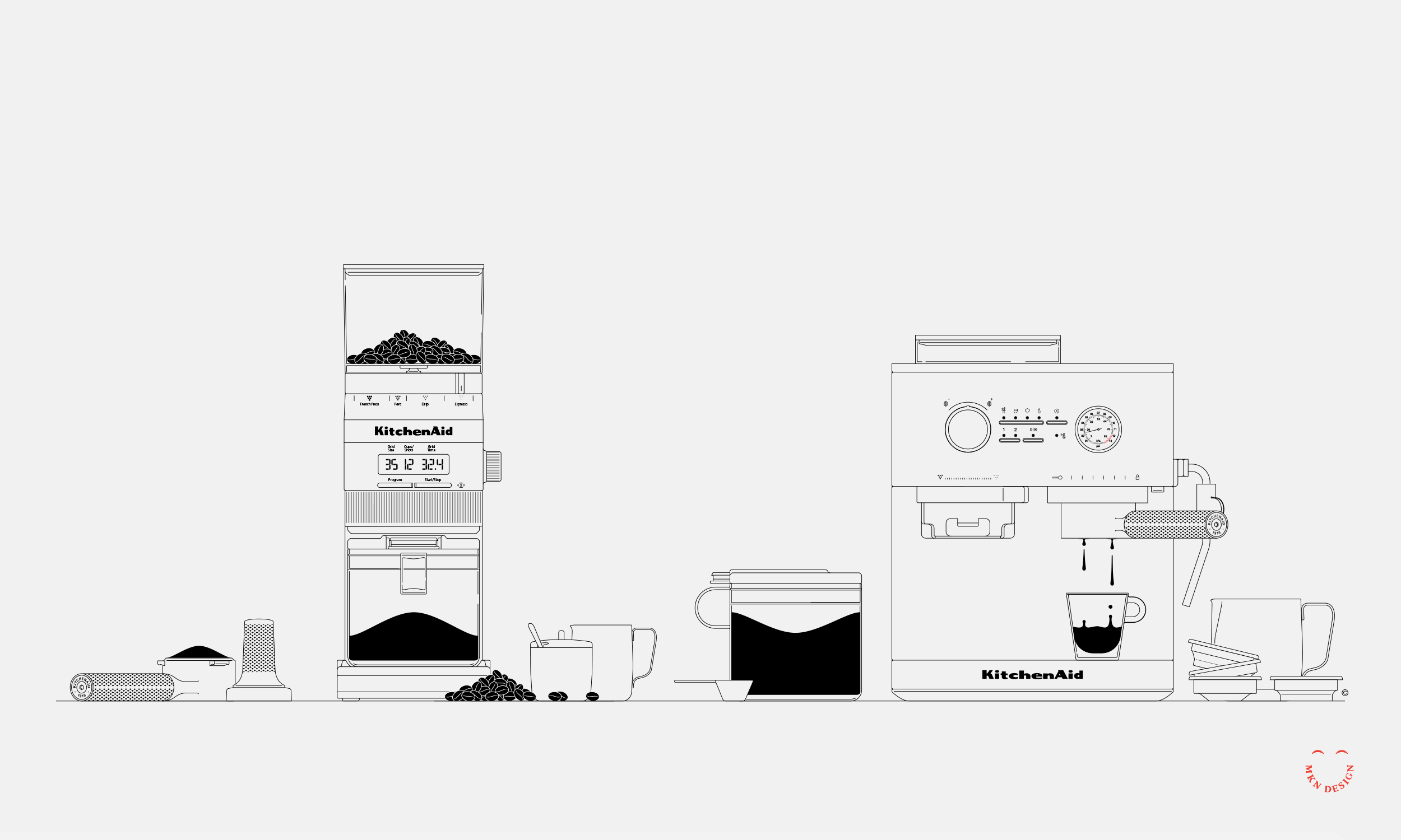
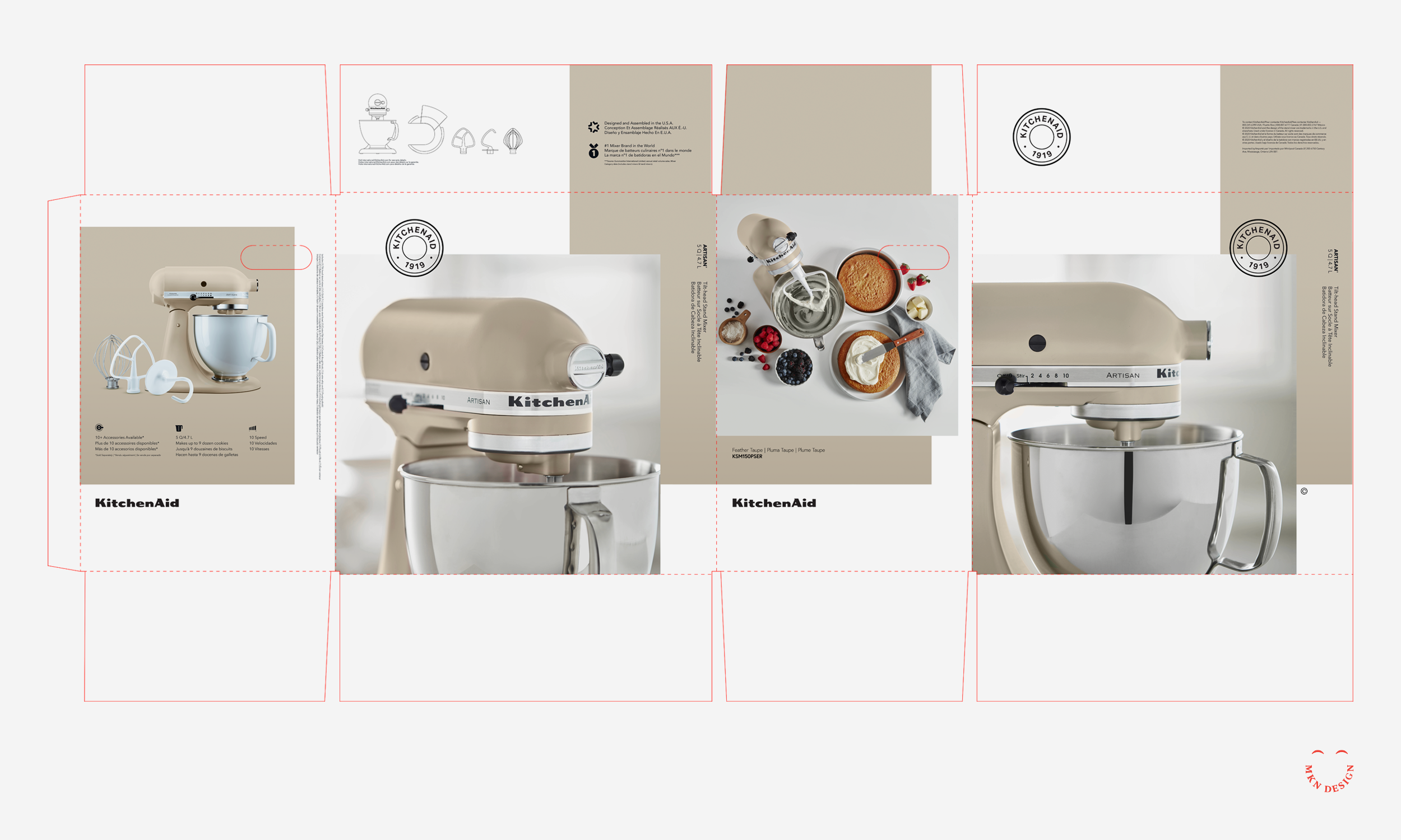
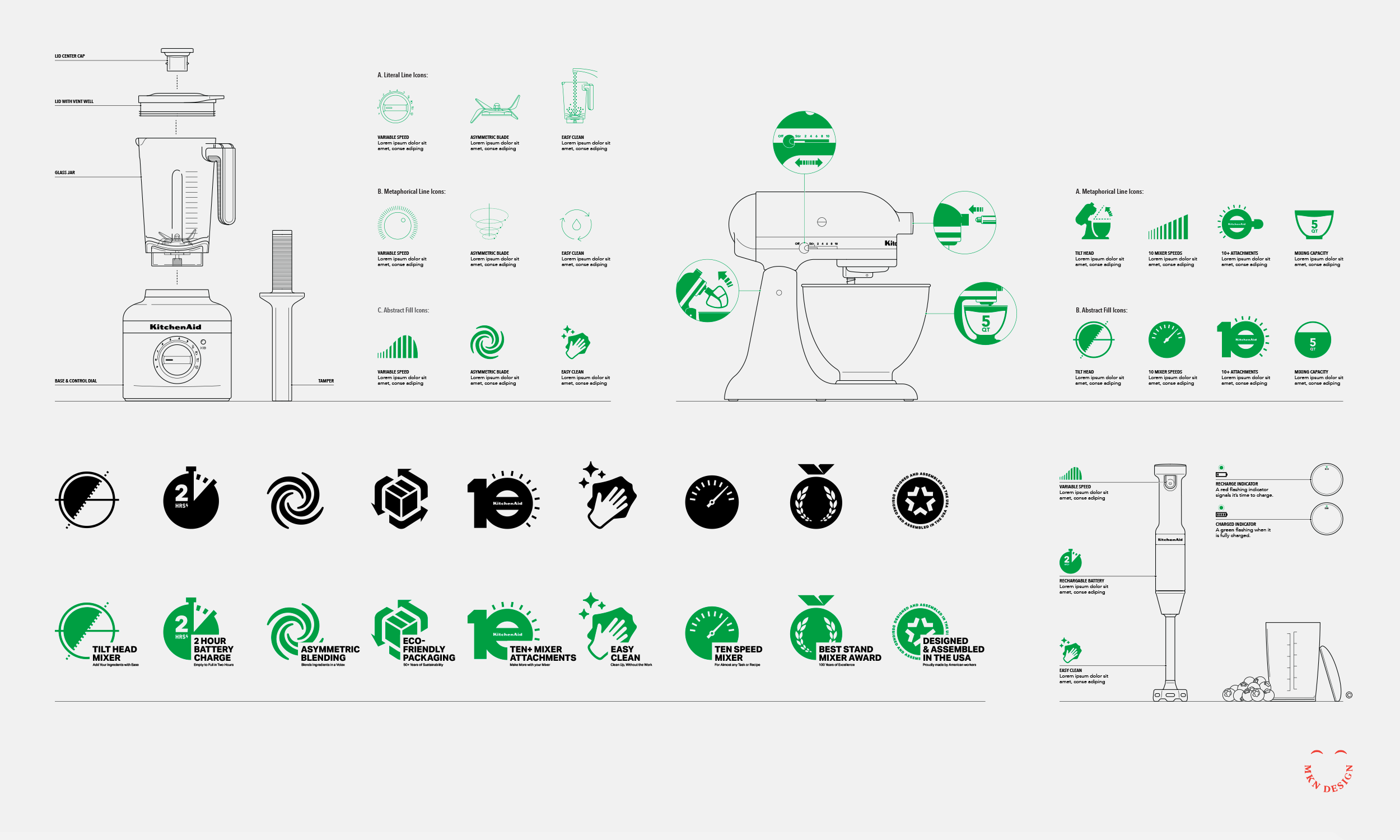
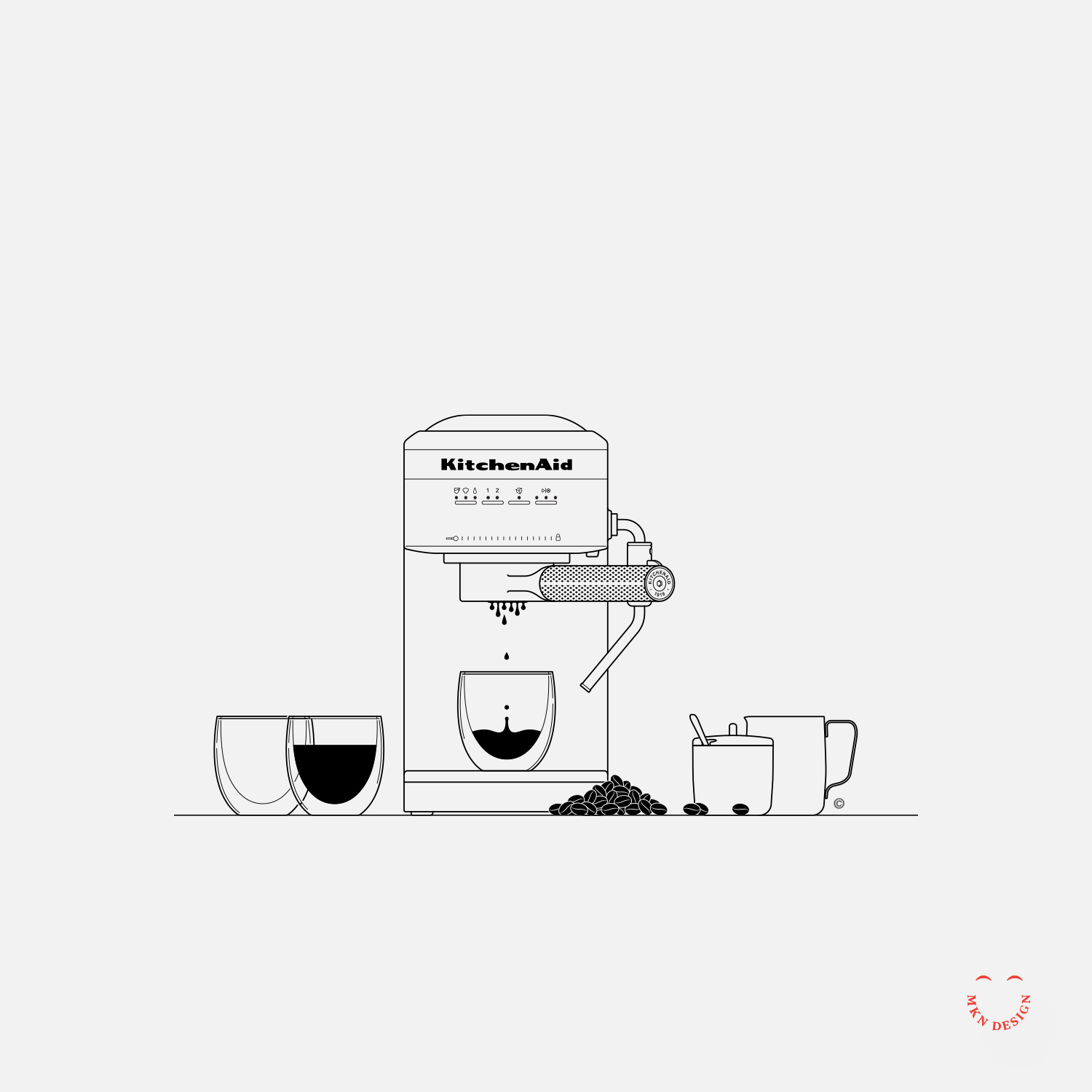
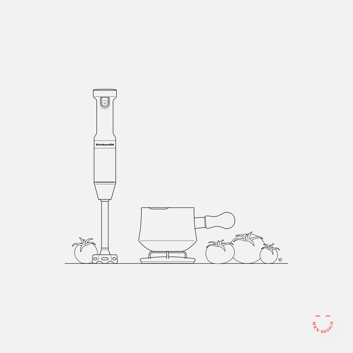
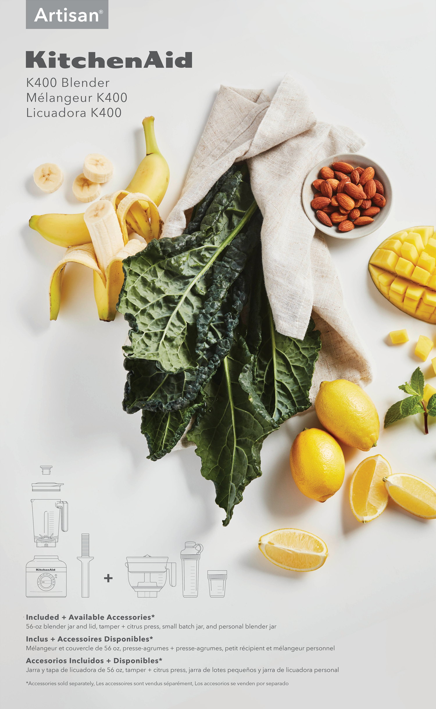
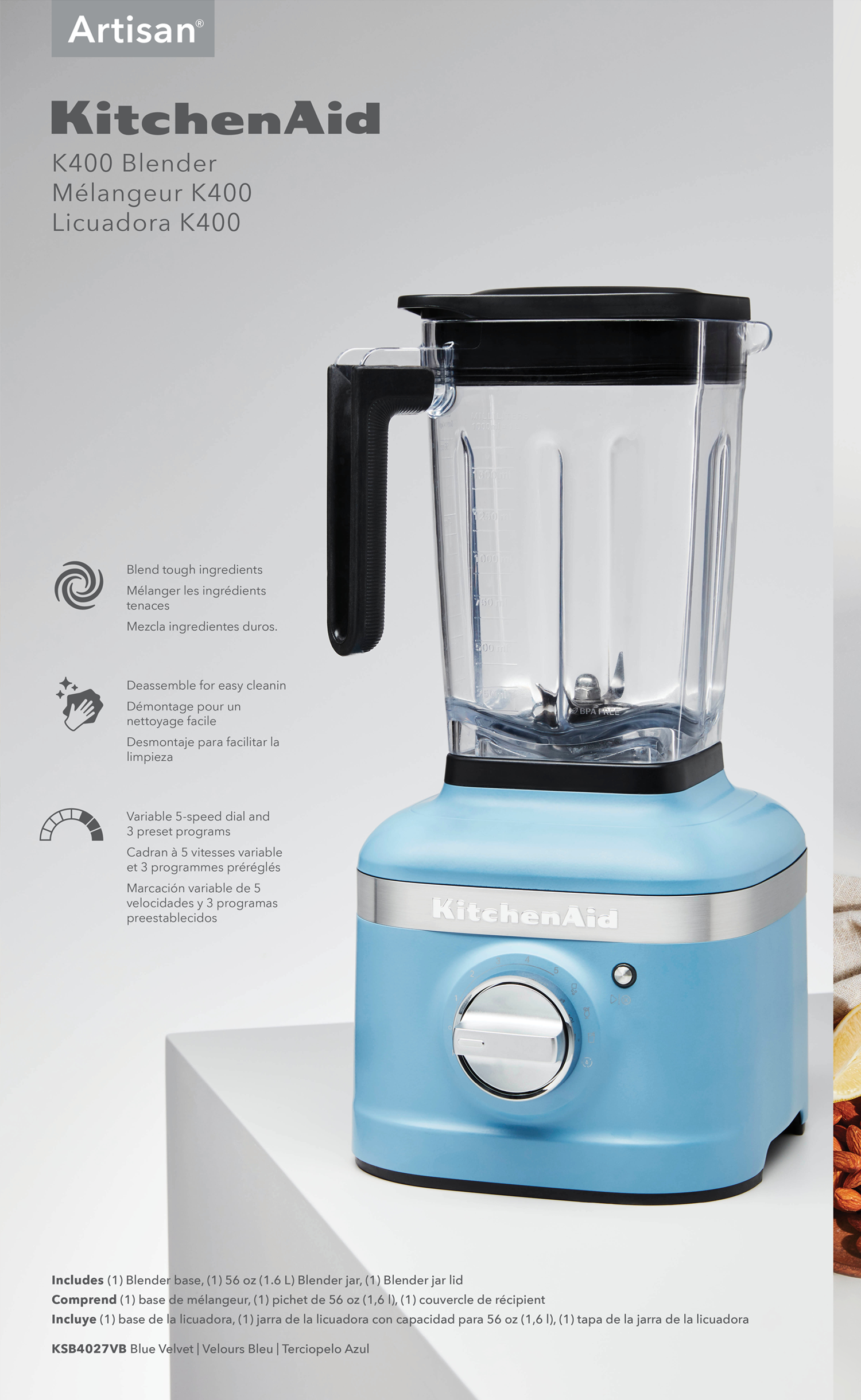
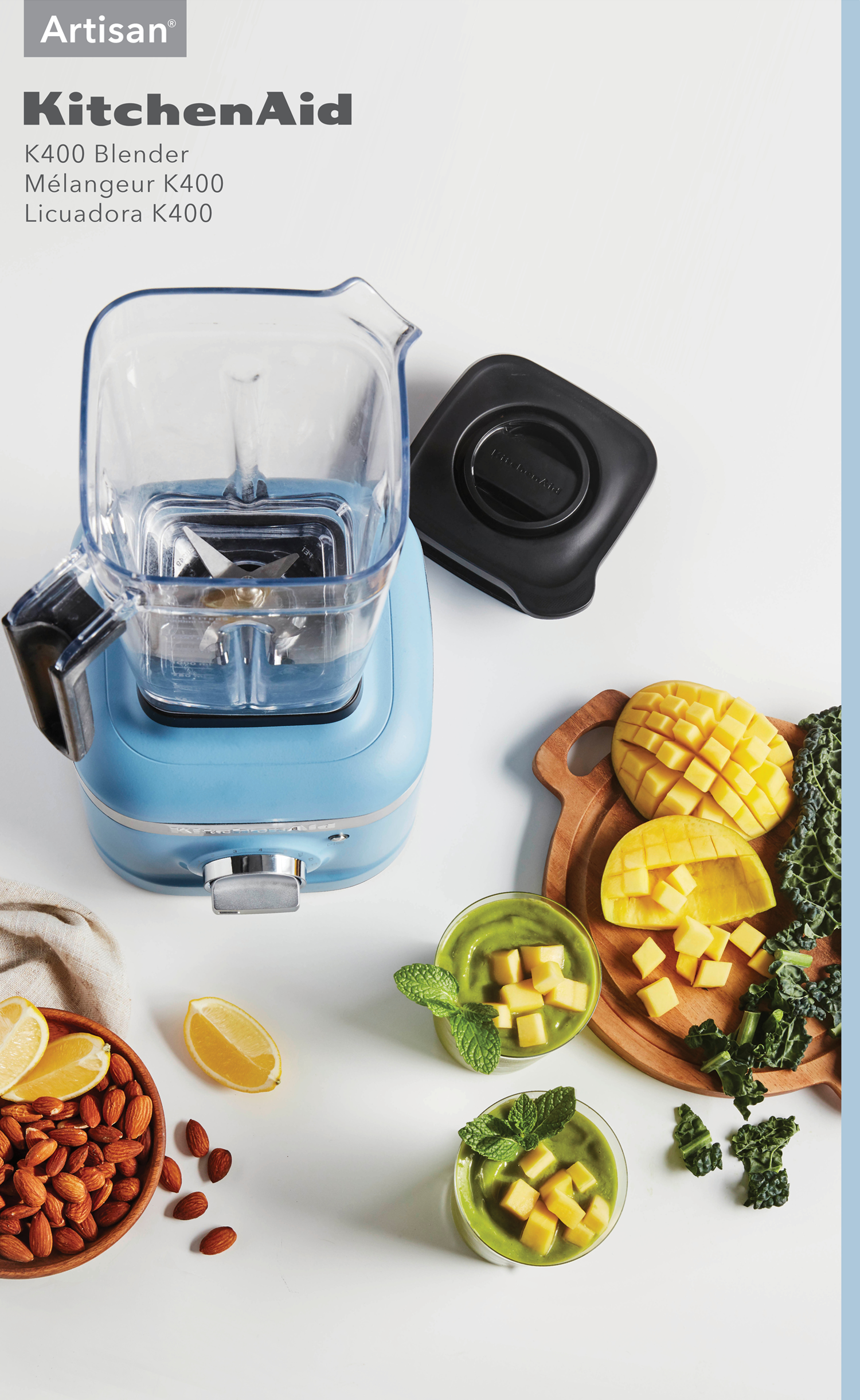
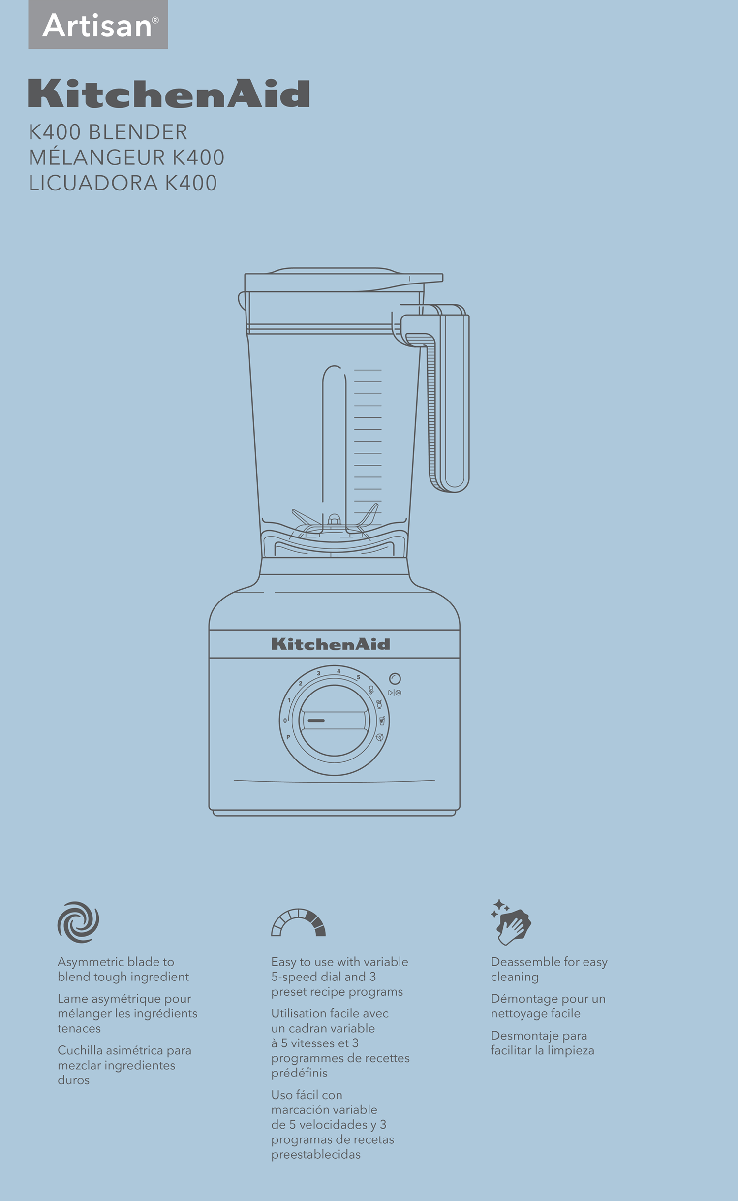
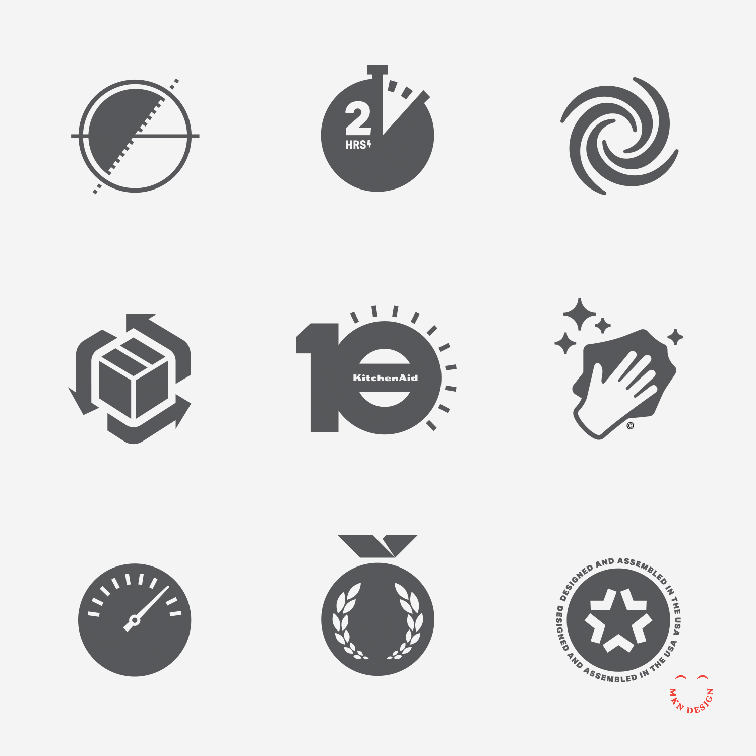
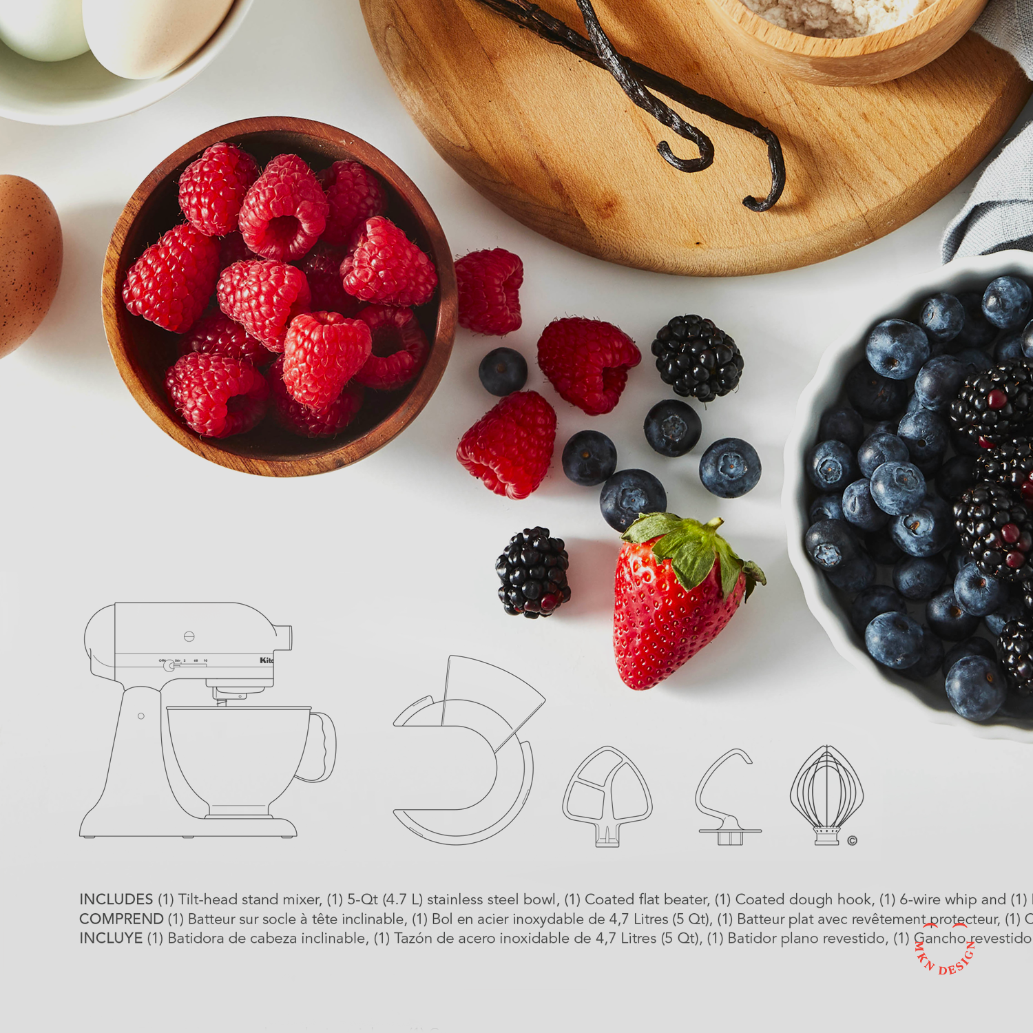
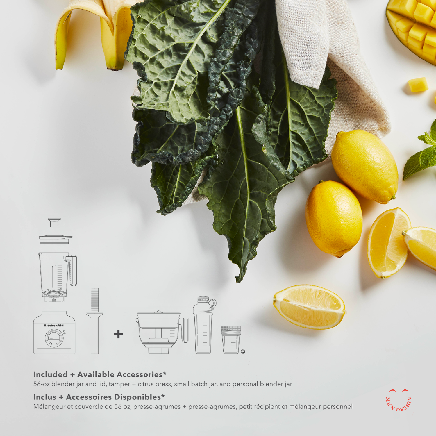
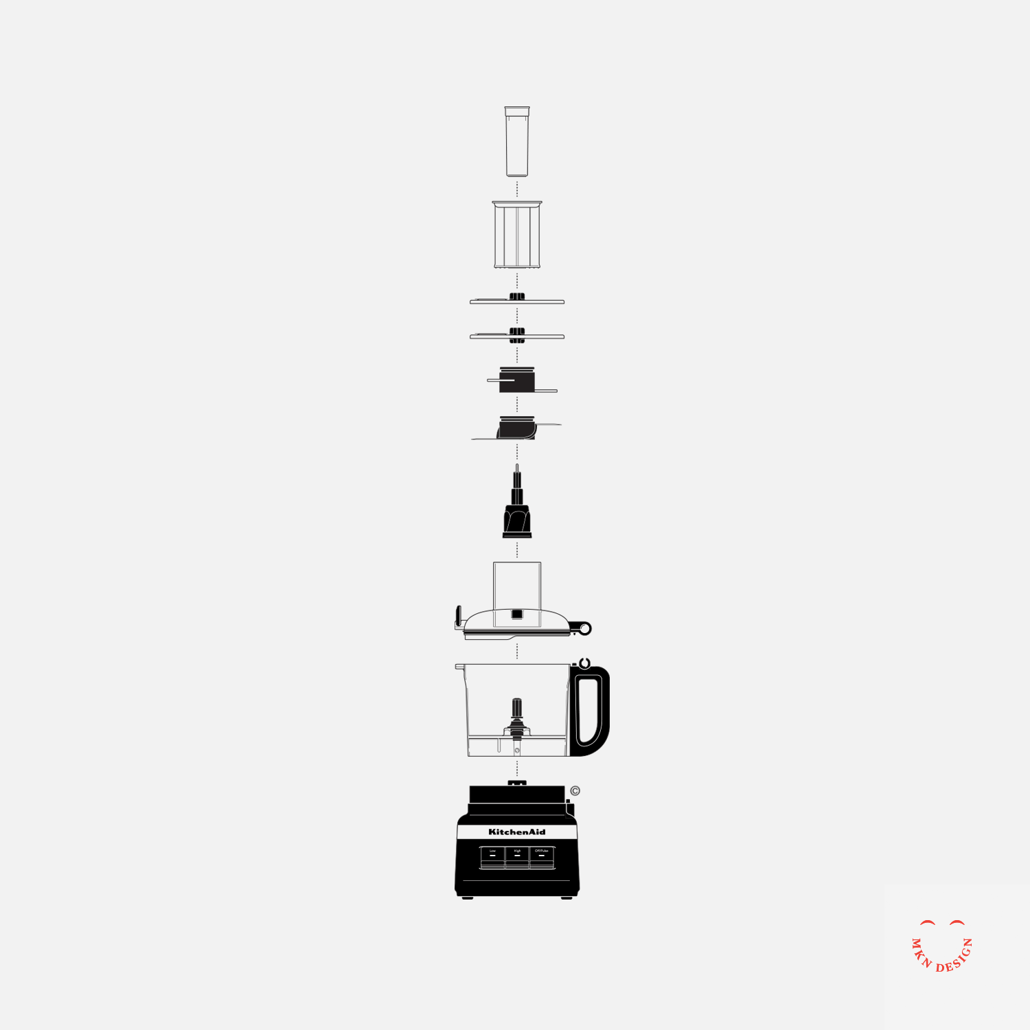
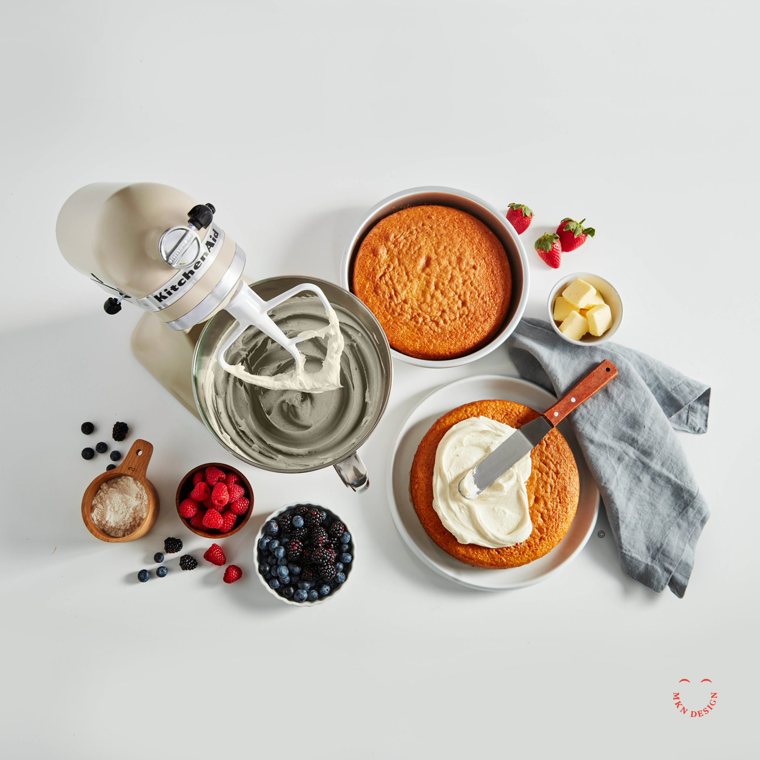
The design challenge was clear—reimagine the packaging in a way that honored KitchenAid’s heritage, spoke directly to today’s consumers, and embraced a more modern visual language. Working closely with the internal KitchenAid team, we began by diving into consumer insights, packaging trends, and design systems across related industries, while also bringing our own creative sensibilities and perspective to the table. From that research, we developed a series of concepts that introduced a refined visual language—using custom iconography, simplified illustrations, and thoughtful layout systems. We explored how this new approach could be applied across product lines and packaging sizes, reinforcing the brand while prioritizing clarity and consumer engagement.
The final result was a flexible, strategic packaging system that scaled across all product tiers—unmistakably KitchenAid, while reinforcing the brand and putting clarity and consumer engagement at the forefront.
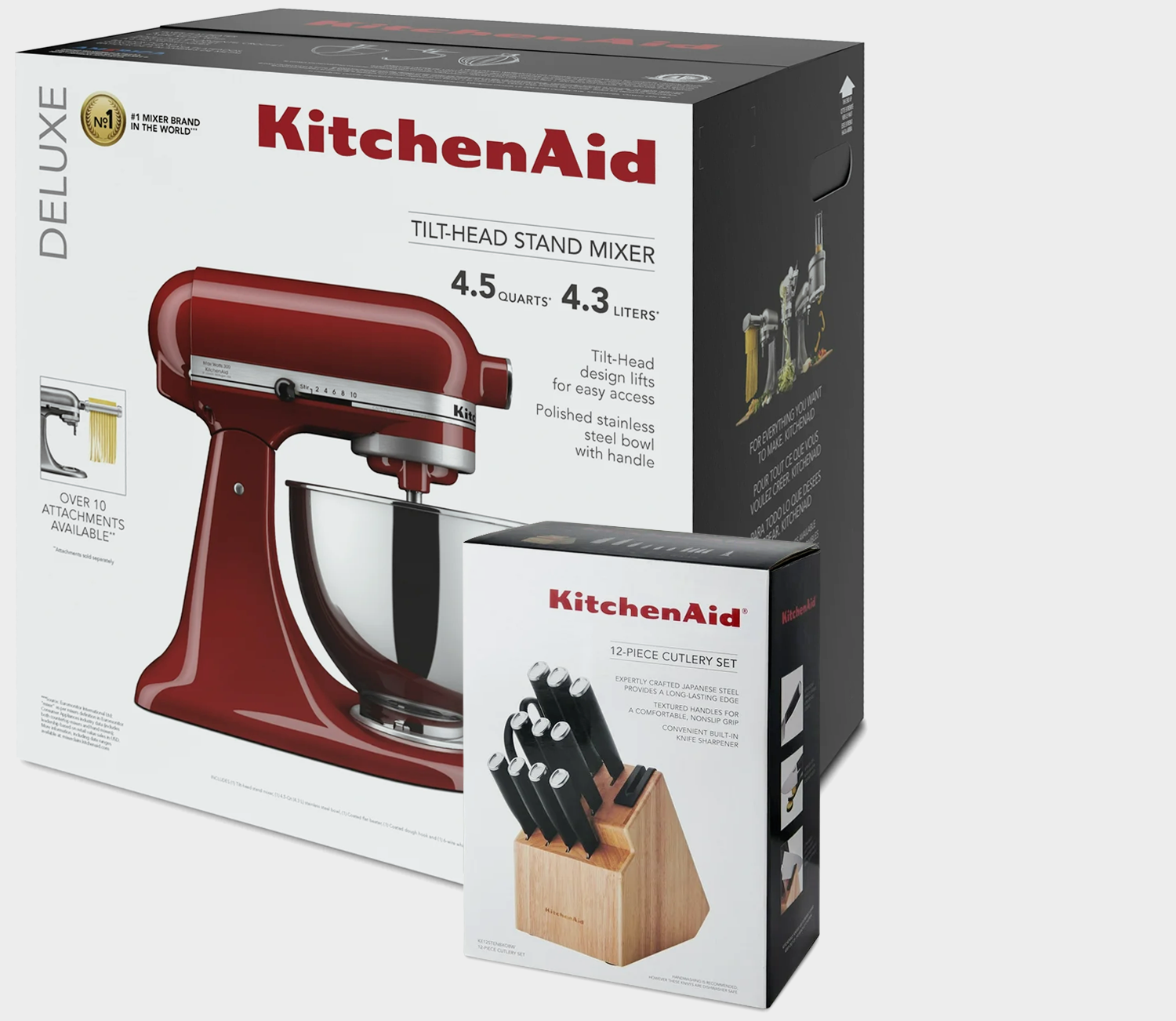
Original KitchenAid Packaging ↑
While the developed concepts were never launched due to COVID-related budget cuts, the work continues to be valuable, providing clear visual and strategic guidance for future KitchenAid packaging.
-
+ Packaging Design
-
+ Research (competitive, consumer, trend)
+ Concept Development
+ Sketching & Ideation
+ Graphic Design & Layout
+ Iconography
+ Instructional Illustrations
+ Product Illustrations
+ Mockups -
This project was a joint endeavor involving numerous individuals from both the KitchenAid design team and external independent contractors, such as Heather Tucker and myself.