Chronicles is a repository of articles, client projects, creative musings and products. All content is copyrighted by MKN Design. Reproduction without express written consent is prohibited. To license a specific illustration or design, please contact me via email.
Use the search function to view specific project type or the use the Chronicles dropdown to search by group.

Article
August 2025
__
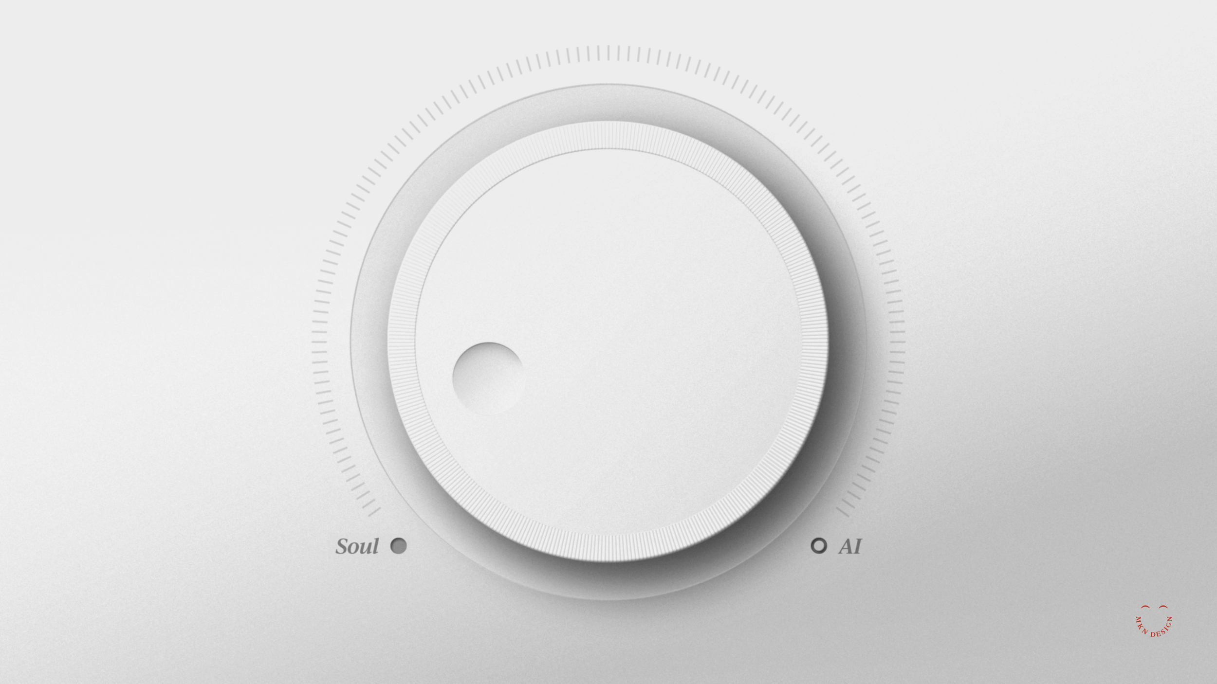
Designed to Speak
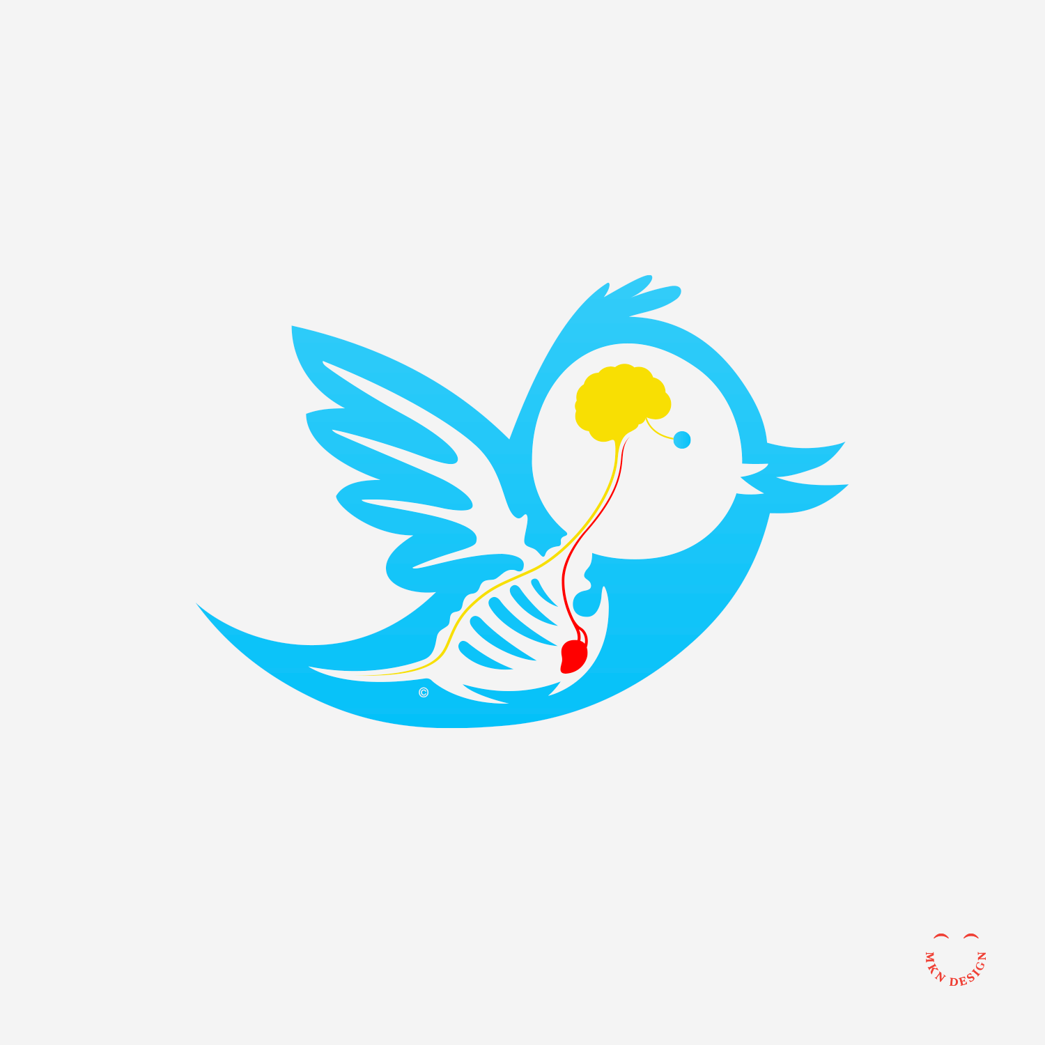
Designing an impactful ad often begins with curiosity and research. I can’t say that these 2 ads hit the mark, but I can say they were born from the kind of thinking I admire most. They’re inspired by the timeless VW Bug campaigns from Bill Bernbach, co-founder of Doyle Dane Bernbach (DDB), whose creative philosophy reshaped advertising.
What I admire most about Bill Bernbach’s philosophy is his belief that creativity isn’t decoration—it’s communication. His work showed that honesty, simplicity, and respect for the audience could be more powerful than any gimmick. That idea guides my own approach. Find the truth in what you’re saying, strip away what’s unnecessary, and design it so it speaks clearly and confidently. Below are the core tenets of Bernbach's philosophy:
1. Truth & Purpose: Creativity should serve the truth, not exist for its own sake.
2. Integrated Execution: Art and copy must work together; how a message is delivered matters as much as the message itself.
3. Respecting the Audience: Treat consumers as intelligent humans—direct, honest, and human.
4. Simplicity: Communicate a product’s essence clearly and simply.
5. Relevance: Messages must connect meaningfully to the consumer’s life.
6. Adaptation: Shape techniques around ideas, stay fresh, and don’t fear risk.
7. Stand Out: If you stand for nothing, you’ll have no one against you—and no one for you.
Well Used.
I like to think of myself as a well-used pencil. Not worn—just well practiced.
I haven’t gotten older—but sharper, simpler, smarter.
Over the years, I’ve refined how I help brands tell their story.
I’ve sharpened my skills—smarter strategy, sharper messaging, stronger design.
I’ve improved my process hundreds of times.
I’ve built stronger relationships, better systems, and smarter brands.
I’ve learned what to say—and, more importantly, what not to.
And why all this progress?
Because I focus on what lasts, not what’s trendy.
This is what matters:
Work that communicates.
Ideas that matter.
Design that lasts.
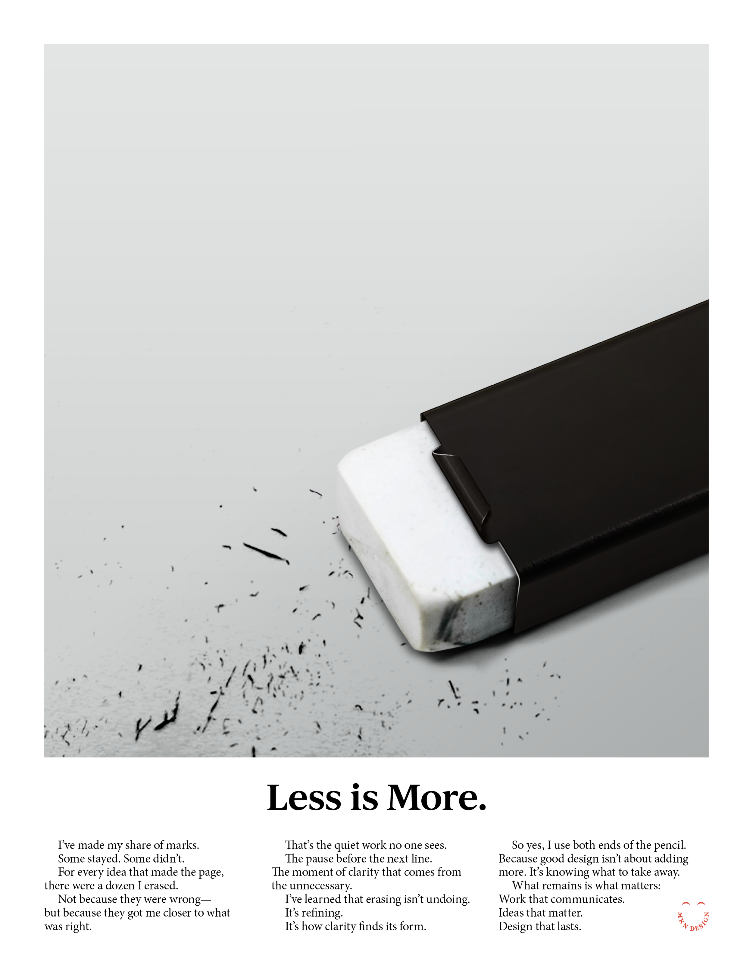
Less is More.
I’ve made my share of marks.
Some stayed. Some didn’t.
For every idea that made the page,
there were a dozen I erased.
Not because they were wrong—but because they got me closer to what was right.That’s the quiet work no one sees.
The pause before the next line.
The moment of clarity that comes from the unnecessary.
I’ve learned that erasing isn’t undoing.
It’s refining.
It’s how clarity finds its form.
So yes, I use both ends of the pencil.
Because good design isn’t about adding more. It’s knowing what to take away.
What remains is what matters:
Work that communicates.
Ideas that matter.
Design that lasts.
-
Learn how my principles guide a thoughtful, transparent design process—one that aligns your brand, business goals, and audience insights to create purposeful, engaging work.
→ Studio Principles & Design Process