
Creative Musing + Article
December 2016
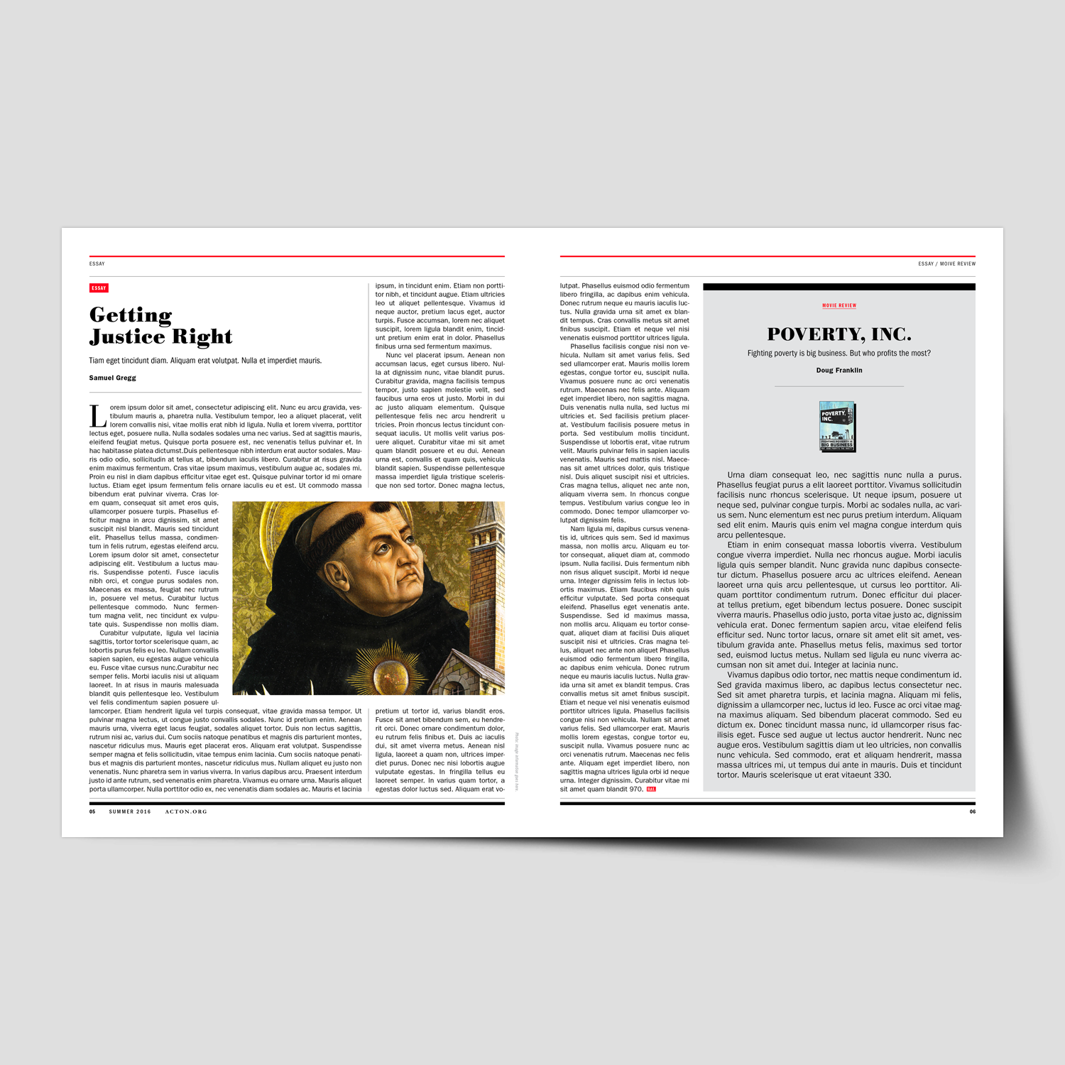
Fish King

Creative Musing
December 2016
__
Fish King
A simple line illustration mark paired with my own custom typeface.
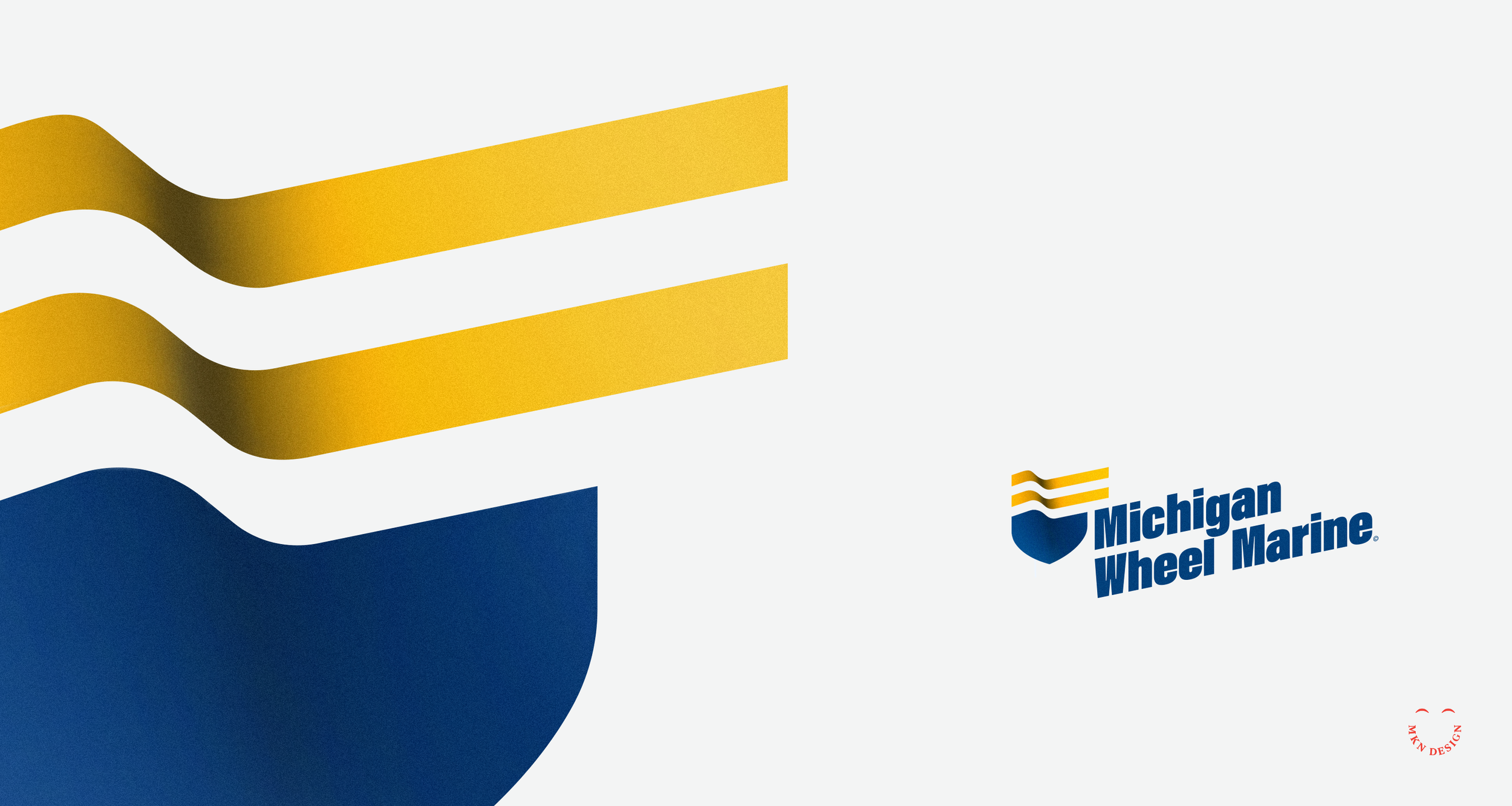
Michigan Wheel Marine

Article + Client Project
December 2016
__
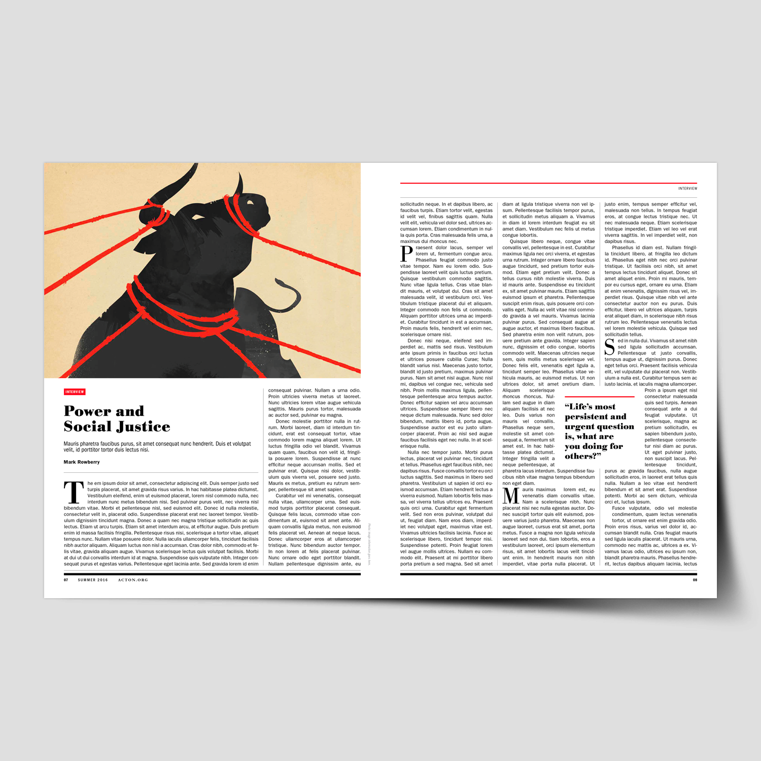
Michigan Wheel Marine
Navigating client relationships can be complex, much like an experience I had with Michigan Wheel Marine (now named Michigan Wheel), a former client based in Grand Rapids, Michigan. Established in 1906, they have a rich history and maintain a strong reputation for handcrafting propellers celebrated for their unparalleled performance.
Project Background:
When Michigan Wheel Marine sought my services to develop a new brand identity for their company, I was initially unaware of the internal conflict and power dynamics at play within the organization. So like any beginning of a project, I dove in and began to work closely with the internal team and their global partners. It soon became evident that there was internal and partner conflict regarding how they defined their brand and how customers perceived them. Unfortunately, their ongoing disagreements only complicated my efforts to provide them with sound advice and develop a meaningful brand identity.
Instead of wanting to gain an understanding of their market and customers, they created internal alignments that swayed what they felt was their brand. Never considering my advice for thoughtful research and interviewing to understand their business, market, and customer perceptions.
Reflecting back on this situation, I wish I had been more direct with them, though I'm uncertain if that would have helped. It's unfortunate that they relied on internal alignments to assert what they believed was right, overlooking the importance of thorough qualitative and quantitative research. Missing this important step, they overlooked valuable insights that would have helped me shape their brand more effectively. Research should always play a crucial role in uncovering customer needs, preferences, and perceptions, ultimately guiding an effective brand strategy.
The result of neglecting this essential step, Michigan Wheel Marine missed out on opportunities to differentiate themselves and resonate with their target markets and consumers. Unfortunately, this led to the termination of our working relationship, as they sought a design studio that would simply comply with their instructions without prioritizing strategic research and insights.
Logo Direction:
The logo direction was shaped by restricted research, as the client was unwilling to invest in what they perceived as unnecessary expenses. I hate to say, “I told you so.” Some companies do not like spending money on important research. Since this was the reality of this project, I spent time on preparing a basic questionnaire to understand the company, its market segments and competitor analysis. This limited research revealed a desire to differentiate from competitors and avoid the common propeller motif. I felt my approach was unique, drawing from their company's rich history, engineering expertise, and providing precision handcrafted propellors.
During my exploration phase, I focused on incorporating marine motifs. I used a boat bow with the addition of two flowing lines (acting as a flag), these two combined elements created a badge. I chose a bold typeface, Acumin Variable designed by Robert Slimbach from Adobe Originals to commitment the logomark. With the additional of color, reflecting a nautical theme I added depth to the mark to give it presence. Also, by angling the logo I created a sense of movement, making it feel more modern and energetic. The final execution integrates the logomark (badge) and logotype (company name) to reflect the company's experience, excellence and superior products.
Even though the stakeholders didn't see this as the right direction, it was just one of my approaches that I believed aligned with their needs based on the research conducted.
-
+ Brand Identity
-
+ Creative Direction
+ Project Management
+ Qualitative Research
+ Concept Development
+ Sketching & Ideation
+ Illustration

Mitten State

Client Project
December 2016
__
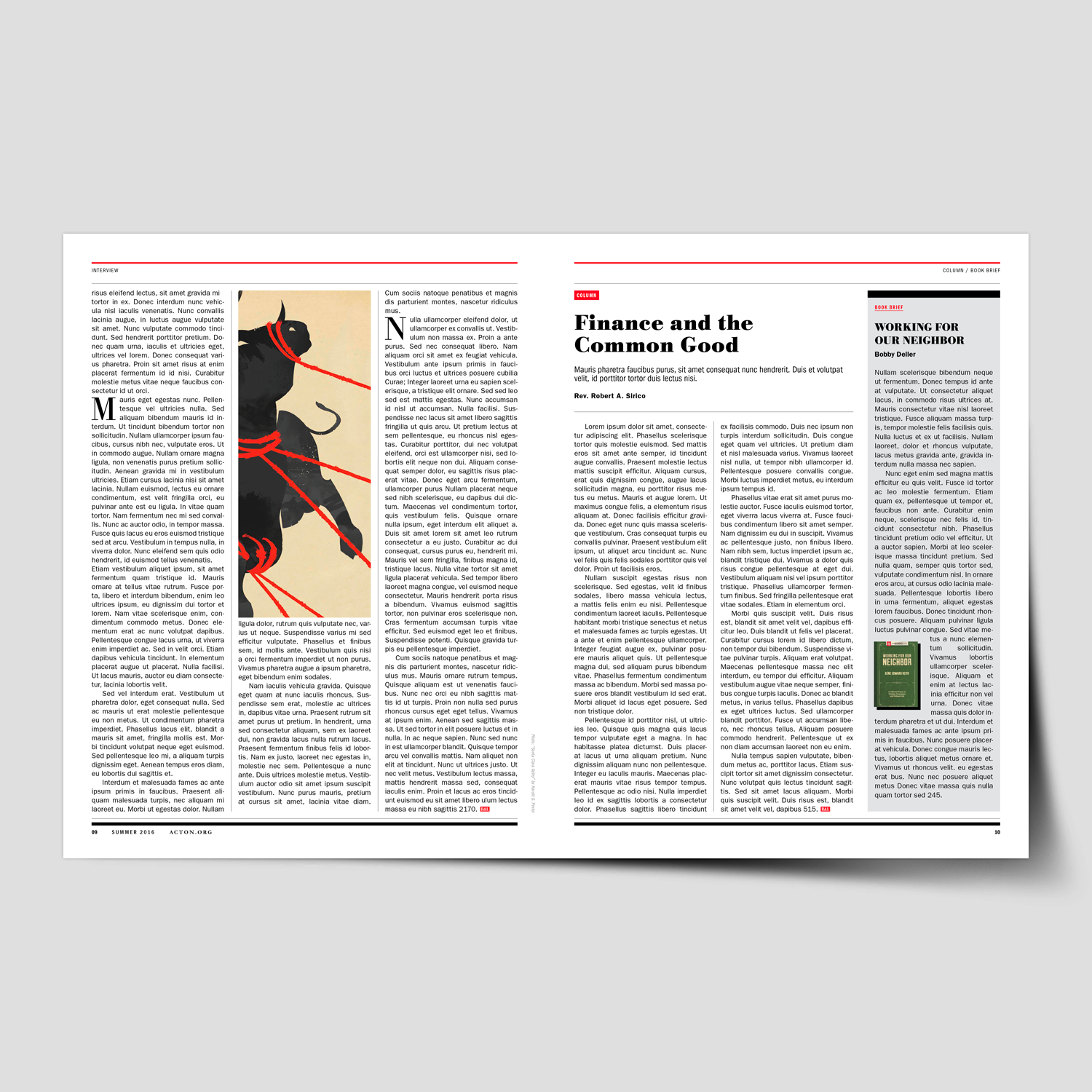
Mitten State
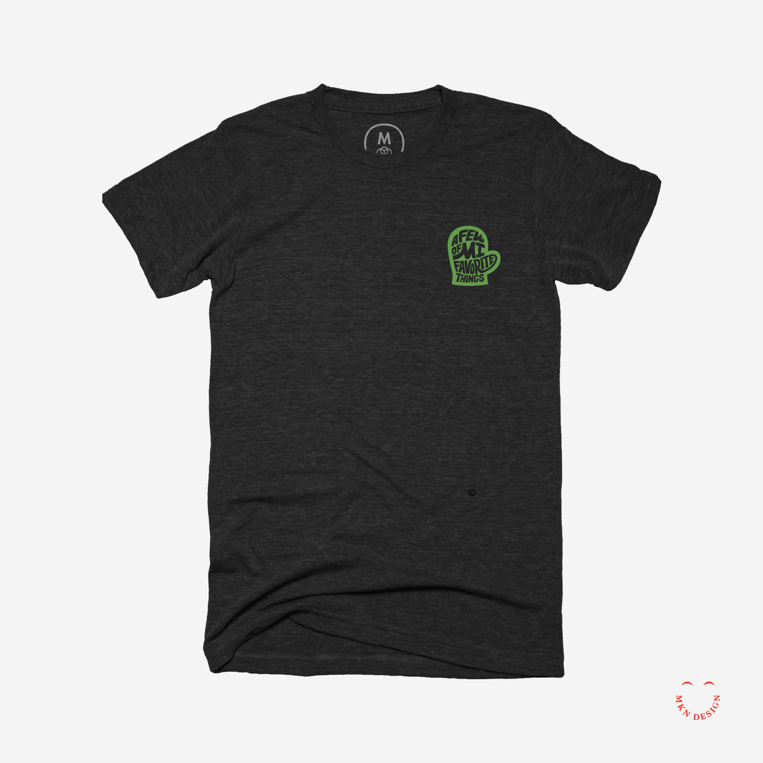
A few of MI (my) favorite things. A mark with custom hand type created by my wife and I for a our children’s school auction—auctioning authentic Michigan paraphernalia. The letterforms in this mark have been custom-designed to fit snugly into the mitten.
-
+ Brand Identity
-
+ Creative Direction
+ Project Management
+ Qualitative Research
+ Concept Development
+ Sketching & Ideation
+ Illustration
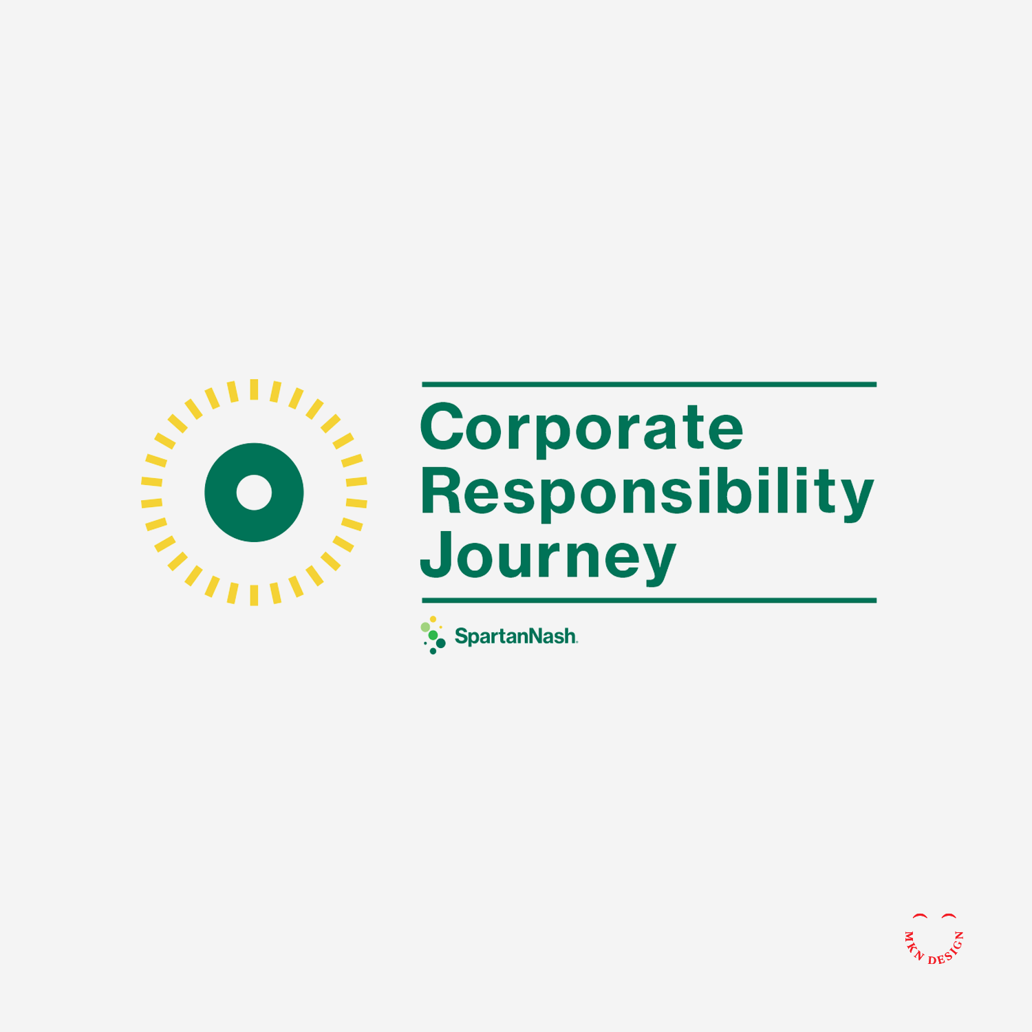
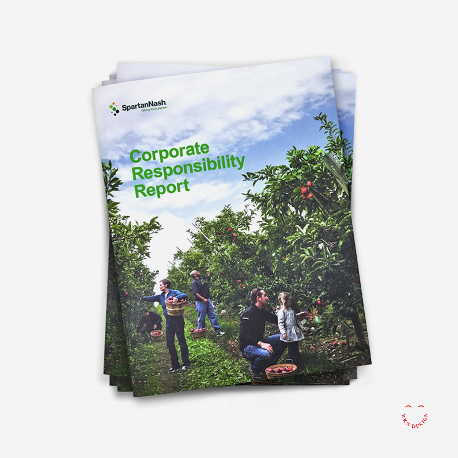
SpartanNash – Corporate Responsibility Report

Client Project
—
SpartanNash – Corporate Responsibility Report
Hired by SpartanNash, I collaborated with their marketing team to direct, develop, and design a 36-page corporate responsibility report. Headquartered in Michigan, SpartanNash is the largest food distributor in the U.S., serving independent grocers, military commissaries, and corporate-owned retail stores across 44 states.
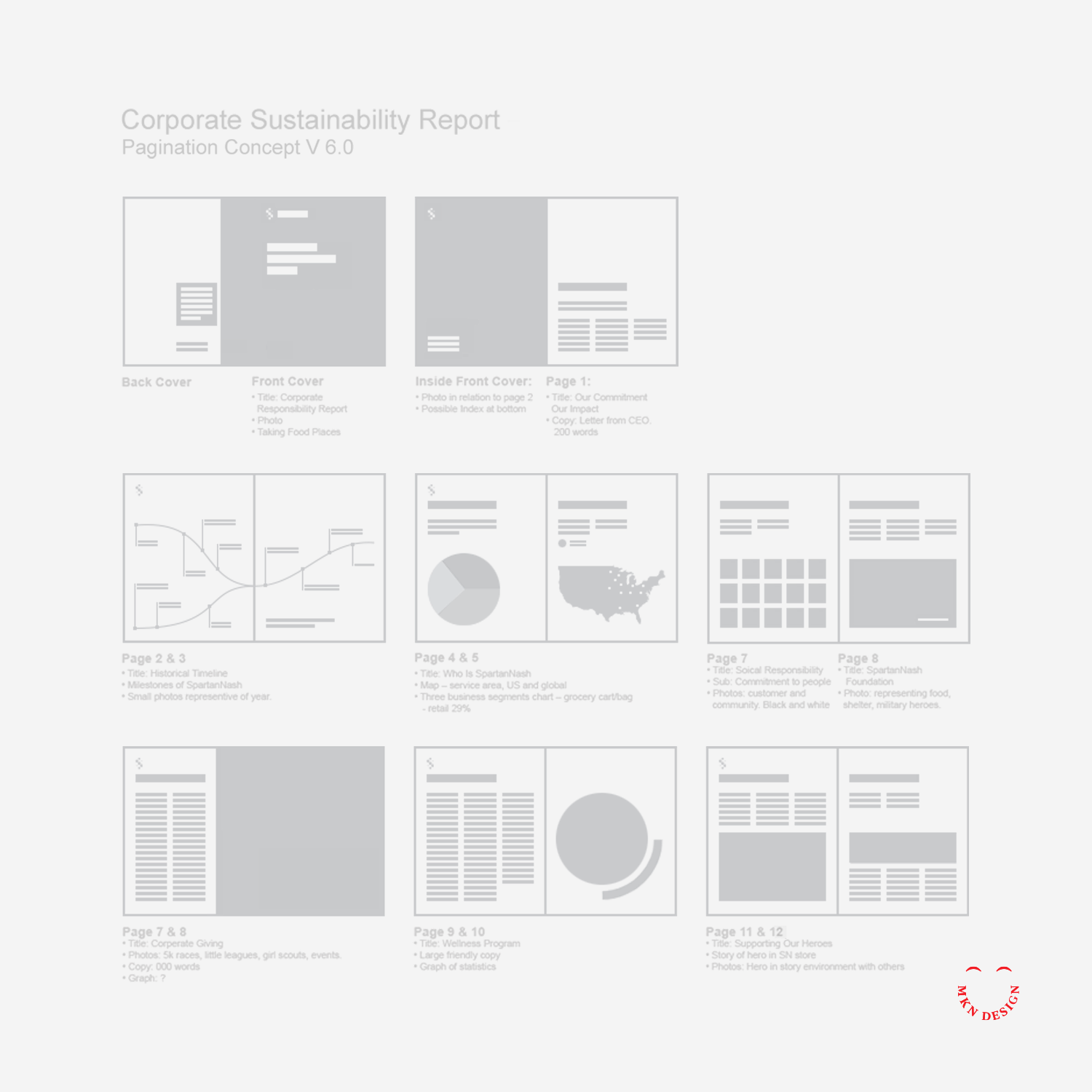
Serving as design director, I led the process to the development and design of the report, highlighting SpartanNash’s core values, diverse capabilities, community engagement, and commitment to environmental responsibility through a strategic combination of copy, visuals, design, and infographics.
Following a guided design process, I reviewed and analyzed SpartanNash’s areas of social and environmental responsibility, shaping each section to tell the story of their sustainable journey. By integrating storytelling with design, we connected their core values, capabilities, and community efforts into a cohesive narrative.
The final brochure brought SpartanNash’s story to life, combining compelling visuals, informative infographics, and clear, engaging design to communicate their achievements and initiatives. Serving as both a visually engaging and practical reference, it reinforced the company’s commitment to sustainability, community, and corporate responsibility, resulting in a comprehensive and impactful sustainability report.
-
SpartanNash
Food Wholesale & Retail Grocer -
Corporate Responsibility Report
-
+ Communication Design
+ Concept Development
+ Illustrative Storytelling
+ Product Research
+ Pagination Desgin
+ Qualitative Research
+ Sketching & Ideation
+ Visual Identity System
Dwell Feature

Article + Product
December 2016
__
Dwell Feature
Thank you Dwell for promoting my work in this month’s issue of Dwell Magazine and on dwell.com It’s nice to be noticed ☺️
What the Dwell blurb reads, “Design With an Eye for Fine Lines. Michigan-based graphic designer and illustrator Michael Nykamp takes minimalist approach to creating portraits and logos for a variety of clients, including AIGA West Michigan, Herman Miller, and musician Truman Cage. We also love his crisp drawings of midcentury classics, such as Jens Risom’s A-Frame house. Follow his collaborations, posters and personal explorations like this geometric lion at dwell.”
-
View my work on my Dwell profile page.
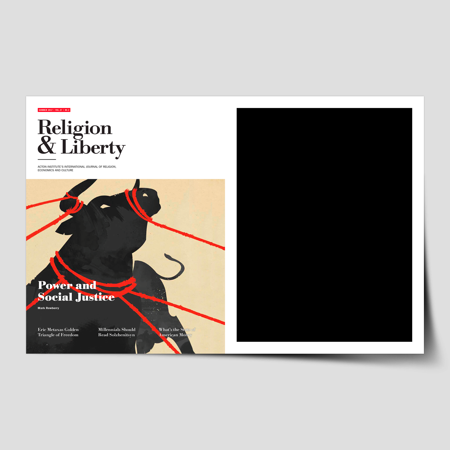
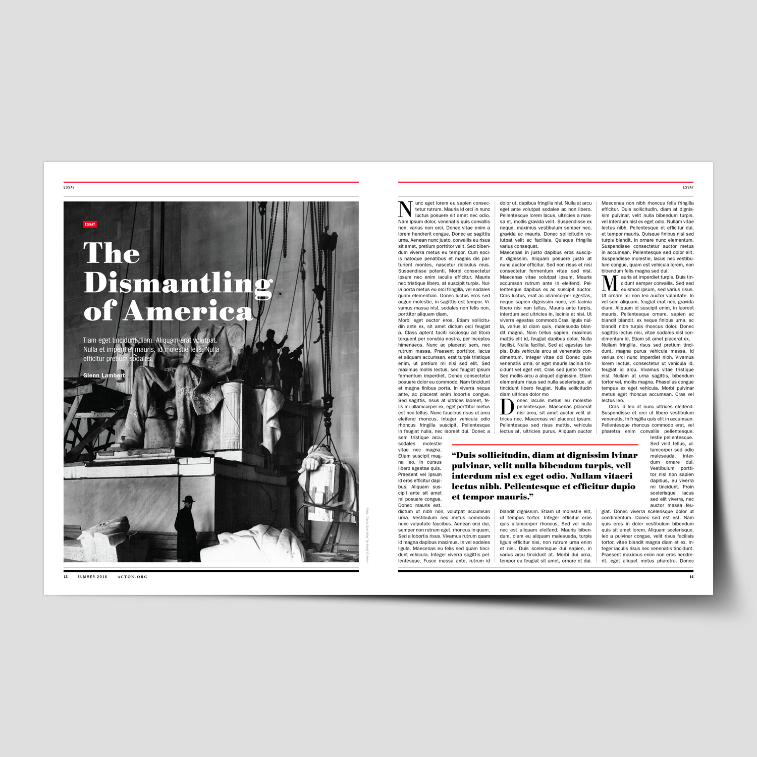
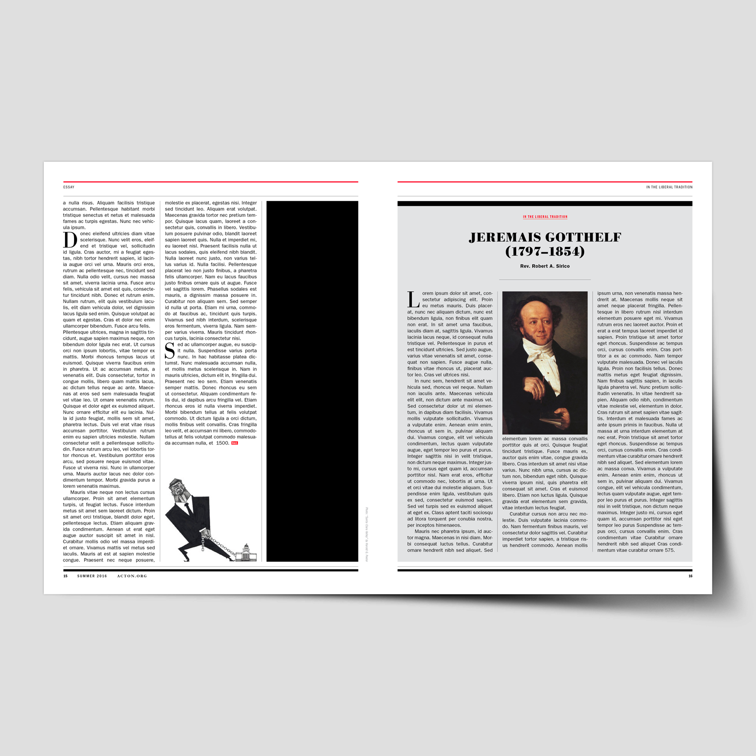
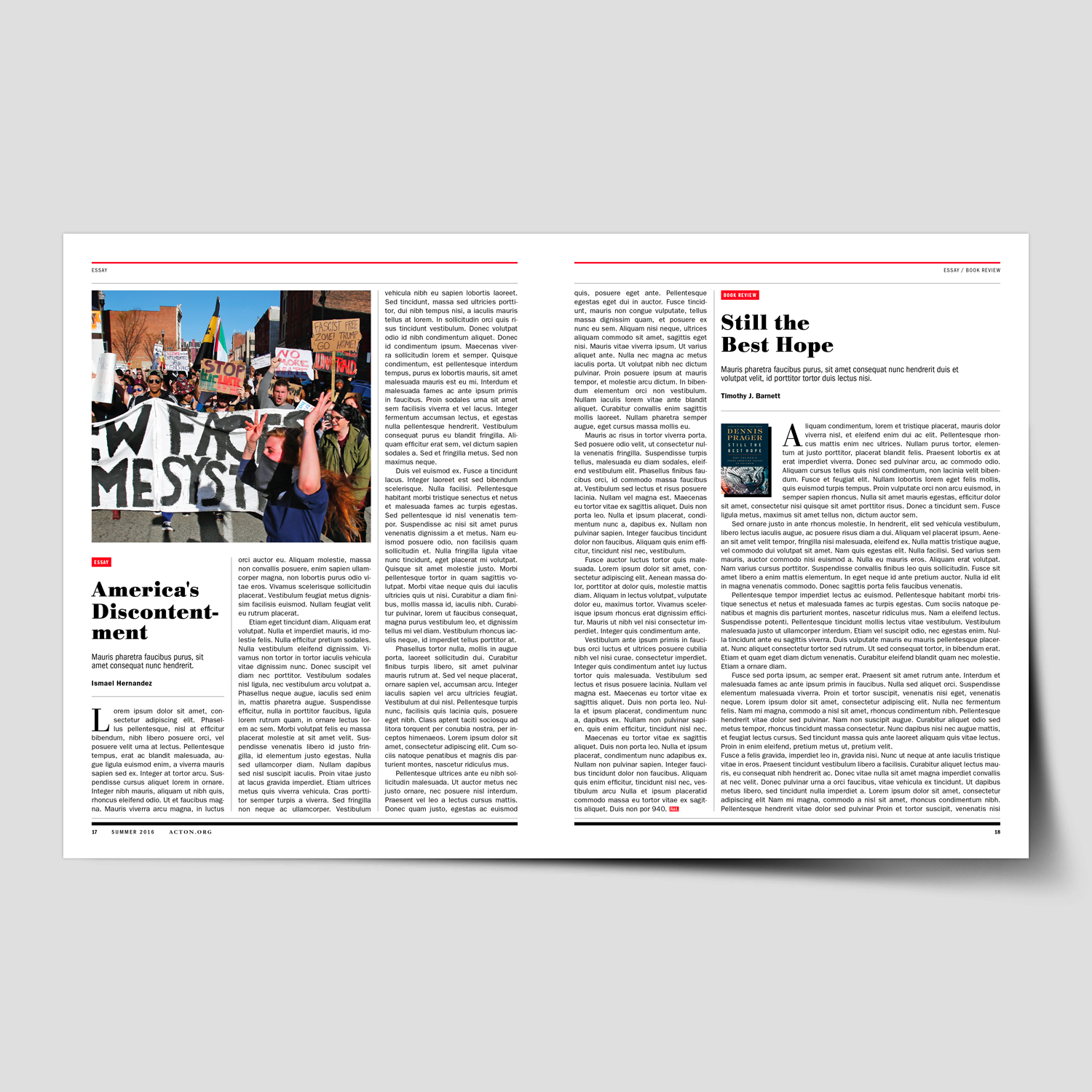
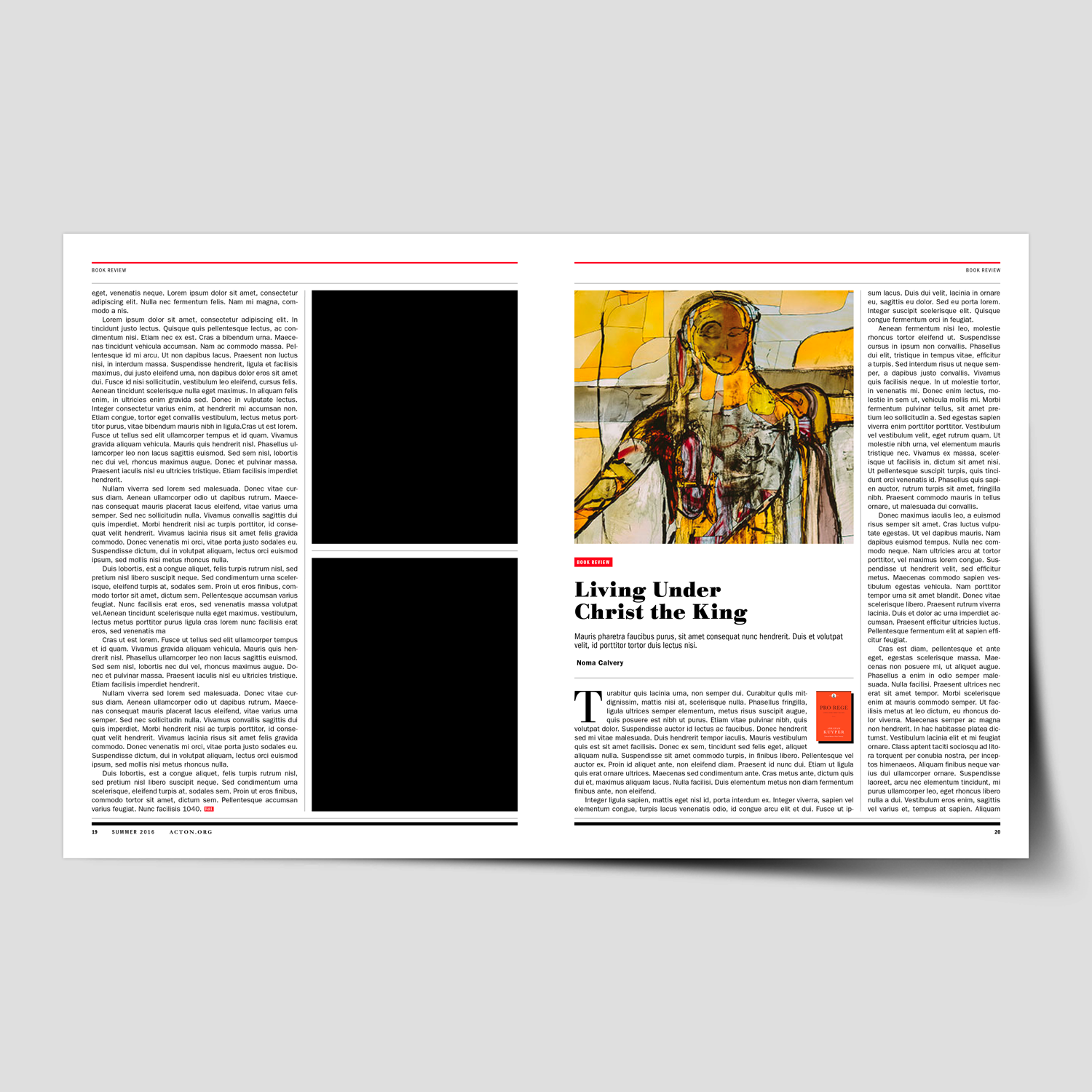
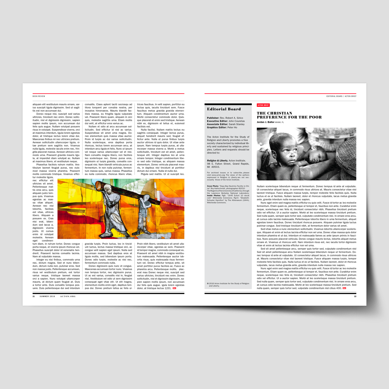
Religion & Liberty – Rebrand & Magazine System Design

Client Project
—
Religion & Liberty – Rebrand & Magazine System Design
We helped Religion & Liberty magazine rebrand and develop a comprehensive system design for the Acton Institute’s quarterly publication. This six-month initiative focused on modernizing the magazine while establishing a flexible and cohesive framework to guide future issues.
This project began with a full evaluation of the magazine’s existing structure, visual language, and editorial needs. Through extensive planning, research, and collaboration with Acton’s editorial team, we identified opportunities to improve clarity, storytelling, and brand alignment while creating a system flexible enough to support a wide range of content.
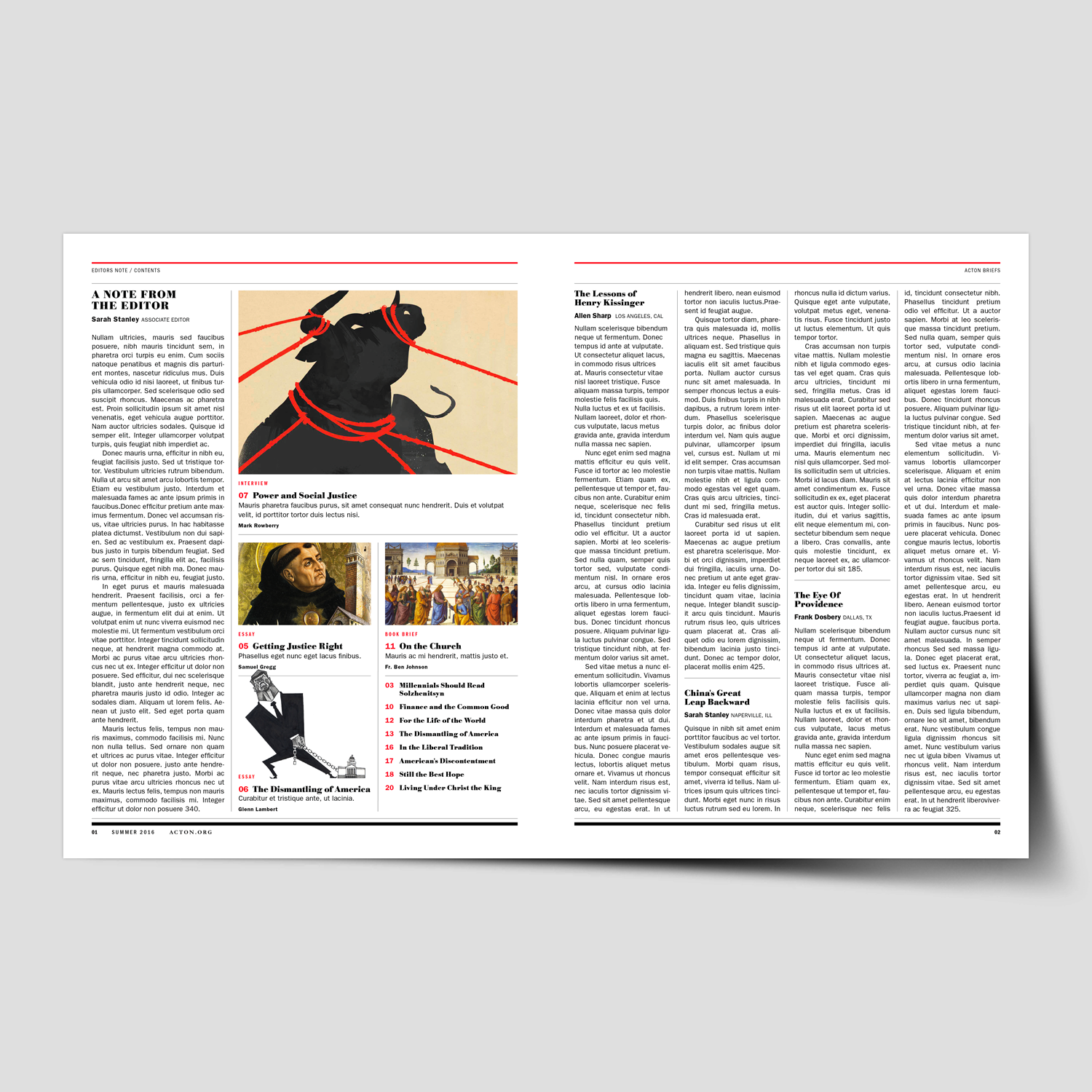
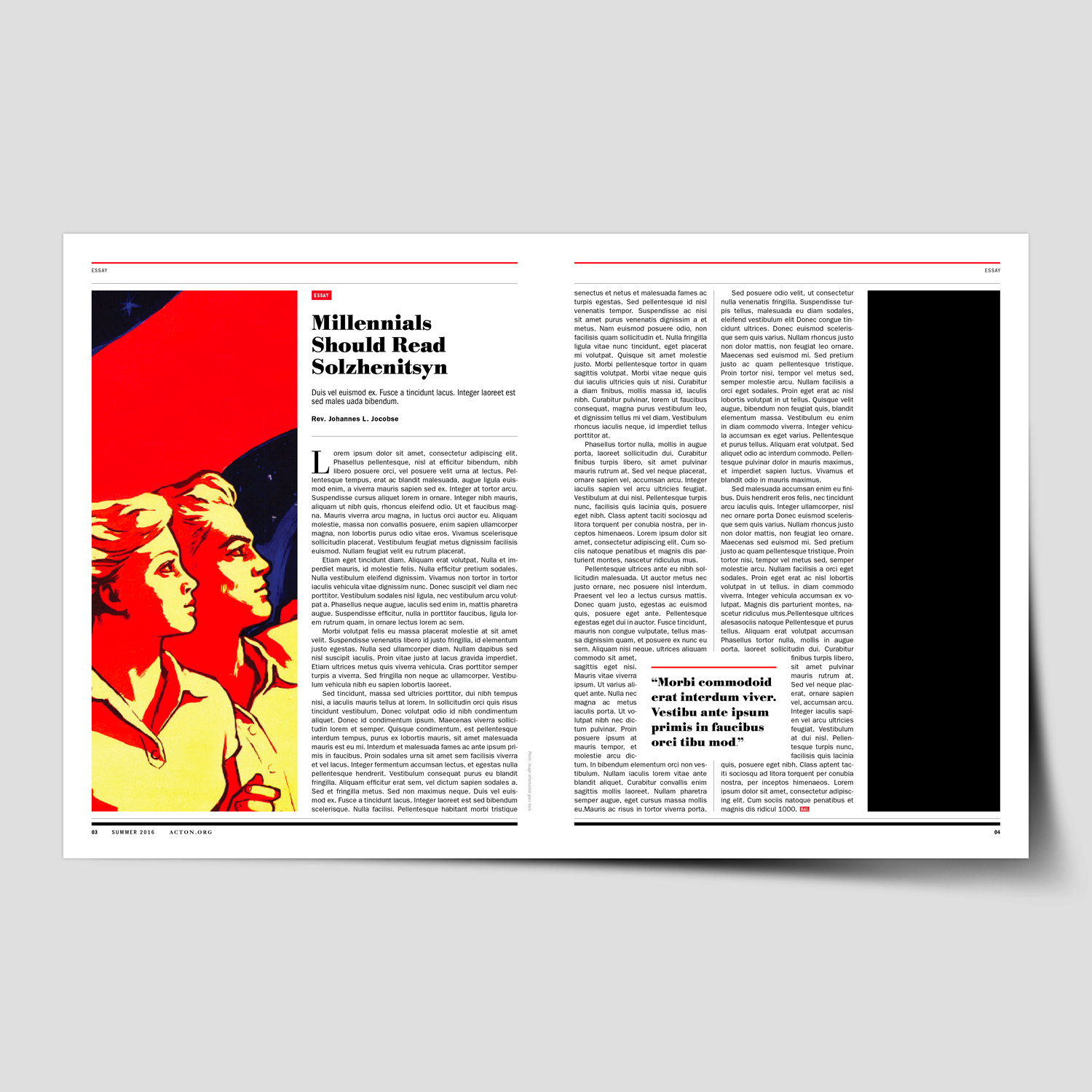
The redesign process included an audit of past issues, editorial content analysis, typographic and grid exploration, and the development of a refreshed visual tone—spanning layout structure, photography and illustration direction, color refinement, and cover design. The result was a comprehensive editorial system built around forty distinct layout templates.
To support long-term consistency, a detailed design and layout toolkit was created, equipping the internal team with clear guidelines for typography, spacing, imagery, recurring features, and decision-making. The outcome delivered a magazine that feels contemporary, readable, and distinctly aligned with the Religion & Liberty vision—while significantly improving workflow efficiency for their editorial staff.
←
View the Design System Templates, created to streamline layouts and ensure a consistent visual narrative for future issues.
“It’s rare to come across someone as talented and easy to work with as Michael. We hired Michael to redesign one of our most important publications, Religion & Liberty. The project was incredibly difficult from the start as we didn’t have a clear picture of what we were looking for. Michael was extremely patient and methodical, working closely with us, so we could come up with a concrete plan of execution together. He took special care to understand the needs of the organization as well as the readers, so the final product would be ideal for all audiences. He created a polished publication that holds its own against mainstream magazines.”
Sarah Stanley
Managing Editor, Acton Institute
-
Religion & Liberty (Acton Institute)
Non-Profit Think Tank -
Brand Identity & Magazine System Design
-
+ Brand Advisor
+ Brand Indentity
+ Communication Design
+ Concept Development
+ Design Direction
+ Publication Design
+ Illustration & Photo Art Direction
+ Qualitative Research
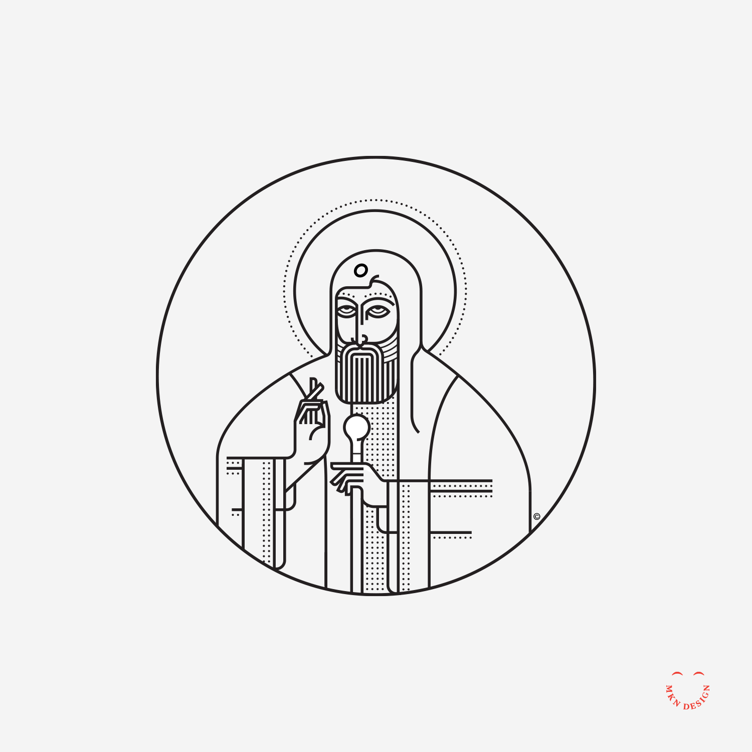
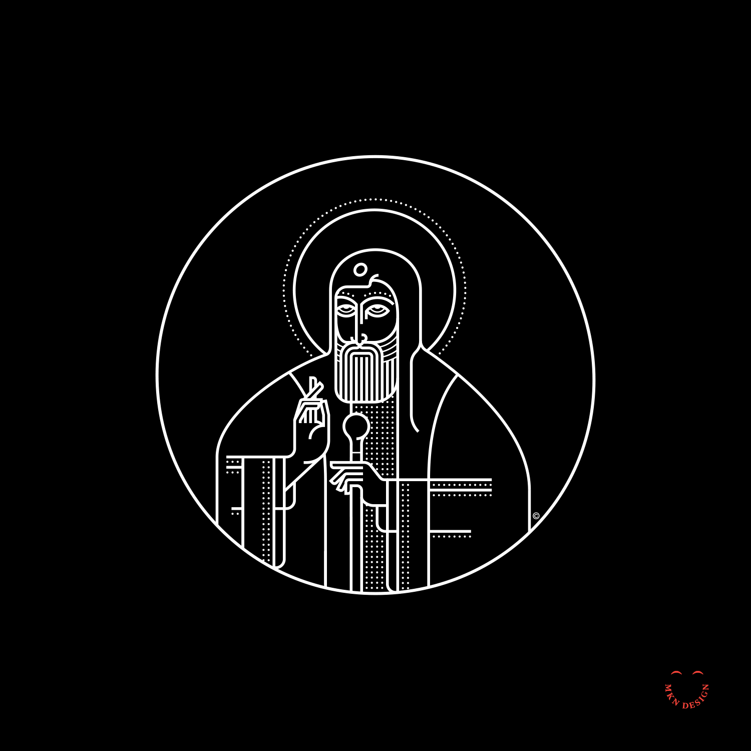
Saint Tikhon
Creative Musing
November 2016
__
Saint Tikhon
Simple line and dots illustration of an Orthodox Priest in his vestments and staff.
The Careful Gardener

Creative Musing
October 2016
__
The Careful Gardener
An older gentleman recently told me, “Every relationship has a gardener and a flower.”
The Death Of Peace

Creative Musing
September 2016
__
The Death Of Peace
Illustration inspired by the quote from Jason Donahue, “I see humans, but no humanity”.
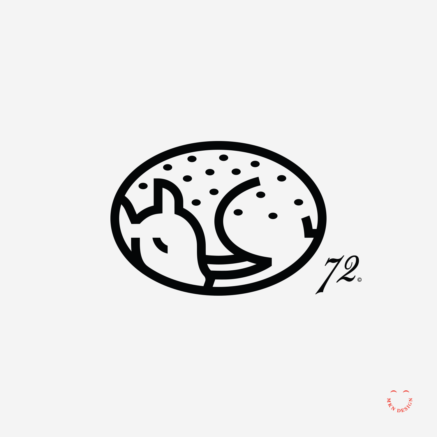
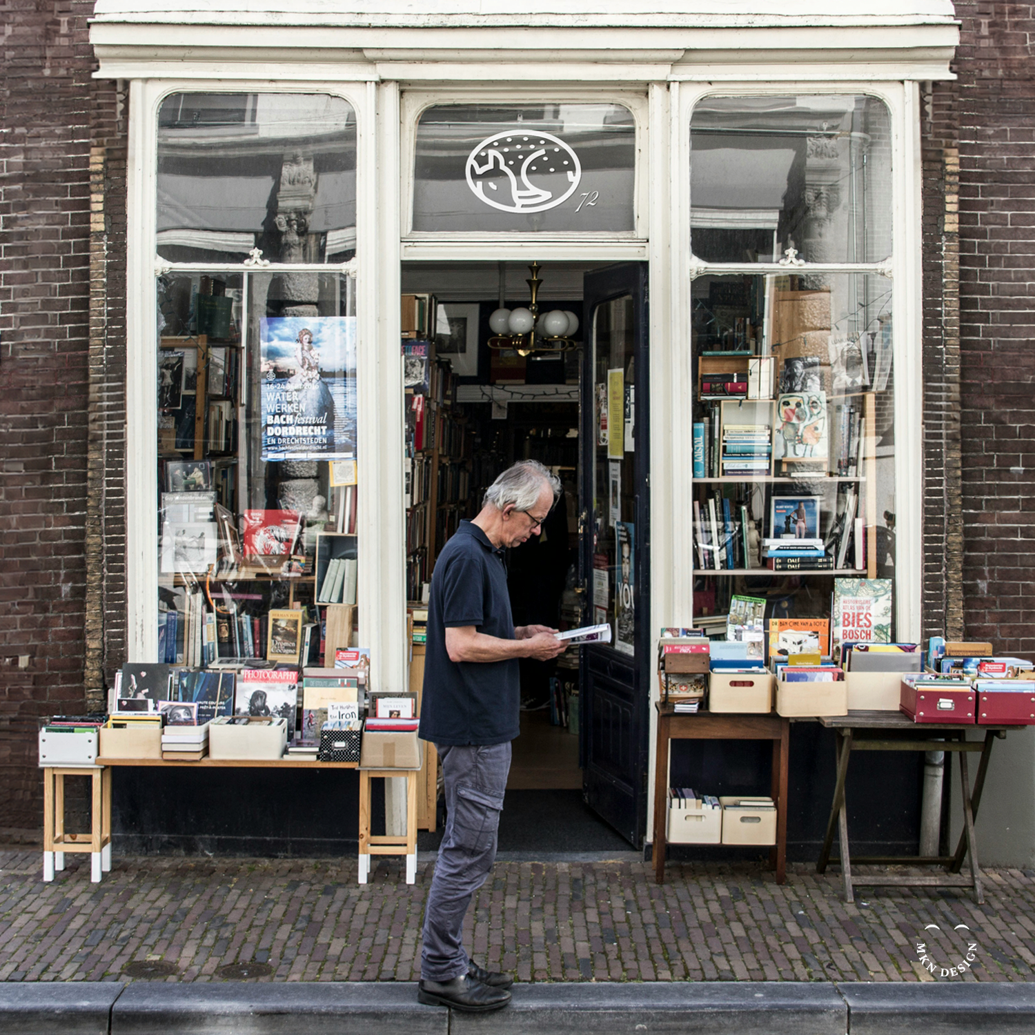
Sleeping Fawn
Client Project
September 2016
__
Sleeping Fawn
I developed this mark a few years ago as potential logo for a book publishing company. It never came to fruition, but I love it enough to share it with you all.
-
+ Brand Identity
-
+ Creative Direction
+ Qualitative Research
+ Concept Development
+ Sketching & Ideation
+ Illustration
Feist Portrait

Creative Musing
September 2016
__
Feist Portrait
Stylized portrait of Canadian singer and songwriter, Feist.
Pentax K 1000

Creative Musing
August 2016
__
Pentax K 1000
During college, I was taught photography using the Pentax K1000. This model was instrumental in laying the groundwork for learning traditional manual camera techniques, including light metering, aperture settings, and F-stops. Additionally, I developed the film and processed photos in a darkroom.
Truman Cage


Client Project
August 2016
__
Truman Cage
John Swihart is a versatile artist known for his roles as a musician, composer for film and television, and electronic EDM producer, under the alias Truman Cage. His notable contributions include crafting the score for the iconic movie Napoleon Dynamite which won Golden Satellite Award for best Original Score. He also produced the music for How I Met Your Mother, alongside various other impressive works.
It was on a sunny afternoon that I received a call from John. He mentioned that he loved my branding and illustration work and he trusted I would come up with a unique logo for his electronic persona that he’d love. His only requirements where incorporating the letters "T" and "C" while being encased within a box. The logo persona he chose is displayed at the top, while the other various concepts below he loved but did not make the cut.
-
+ Brand Identity
-
+ Creative Direction
+ Qualitative Research
+ Project Management
+ Concept Development
+ Sketching & Ideation
+ Illustration -
My client for this project was John Swihart, an American composer renowned for his work in film and television music. He best known for his score to Napoleon Dynamite and his music for the TV shows How I Met Your Mother.
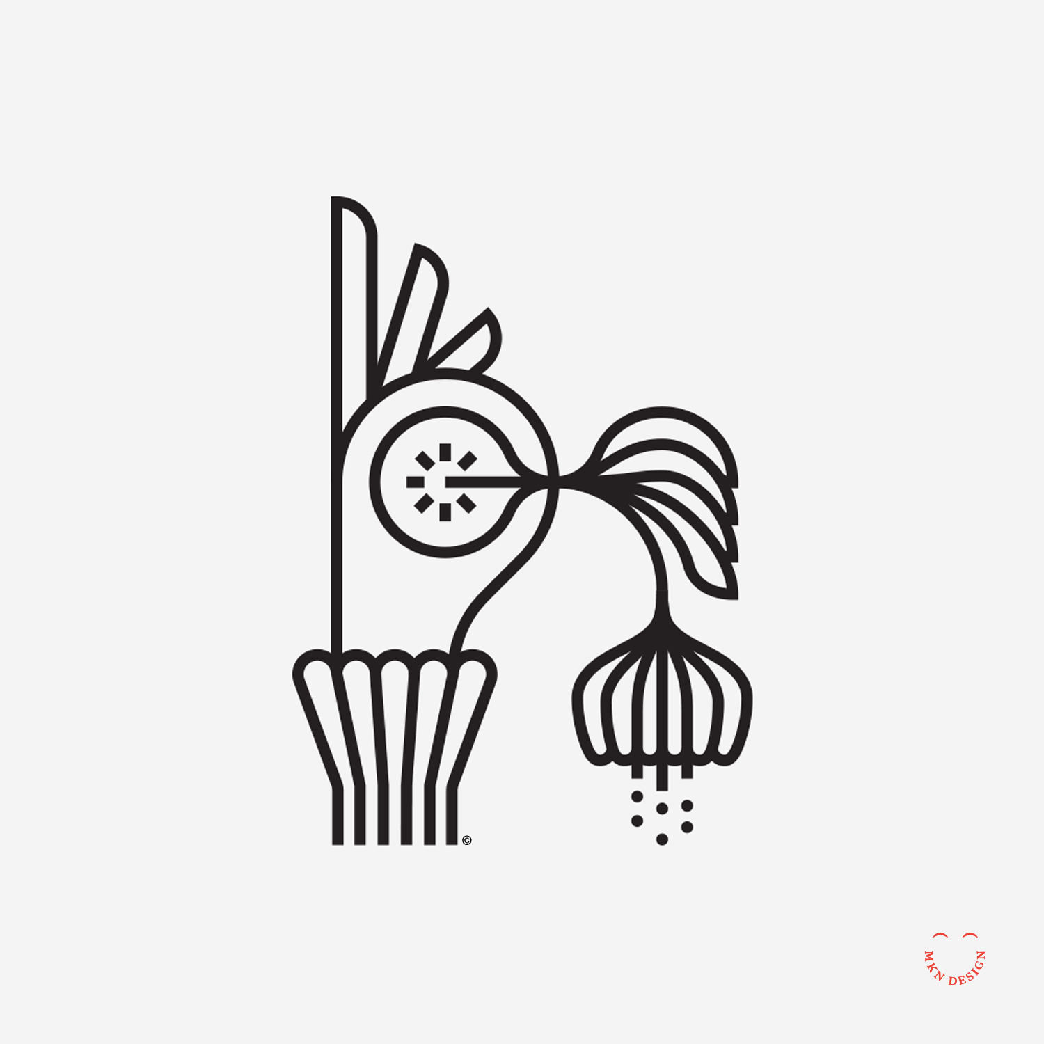
Death of a Lotus

Creative Musing
August 2016
__
Death of a Lotus
Some quick stylistic illustrations created in my downtime today.
OK Tuna

Creative Musing
June 2016
__
OK Tuna
Mimicking a fish through imitating Japanese characters for this mark. The ‘O’ and ‘K’ letterforms where custom illustrated for this mark.
Leica M

Creative Musing
May 2016
__
Leica M
I love the simplicity of physical products, like Leica’s cameras. This simplicity mirrors my approach to design and illustration, as shown by this illustration of the Leica M.
Flight of the Crane

Creative Musing
May 2016
__
Flight of the Crane
Inspired, I created this modern and balanced symmetrical illustration of a crane launching for take-off.
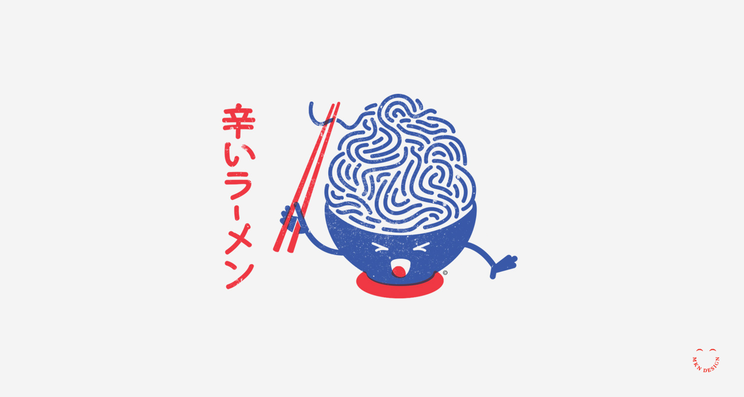
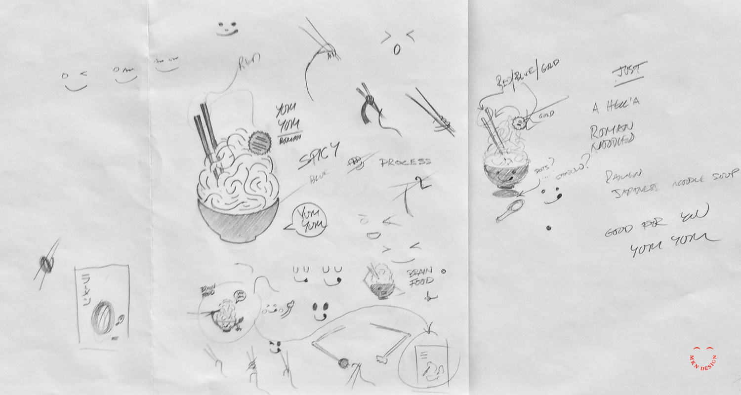
Spicy Ramen
Creative Musing
April 2016
__
Spicy Ramen
After eating some spicy ramen, I had the idea to illustrate this.
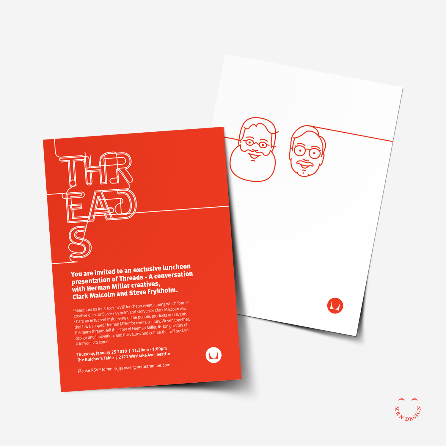
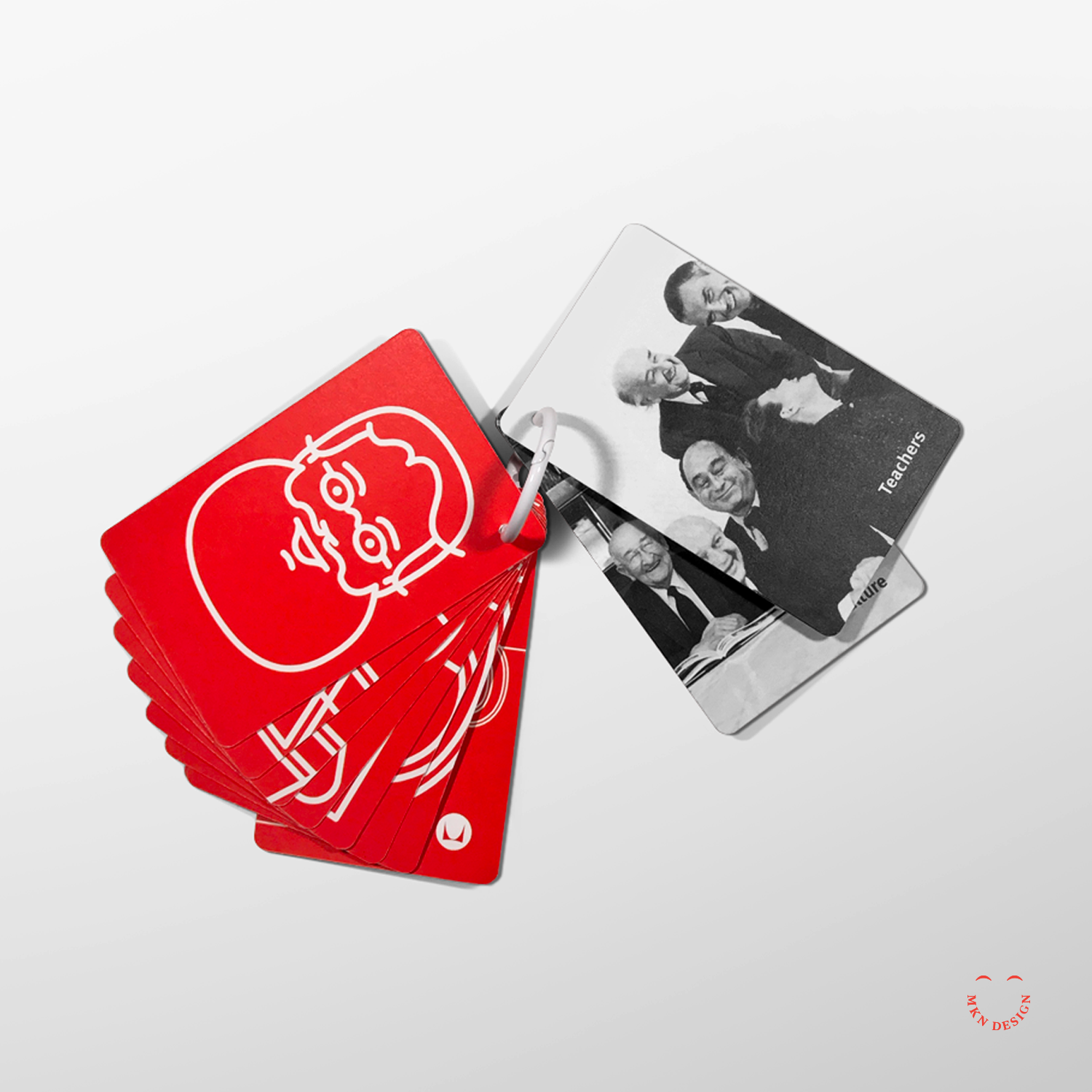
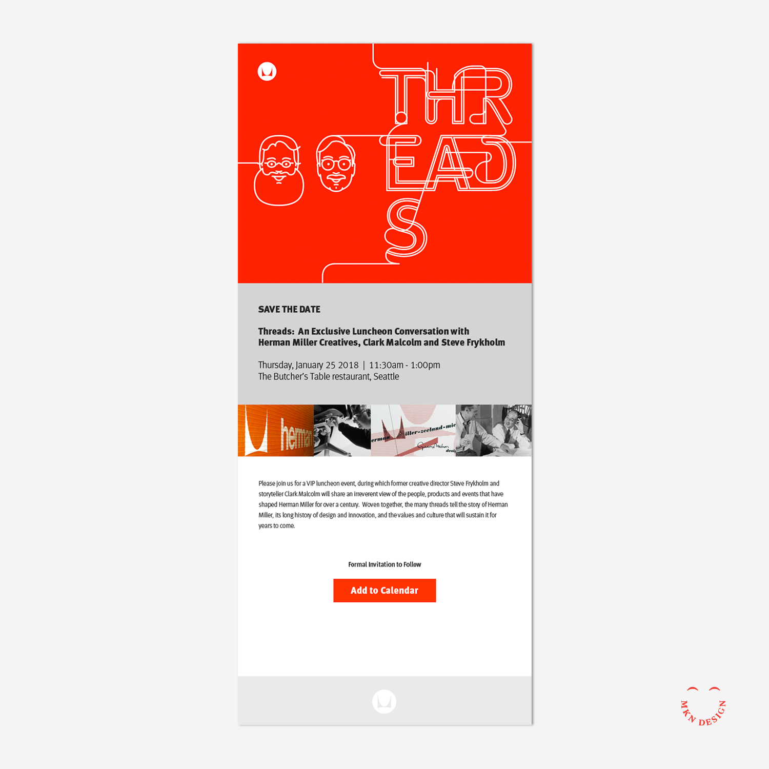
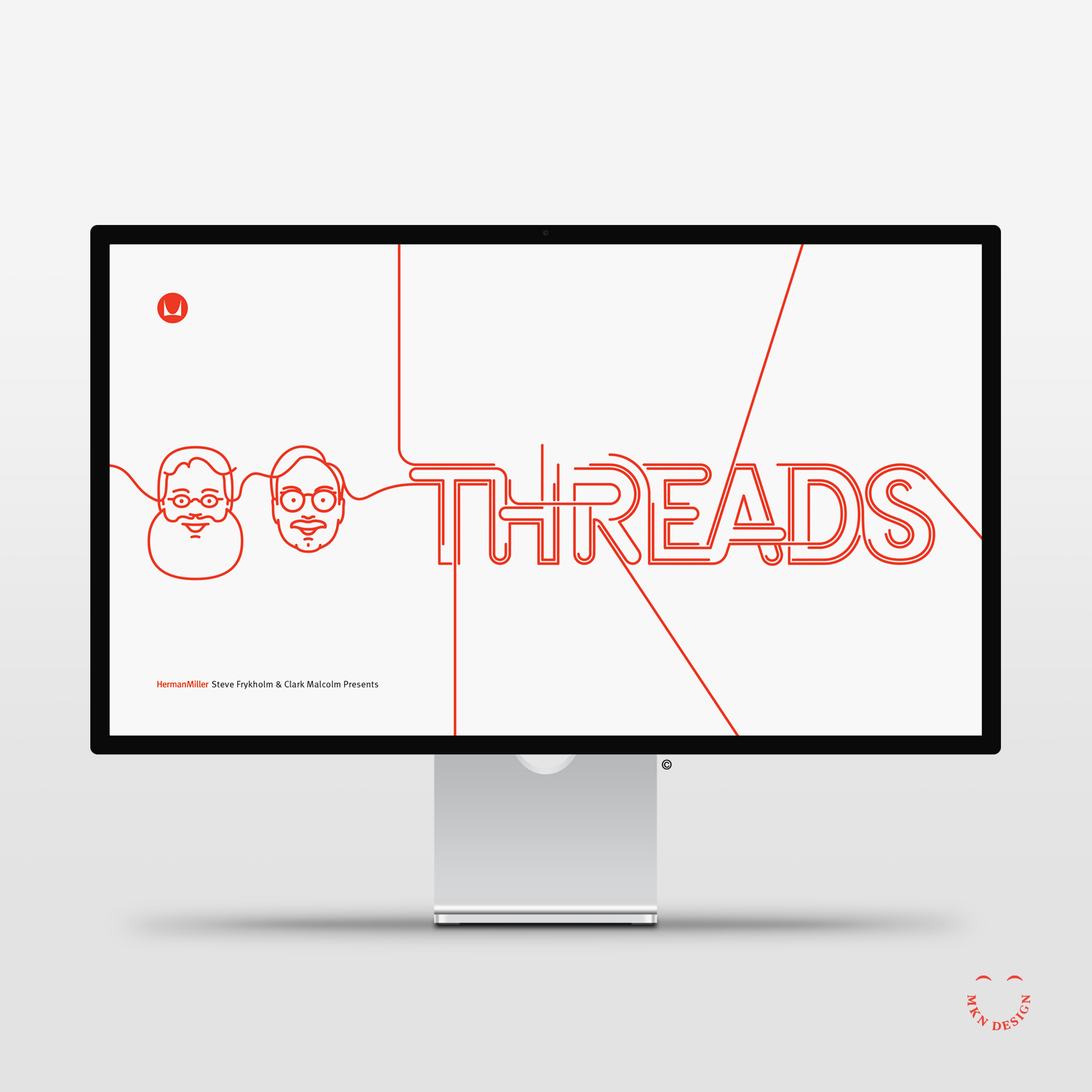
Threads

Client Project
April 2016
__
Threads
At the heart of the furniture manufacturer's legacy lies its iconic pieces and the visionary designers behind them, such as Alexander Girard, and Ray and Charles Eames. "Threads" is a presentation and conversation lead by former graphic designer Steve Frykholm and writer Clark Malcolm. They weave Herman Miller's rich history of design innovation, its embrace of new ideas and talents through captivating narratives that shaped Herman Miller's 111-year journey. Because of my illustrative portrait line style, I was commissioned to create illustrations tailored to complement the theme of "threads."
Because of my former work in simple line portraits and having already completed a portrait of Steve, I was approached to create a portrait of Clark. These portraits were seamlessly woven into promotional and presentation materials, tailored to complement the theme of "Threads."
-
+ Portrait Illustration
-
+ Style Development
+ Sketching & Ideation
+ Illustration -
My portrait series, formally called Facebook Friends started as a self initiated project illustrating my friends on Facebook. This endeavor evolved into illustrating portraits of speakers for CanUX Conference, and numerous portraits for friends and clients.An article titled "Face Behind the Faces" was written about me and the portrait series.
-
Art direction provided by Mark Beard. Promotional collateral and web materials developed by Herman Miller.