Foundations of My Design Practice


Article
July 2025

__
Foundations of My Design Practice
I didn’t just wake up one day and decide to become a graphic designer, or what some might call a design generalist or T-shaped designer. My path started much earlier as a kid who loved to draw and express ideas through color. That early curiosity eventually led me to study fine art, illustration, and user experience—five years of focused learning, exploration, and hands-on practice. Though these studies were instrumental in shaping how I work, I do not practice just one of these disciplines. Over time, they’ve blended into a focused approach that has taught me to observe closely, think conceptually, and design with sensitivity to the human experience.

It was from these foundational beginnings that I naturally flowed into practicing graphic design, but with a unique, visually driven, illustrative approach woven into my design work. Over time, this developed into my style and has helped me shape brands and build design materials grounded in thoughtfulness, meaning, clarity, and how people relate to and engage with them.

Not only have these foundations shaped my work, but they’ve also led to a set of guiding principles, approaches that continue to influence how I collaborate, problem-solve, and design with purpose.

These are the guiding principles I work by (in no particular order):

• Design Happens Together
• Approached with Thoughtfulness
• Design with Intention
• Acumen Equals Impact
• Crafted to Compel

  • This article expands on an later piece I wrote where I reflect on my process and why principles matter.

    5 Principles Behind the Process

  • The reel above is a mix of client collaborations and personal creative explorations I’ve pursued between projects. They express the breadth of my skills, my evolving style, and the passion I bring to every piece of work—whether driven by client goals or personal curiosity.
Luminous Branding


↑ Brand Development Deck
An overview of the process behind defining and executing the development of the Luminous identity.

Abbreviated Brand Guidelines
These guidelines outline the essential elements and standards for presenting the Luminous brand accurately.

Client Project
June 2025

__
Luminous Branding
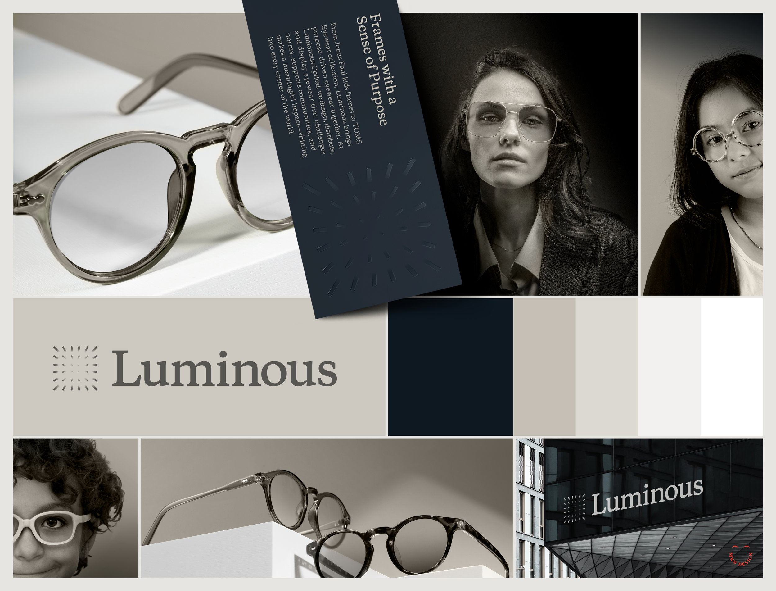
The word Luminous means "full of or giving off light.” 

Luminous originated from Jonas Paul Eyewear, a brand that was inspired by the birth of their son, Jonas, who was born with a rare eye condition. Today, Luminous serves as the holding company for Jonas Paul and several other optical brands—dedicated to, "shedding light into every corner of the optical space with eyewear that is designed, distributed, and displayed in a way that supports the greater good.”

What started as a mission to help their son Jonas has grown into a global effort to bring vision to children in need. Through their “Buy Sight, Give Sight” program, Luminous provides glasses, funding, and eye care support to children around the world.

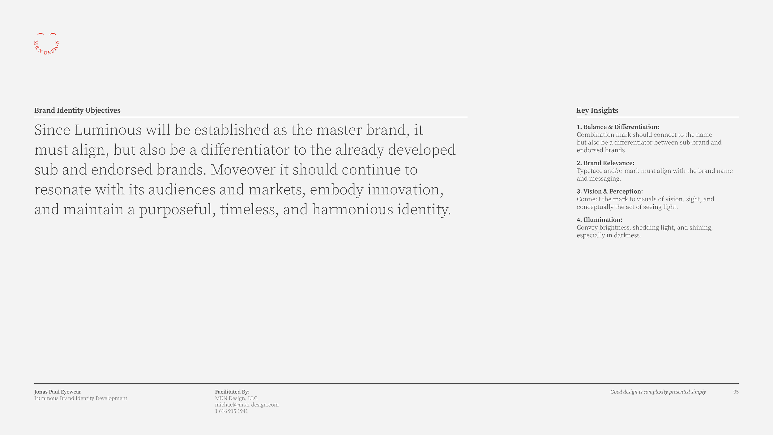
At the time, Jonas Paul hired me to elevate its existing portfolio by designing an identity that would create space for future brands aligned with its mission. Guided by research, collaboration, and informed insights provided by the team, my primary design goals were to establish a strong identity that connects the master brand with its sub-brands, stands out in a competitive market, and reflects boldness, innovation, and meaningful impact.

Though the project faced early challenges, our shared determination and open dialogue allowed us to refine the concepts until one emerged that aligned seamlessly with their vision, core audience, and markets. The process was rigorous but ultimately fulfilling, requiring a careful balance of innovation and consistency within a hybrid brand model.

The result is innovative, distinctive, and thoughtfully aligned with their mission, as well as their current and future brands, and sub-brands. Luminous embodies a quiet sophistication—illuminating rather than overwhelming. It reflects an intentional brilliance, balanced with confident contrast to express the essence of the brand.

  • + Brand Identity Design

  • + Creative Direction
    + Research
    + Concept Development
    + Sketching and Ideation
    + Graphic Design
    + Illustration
    + Project Management

  • This project was a collaborative effort between Jonas Paul Eyewear team: Ben Harrison, Laura Harrison, Spencer Blanchard and myself. For more information about Luminous products, visit Lumionus Optical.


Corewell Health Wayfinding


Process Detail: Phase III - Alternative Main Level & Parking Wayfinding

Complete Three-Phase Process Development Map

Process Detail: Phase II - Application & Concept Review

Client Project
May 2025

__
Corewell Health Wayfinding
This project set out to design an intuitive, user-centered wayfinding map for Corewell Health’s 25 and 35 Michigan buildings, sparked by a critical insight: patients were frequently arriving late to their appointments due to confusion about their location within the parking structures. The first point of contact for patients typically begins with an email from Corewell Health, directing them to the appropriate parking area for their appointment. From that point on, our project began to take shape—expanding on the existing wayfinding system implemented by Corewell Health to reduce stress, improve punctuality, and enhance the overall experience of navigating their campus.

In response to this challenge, the project focused on enhancing the physical navigation experience through a structured, research-driven approach. Starting with onboarding and immersion, the team worked to under-stand user needs, identify key service traits, and align it with Corewell Health exsisting brand system. Through thorough research, benchmarking, observational studies, and concept development, the project established clear design directions that reflected the organization’s vision—while emphasizing that effectively guiding patients, visitors, and staff was essential.

From initial audits to refined prototypes, the final solution resulted in a simple, effective set of wayfinding signs that clearly communicated a person’s location within the parking structure while also identifying the surrounding buildings across Corewell Health’s campus. The result was a new, human-centered wayfinding components designed not only to guide people to their destinations, but just as importantly, to help them find their way back.


  • + Wayfinding System

  • + Lead Creative & UX Director
    + Qualitative Research
    + Graphic Design
    + Illustration

  • This project was a joint endeavor with The Corewell Health Consumer Experience Team, Augusto Digital via Christy Ennis-Kloote and David Schofield.


KitchenAid Branded Environment


▲ Branded environment concept based on KitchenAid’s updated brand.


▼ Final design integrated into branded environment

Client Project
October 2024

__
KitchenAid Branded Environment
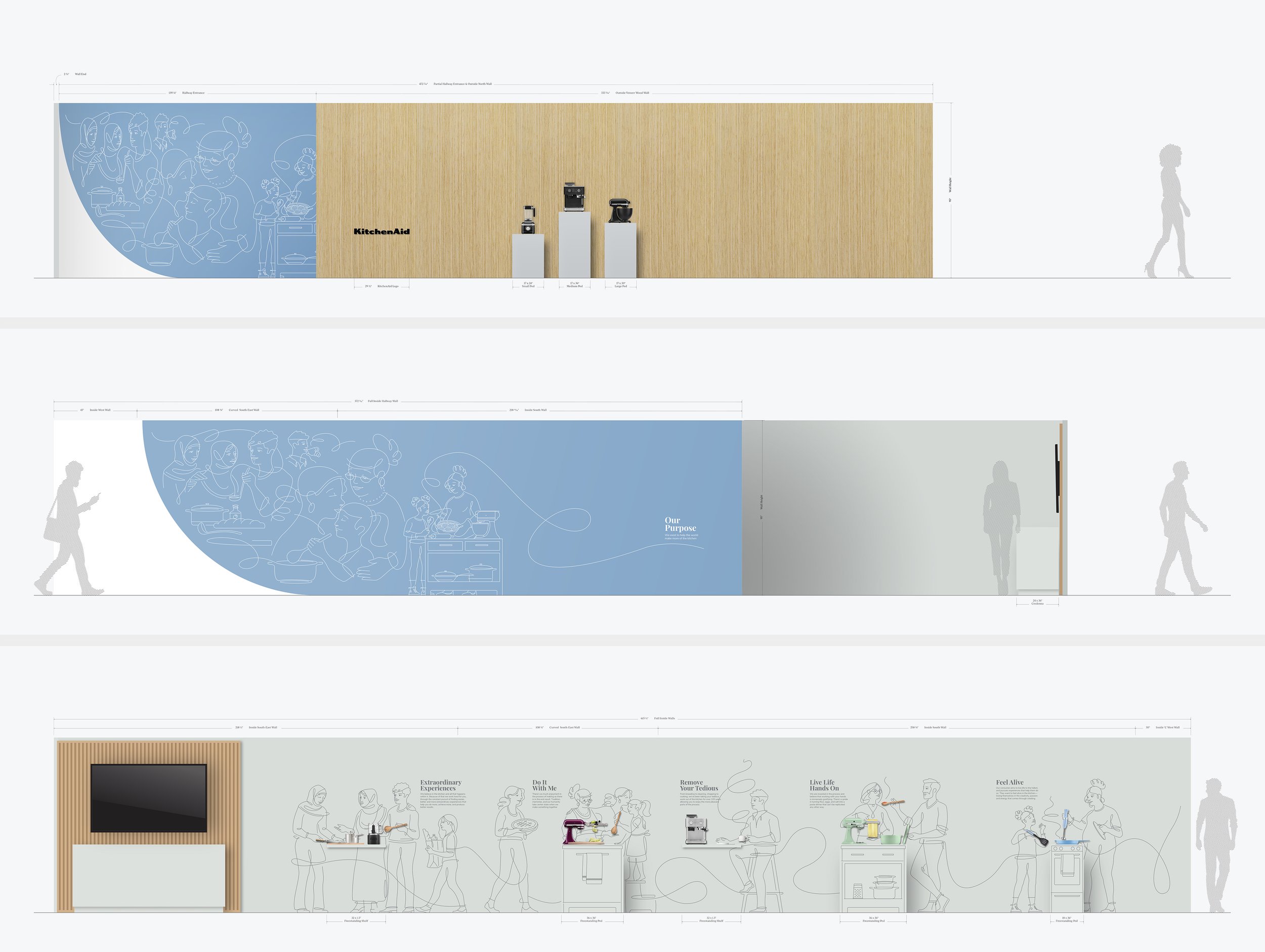
For the second consecutive year, I partnered with Whirlpool Corporation to assist in the development of their annual Board of Directors meeting showcasing their latest and most innovative products to investors. The 2023 event spotlighted KitchenAid, and I was tasked with translating their updated brand into environmental graphics that conveyed this new direction. The visualization were carefully crafted to reflect the brand's new direction, integrating the essence of family and innovation into every element of the showroom experience.

In close collaboration with KitchenAid’s product and CMF team, I developed five distinct narratives to bring the “Do It With Me” ethos to life. Each story focused on households preparing meals in their kitchens, showcasing KitchenAid countertop appliances, cookware, and utensils in action. These individual stories were then seamlessly integrated into a larger, cohesive narrative, illustrating how KitchenAid plays a central role in bringing people together in the kitchen, helping families prepare food and create meaningful experiences.

The final installation was a seamless blend of clean, minimalist line illustrations paired with physical KitchenAid products, effectively demonstrating how the brand serves as an ‘aid’ in everyday cooking routines. The result was a *visually captivating* environment that embodied KitchenAid’s brand principles and brought their message to life.

  • + Branded Environment Design

  • + Creative Direction
    + Research
    + Concept Development 
    + Narrative Storytelling
    + Sketching and Ideation
    + Graphic Design
    + Illustration
    + Print Management

  • This project was a collaborative effort, with the KitchenAid product and CMF teams.

    Concept illustrations provided by Jody Williams.


Midwest UX Conference Design


Client Project
October 2013

__
Midwest UX Conference Design
Managed a team to orchestrate the planning, development, and design of the Midwest UX Conference. This three-day event took place in Grand Rapids and drew more than 500 participants who engaged in workshops, talks, and keynotes. The overarching theme of “Place” served as the foundation for the event’s visual identity. 

We meticulously crafted and refined key visuals, which were then translated into a range of assets, including badges, wayfinding elements, videos, websites, t-shirts, service design, social media content, and posters. The resulting assets harmoniously conveyed a unified design language, enriching the experience for both attendees and participants of the conference.

  • + Branded Conference Environment Design

  • + Creative Direction
    + Research
    + Creative Strategy
    + Concept Development
    + Design Ideation
    + Environmental Graphic Design
    + Project Management