Creative Musing
November 2020
Agri Canada
Creative Musing
April 2020
__
Agri Canada
A mark exploration that didn’t make the cut.
Francophone du Canada
Article + Creative Musing
October 2019
__
Francophone du Canada
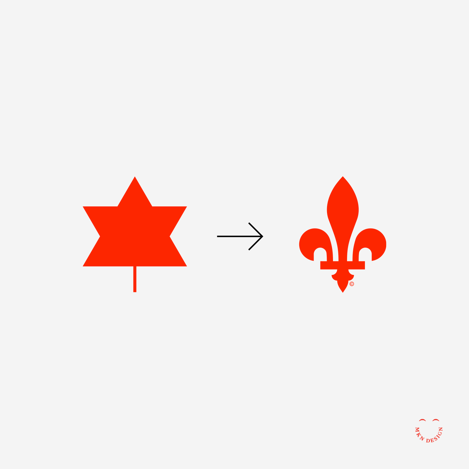
The French-speaking population of Canada lacks a distinctive symbol that encapsulates the relationship between Canada's national emblem, the maple leaf, and Quebec's Fleur-de-lis. For those unfamiliar, Francophones refer to French-Canadians who are descendants of French pioneers. These include Acadians, Quebecois, and other French-speaking communities that were established in the 19th and 20th centuries. This study aimed to explore ways to bridge the gap between French-speaking and English-speaking Canadians. To achieve this, I simplified Stuart Ash's Centennial Symbol (1967) and updated the design of the Fleur-de-lis, integrating it into the emblem. This combined logo was then paired with Canada's federal identity program. The Francophone du Canada mark is paired with Helvetica designed by Linotype Design Studio in 1961 and Max Miedinger.
Canada 150
Creative Musing
July 2017
__
Canada 150
I designed this anniversary mark for Canada’s 150th celebration. The mark features a maple leaf bursting like fireworks, embodying Canada's iconic Maple Leaf while also representing the unity of its citizens. The mark is paired with the typeface ATF Alternate Gothic designed by American Type Founders Collection.
Canada Goose
Creative Musing
January 2017
__
Canada Goose
Bold fills with negative space accents and a Canadian maple leaf.
Feist Portrait
Creative Musing
September 2016


